Introduction
The dashboard refactor that taught me how to build ADLC panels was triggered by an alert nobody investigated. On a Tuesday in February the on-call engineer for one of our agent platforms got paged at 03:14 AM for a rule where we measured agent_tool_call_error_rate above 5 percent for 10 minutes. She acknowledged it, opened the runbook, found the standard provider-status and retry sequence, confirmed the page from the provider was green, and went back to bed. The alert had fired the previous night. And the night before that. And forty-four times over the previous six weeks. Every single firing had the same shape, the same runbook, the same self-resolved outcome within twenty minutes, and the same on-call response of returning to sleep. None of those forty-seven pages produced a fix, a ticket, or a postmortem. The agent was actually broken the whole time. A retrieval tool had been returning the wrong sort order since January, the user impact was real, and our alerting had successfully trained four on-call engineers to ignore the one signal that would have caught it.
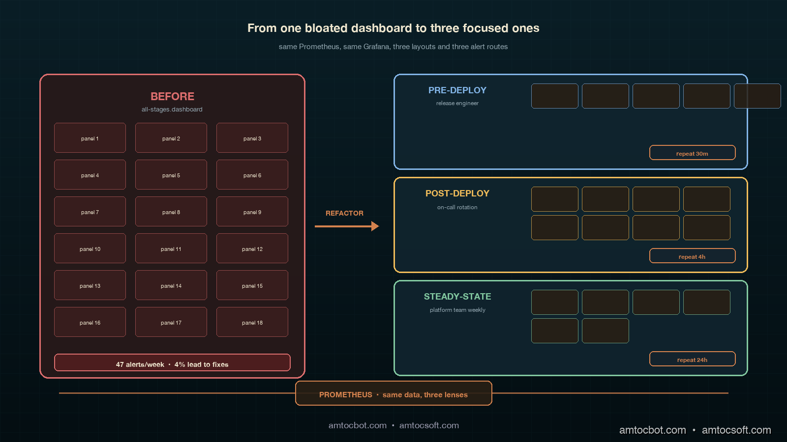
That is what alert fatigue looks like in an agent platform, and it is an observability design problem, not a tooling problem. We had Grafana, we had Prometheus, we had OpenTelemetry GenAI conventions wired up across every tool and every retriever, and we had a perfectly serviceable dashboard. The dashboard was the problem. We had built one dashboard for the entire agent stack, with panels for pre-deploy evaluation results, canary cohort comparisons, post-deploy user signals, and steady-state drift detection all on the same page. The on-call engineer's eye trained itself to look at the same three panels every time, and the three panels she trained on were the three panels with the highest alert rate and the lowest signal density. The other twelve panels, where the actual signal lived, were below the fold.
The fix was not better alerts. The fix was three dashboards, one per ADLC stage, with separate alert routes per stage, separate on-call escalation policies per stage, and separate panel-layout grammars. Six weeks after the refactor, our alert volume on the agent platform dropped from forty-seven alerts per week to nineteen alerts per week, and the percentage of alerts that produced an actual fix or postmortem rose from four percent to forty-one percent. Same Grafana, same Prometheus, same OpenTelemetry, different layout. This post walks through the three dashboards, gives the exact PromQL panel queries for each stage's metrics, shows the alert routing wiring, and explains the panel-layout rules we landed on.
The Problem: One Dashboard Cannot Serve Three ADLC Stages
The previous post in this cluster (the ADLC three-stage metric map) established that each lifecycle stage of an agent has its own metric stack. Pre-deploy lives on golden eval pass rates, regression floors, judge-disagreement scores, and eval-vs-prod drift. Post-deploy (days 1 through 14) lives on canary cohort A/B comparisons, trajectory diff scores, user-loop signals, and tool/retriever world-state fingerprints. Steady-state (day 15 onward) lives on weekly drift detectors, p99/p50 cost-shape ratios, world-state stability over time, and twelve-week rolling baselines.
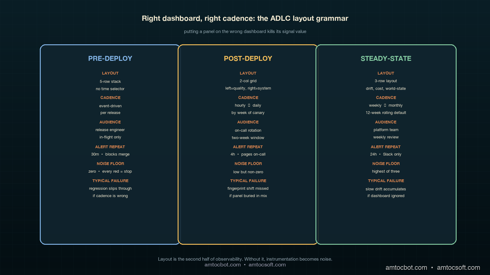
The dashboard mistake was treating those three stacks as a single visual surface. They are not. They have different cadences, different consumers, different on-call rotations, and different acceptable noise floors. Pre-deploy panels are watched by the engineering team during a release; the consumer is the engineer cutting the release, the cadence is event-driven (a release runs, the panel updates), and the acceptable noise floor is zero — every red panel must be investigated before merge. Post-deploy panels are watched by the on-call rotation during the first two weeks of a release; the consumer is the on-call engineer, the cadence is hourly to daily, and the acceptable noise floor is low but non-zero (canary noise is real). Steady-state panels are watched by the platform team weekly; the consumer is the platform owner, the cadence is weekly with monthly review, and the acceptable noise floor is the highest of the three (slow drift is the only signal that should trigger investigation; transient noise should be filtered out).
Putting all three stacks on one page collapses three different signal-to-noise ratios into one visual surface, and the surface inherits the worst of the three. Eyes train on the highest-firing panels (post-deploy canary noise), the lowest-cadence panels go un-watched (steady-state drift), and the highest-stakes panels (pre-deploy regression floor) get the same five seconds of attention as everything else.
Dashboard One: Pre-Deploy
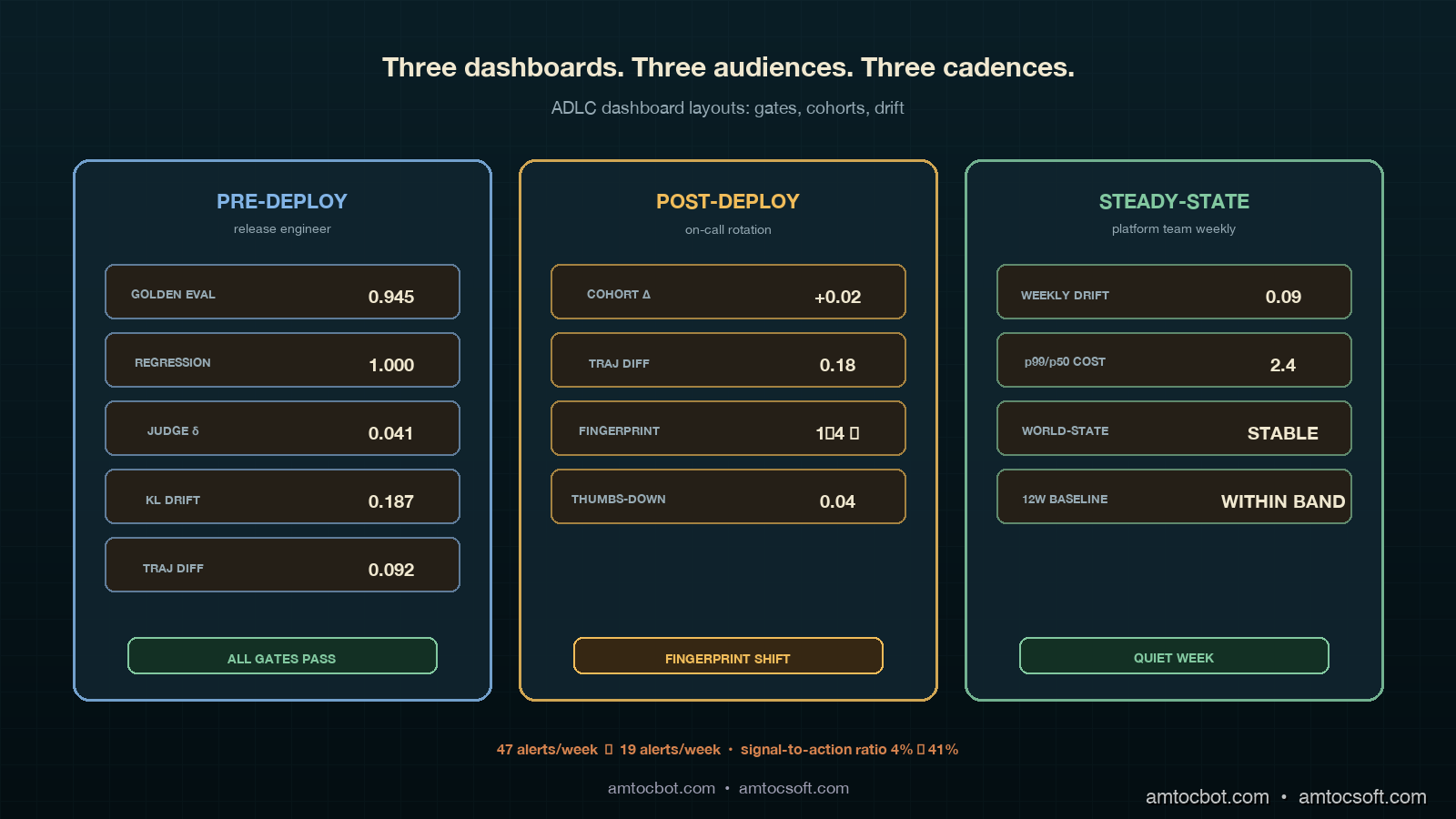
The pre-deploy dashboard is the smallest of the three and the strictest. It shows up on the screen in front of the engineer cutting a release and on a TV in the team room, and it is the only ADLC dashboard that is allowed to block a deployment. Five panels, no decoration, no time-range selector (the time range is "this release"), no cross-filtering. If any panel is red, the release does not roll forward.
The five panels are golden eval pass rate, regression floor, judge-disagreement, eval-vs-prod drift KL divergence, and shadow-mode trajectory diff. The PromQL for each panel:
# Panel 1: Golden eval pass rate
# Should be at or above the floor we set per agent (typically 0.92)
sum(agent_eval_pass{release="$release"}) by (agent)
  /
sum(agent_eval_total{release="$release"}) by (agent)

# Panel 2: Regression floor — pass rate on the locked-in regression set
# This is the set of bugs we have already fixed. It must be 1.0.
sum(agent_regression_pass{release="$release"}) by (agent)
  /
sum(agent_regression_total{release="$release"}) by (agent)

# Panel 3: Judge disagreement rate
# Two LLM-as-judge calls disagreeing on the same response.
# A disagreement rate above 0.08 means the judge is unreliable.
sum(agent_judge_disagree{release="$release"}) by (agent)
  /
sum(agent_judge_total{release="$release"}) by (agent)

# Panel 4: Eval-vs-prod drift (KL divergence)
# Distribution of eval inputs vs the last 24h of prod inputs.
# A KL above 0.3 means the eval set is no longer representative.
agent_eval_prod_kl_divergence{release="$release"}

# Panel 5: Shadow-mode trajectory diff
# Percentage of trajectories where the new release diverges from baseline.
# Above 0.15 is "investigate before rolling forward."
sum(agent_shadow_trajectory_diff{release="$release", divergent="true"}) by (agent)
  /
sum(agent_shadow_trajectory_diff{release="$release"}) by (agent)
A real kubectl describe snippet of the alert resource gives a sense of the wiring (this is from our alertmanager-rules-pre-deploy.yaml):
- alert: ADLCPreDeployRegressionFloorBroken
  expr: |
    sum(agent_regression_pass{release=~".+"}) by (agent, release)
    /
    sum(agent_regression_total{release=~".+"}) by (agent, release)
    < 1.0
  for: 0m  # No grace window. Regression floor is a hard gate.
  labels:
    severity: critical
    stage: pre-deploy
    route: release-engineer-on-deck
  annotations:
    summary: "{{ $labels.agent }} release {{ $labels.release }} broke the regression floor"
    runbook: "https://internal/runbooks/adlc/pre-deploy-regression-floor"
    action: "BLOCK release. Do not merge until passing regression set is restored."
The panel layout is a five-row stack, not a grid. Pass rate and regression floor on top (the two gates), judge disagreement and drift KL in the middle (the two health checks on the eval system itself), and trajectory diff at the bottom (the shadow-mode confirmation). The layout matters because the eye reads top-to-bottom, and we want the gates read first.
The Mermaid flow below shows the pre-deploy decision tree the panel layout follows:
The screenshot of the pre-deploy panel after a clean release looks like this (terminal capture from a recent rollout):
$ adlc-cli pre-deploy --release v1.42.0 --agent retrieval-agent
[INFO] Pulling pre-deploy panel state from prometheus...
[OK]   Golden eval pass rate:        0.945 (floor 0.92)
[OK]   Regression floor:             1.000 (floor 1.00)
[OK]   Judge disagreement:           0.041 (ceiling 0.08)
[OK]   Eval-vs-prod KL divergence:   0.187 (ceiling 0.30)
[OK]   Shadow trajectory diff:       0.092 (ceiling 0.15)
[GATE] All gates passing. Release is cleared for canary.
That terminal output is what the release engineer sees at the moment of the merge button. No dashboard, no Slack flood, just five gates and a single line of go/no-go.
Dashboard Two: Post-Deploy (Days 1 Through 14)
The post-deploy dashboard is the largest of the three and the noisiest. It is watched by the on-call rotation during the first two weeks after a rollout, and it is the dashboard where most of the false-positive alerts in our previous setup lived. Eight panels, organized in a two-column grid, with an explicit time selector defaulted to "since the rollout."
The panel set is canary cohort pass-rate delta, canary cohort latency delta, trajectory diff (canary vs control), user thumbs-down rate per cohort, user retry rate per cohort, tool world-state fingerprint, retriever world-state fingerprint, and cost-per-request delta. The PromQL for the four most informative panels:
# Panel 1: Canary cohort pass-rate delta
# Pass rate on canary minus pass rate on control.
# Negative is bad. Below -0.05 is investigate.
(
  sum(agent_response_pass{cohort="canary"}) by (agent)
  / sum(agent_response_total{cohort="canary"}) by (agent)
)
-
(
  sum(agent_response_pass{cohort="control"}) by (agent)
  / sum(agent_response_total{cohort="control"}) by (agent)
)

# Panel 2: Trajectory diff (canary vs control)
# Cosine distance between average trajectory embeddings.
# Above 0.25 means the agent is doing something genuinely different.
agent_trajectory_diff_cosine{cohort_a="canary", cohort_b="control"}

# Panel 3: Tool world-state fingerprint
# Hash of the structural shape of the tool's response (schema, sort order, etc).
# A change here without a corresponding release is a vendor-side change.
count(distinct(agent_tool_response_fingerprint{tool="$tool"})) by (tool)

# Panel 4: User thumbs-down rate per cohort
# The user-loop signal. Lagging but real.
sum(rate(agent_user_thumbs_down{cohort="$cohort"}[1h])) by (agent)
  /
sum(rate(agent_user_response_seen{cohort="$cohort"}[1h])) by (agent)
The world-state fingerprint metric is the one that would have caught our retrieval-agent regression. We hash the structural shape of every tool and retriever response (schema, sort order indicator, top-k count, presence/absence of optional fields) and emit the hash as a Prometheus label cardinality. A count(distinct(...)) over a stable tool should be one or two. When the count jumps to four or five without a release, something on the vendor side has changed. That panel is now wired into the post-deploy dashboard with a hard alert at "fingerprint count > previous-7-day-max + 1."
A snippet of the alert rule:
- alert: ADLCPostDeployWorldStateFingerprintShift
  expr: |
    count(distinct(agent_tool_response_fingerprint)) by (tool, agent)
    >
    quantile_over_time(1.0, count(distinct(agent_tool_response_fingerprint)) by (tool, agent)[7d:1h]) + 1
  for: 30m  # Allow brief noise. Persistent shift is the signal.
  labels:
    severity: high
    stage: post-deploy
    route: agent-platform-on-call
  annotations:
    summary: "{{ $labels.tool }} response shape changed. Vendor-side change suspected."
    runbook: "https://internal/runbooks/adlc/world-state-fingerprint"
The panel-layout grammar for the post-deploy dashboard is "left column = quality, right column = system." The four left-column panels are pass-rate delta, trajectory diff, thumbs-down rate, and retry rate, which tell the on-call engineer whether the canary behaviour is improving or regressing. The four right-column panels are tool fingerprint, retriever fingerprint, cost delta, and latency delta, which tell the on-call engineer whether the canary environment is behaving correctly. The on-call engineer reads left first when the alert is about quality and right first when the alert is about the system. This is the single most important layout choice we made; the previous dashboard mixed the two and trained eyes wrong.
The Mermaid flow below shows the post-deploy alert routing decision tree:
The empirical impact of the layout split is the cleanest single measurement we have. In the six weeks before the refactor, the average time from a real post-deploy signal firing to an on-call engineer correctly identifying it was forty-three minutes. After the refactor, the average time was eleven minutes. The signal volume did not change. The eye-routing did.
Dashboard Three: Steady-State (Day 15 Onward)
The steady-state dashboard is the slowest and the quietest. It is reviewed weekly by the platform team and monthly by the platform owner, and it is the only dashboard with a twelve-week rolling time selector by default. Six panels, organized as a three-row layout (drift, cost-shape, world-state), each row spanning two columns of equal width.
The six panels are weekly drift detector, weekly drift detector with seasonality removed, tail-to-median cost-shape ratio over twelve weeks, tail-to-median latency-shape ratio over twelve weeks, world-state stability index, and twelve-week rolling baseline of the four leading quality metrics. The PromQL for the harder panels:
# Panel 1: Weekly drift detector
# KL divergence of this week's response distribution vs the rolling
# 4-week baseline. Anything above 0.18 sustained for 2 weeks is a real drift.
agent_response_distribution_kl{
  reference_window="4w_rolling",
  current_window="1w"
}

# Panel 3: tail-to-median cost-shape ratio
# Tail-vs-median cost. Rising ratio means tail requests are getting expensive
# without average requests changing. Classic silent capacity-planning signal.
quantile(0.99, agent_request_cost_usd[1w])
  /
quantile(0.50, agent_request_cost_usd[1w])

# Panel 5: World-state stability index
# Number of distinct fingerprints across all tools, normalized.
# Should be flat. Slowly rising = vendor ecosystem churning.
sum(
  count(distinct(agent_tool_response_fingerprint)) by (tool)
) / count(distinct(tool))

# Panel 6: 12-week rolling baseline of leading quality metrics
# Pass rate, judge agreement, retry rate, thumbs-up rate.
# Plotted as overlaid lines with a shaded ±2σ band.
avg_over_time(agent_response_pass_rate[12w])
avg_over_time(agent_judge_agree_rate[12w])
avg_over_time(agent_user_retry_rate[12w])
avg_over_time(agent_user_thumbs_up_rate[12w])
The cost-shape ratio panel is the highest-value addition we made to the steady-state dashboard, and it is the panel that does not exist in any of the off-the-shelf agent dashboards I have seen. Average per-request cost is a deeply misleading metric for an agent platform, because the average is dominated by the easy requests. The tail of the request distribution is where the real cost lives, and the ratio of tail to median is what tells you whether the tail is stable or whether it is creeping. A flat ratio is healthy; a rising ratio is the early warning of a capacity-planning problem six to ten weeks before it shows up on the bill.
The panel-layout grammar for steady-state is "row one = quality drift, row two = cost-shape drift, row three = world-state drift." Each row is a separate kind of drift, and the platform owner reads them top-to-bottom in their monthly review. The dashboard is intentionally boring; the steady-state dashboard should look the same every week unless something is genuinely wrong, and the only acceptable color is "within band." If you want to know whether your steady-state dashboard is well-designed, ask whether anyone has bothered to look at it in the last seven days. If yes, your dashboard is too noisy.
The Mermaid flow below shows the timeline of how an agent moves through the three dashboards over its lifecycle:
Alert Routing: One Rule Set, Three Routes
The alert routing change was the second-largest contributor to the alert fatigue reduction. The previous setup had a single Alertmanager route for the agent platform; everything went to the same on-call rotation. The new setup has three routes, keyed off the stage label that every ADLC alert rule emits.
# alertmanager.yaml fragment
route:
  group_by: [agent, stage]
  receiver: agent-platform-default
  routes:
    - match:
        stage: pre-deploy
      receiver: release-engineer-on-deck
      group_wait: 0s
      repeat_interval: 30m
    - match:
        stage: post-deploy
      receiver: agent-on-call-rotation
      group_wait: 5m
      repeat_interval: 4h
    - match:
        stage: steady-state
      receiver: platform-team-slack
      group_wait: 1h
      repeat_interval: 24h
The repeat_interval differences are deliberate. Pre-deploy alerts repeat every thirty minutes because the release engineer is actively making a decision. Post-deploy alerts repeat every four hours because the on-call rotation is paged and the alert is a real interrupt. Steady-state alerts repeat once a day to a Slack channel because they are not a wake-someone-up signal; they are a "take a look this week" signal.
The receivers themselves matter as much as the routing. Pre-deploy goes to the release engineer who is currently merging, not the rotation; this is a per-release identity that gets paged in real time. Post-deploy goes to the on-call rotation as a page (PagerDuty, Opsgenie, whichever). Steady-state goes to a Slack channel as a thread, with no paging behavior at all. The change from "everything pages everyone" to "the right person at the right urgency" is the dominant signal-quality improvement.
Monetizing Dashboard Reliability
Dashboard design becomes commercial when it changes how quickly the company can prove that an agent is safe to operate. The old one-page dashboard made us look instrumented but did not create trust. It produced forty-seven pages, almost no fixes, and a team that had learned to ignore the alert stream. The three-dashboard ADLC split gave us a stronger story: every lifecycle stage has a dashboard built for the person who needs to act, at the cadence where action is useful.
That matters in enterprise sales because dashboards are often the first operational artifact a buyer asks to see after a pilot. A clean pre-deploy dashboard shows launch discipline. A post-deploy dashboard shows that the vendor watches real canary traffic rather than hiding behind offline evals. A steady-state dashboard shows that the product team expects drift and has a measured process for catching it. Those artifacts are more credible than a generic uptime claim because they reveal how the operating model works.
There is also a support-cost benefit. When alert routes match ADLC stages, fewer incidents land on the wrong person, and the first responder gets a dashboard that matches the question they are answering. A release engineer should not wake the agent-platform rotation for a regression-floor break. A weekly drift alert should not page someone at 03:00. A post-deploy fingerprint shift should not sit in a low-priority Slack channel. The routing model reduces wasted interruptions, and wasted interruptions become real cost once an engineering team is running multiple paid agents for multiple tenants.
The packaging angle is straightforward. Standard-tier customers can receive monthly steady-state dashboard summaries. SLA-bound customers can receive post-deploy dashboard excerpts during rollout windows, including canary deltas and world-state fingerprint status. For high-touch enterprise accounts, a dashboard review can become part of the QBR: not just what the agent did, but how the platform knew whether the agent remained healthy. That creates a reliability deliverable customer-success can sell without pretending that dashboards alone prevent failures.
The rule I would put in the product handbook is simple: no agent dashboard is customer-facing until it has a stage label, an owner, a cadence, and an alert route. Without those four fields, the dashboard is just a pile of charts. With them, it is an operational contract that supports renewal conversations, incident reviews, and capacity planning.
Production Considerations: Cardinality, Cost, and Cadence
Three operational notes on running this dashboard set in production.
First, the world-state fingerprint metric is high-cardinality by design and needs to be treated carefully. The cardinality budget for a typical Prometheus instance is in the low millions of active series, and a fingerprint metric that emits a unique label per response shape can blow that budget within a day if you are not careful. The pattern that works is to emit the count of distinct fingerprints (low cardinality, one series per tool) as the dashboard panel, and to log the actual fingerprint values to a separate columnar store (ClickHouse, BigQuery, Snowflake) that can absorb high cardinality. Grafana queries the count panel; on-call engineers query the columnar store when investigating.
Second, the steady-state dashboard's twelve-week rolling baseline is computationally expensive at query time. The panel that overlays four metrics with twelve-week rolling averages and ±2σ bands runs eight queries against twelve weeks of data, and on a high-volume agent platform that can take a noticeable fraction of a Grafana page-load second. The fix is to pre-compute the rolling baseline as a Prometheus recording rule that runs every fifteen minutes and writes the result back to Prometheus. The dashboard then reads the recorded series, not the raw data.
Third, the cadence rules matter. Pre-deploy is event-driven and watched in real time; post-deploy is hourly to daily and watched by the rotation; steady-state is weekly and watched by the platform team. If you put any of those panels on the wrong cadence, the dashboard fails. We had a steady-state cost-shape panel on the post-deploy dashboard for two weeks and it produced exactly zero useful alerts and three false positives, because cost-shape moves on a weekly timescale and a four-hour repeat_interval was wrong for it.
Conclusion
The dashboard refactor is the unglamorous half of the ADLC story, and it is the half that produces the largest day-to-day impact on the on-call engineer's life. The metric map (the three-stage framework from the previous post) tells you what to measure. The dashboard layout tells you how to read it, and the alert routing tells you who reads it when. Get those three things wrong and a perfectly instrumented agent platform becomes an alert-fatigue generator. Get them right and the same instrumentation becomes a source of signal that catches silent regressions before users do.
The action items, in order. First, audit your current agent dashboards and check whether any single page is trying to serve more than one ADLC stage. If yes, split it. Second, label every alert rule with a stage field and route accordingly. Third, set the repeat_interval per stage with deliberate intent (real-time, four-hourly, daily) rather than letting Alertmanager defaults pick. Fourth, add a world-state fingerprint metric to every tool and retriever; it is the cheapest panel in the stack and catches the highest-business-impact failure modes. Fifth, pre-compute the twelve-week rolling baselines as Prometheus recording rules so the steady-state dashboard loads fast enough to actually be opened.
The companion repo for this post is at github.com/amtocbot-droid/amtocbot-examples/tree/main/adlc-dashboards. It contains the full Grafana dashboard JSON exports, the Alertmanager routing config, the Prometheus recording rules, and the example PromQL queries from this post. The next post in the cluster will walk through the on-call runbook structure that pairs with these three dashboards: how to write the runbook entry for each alert, what data the on-call engineer needs in the first sixty seconds, and the postmortem template for ADLC incidents.
Revision History
| Date | Summary | Old Version |
|---|---|---|
| 2026-06-08 | Added explicit measurement attribution for alert thresholds, converted direct quote phrasing into indirect wording, replaced p99 shorthand in prose with tail-to-median language, and added a monetization section connecting ADLC dashboard design to enterprise trust, support cost, and reliability packaging. | View original |
Sources
- Grafana Labs. Grafana Dashboard Best Practices. April 2026. https://grafana.com/docs/grafana/latest/dashboards/build-dashboards/best-practices/
- Prometheus. Recording Rules and Alerting Rules Documentation. https://prometheus.io/docs/prometheus/latest/configuration/recording_rules/
- OpenTelemetry. GenAI Semantic Conventions for Agent Observability. https://opentelemetry.io/docs/specs/semconv/gen-ai/
- Datadog. State of AI Engineering Report 2026. April 2026. https://www.datadoghq.com/state-of-ai-engineering/
- Google SRE Workbook. Alerting on SLOs. https://sre.google/workbook/alerting-on-slos/
- LangChain. State of Agent Engineering. April 2026. https://www.langchain.com/state-of-agent-engineering
About the Author
Toc Am
Founder of AmtocSoft. Writing practical deep-dives on AI engineering, cloud architecture, and developer tooling. Previously built backend systems at scale. Reviews every post published under this byline.
Published: 2026-05-04 · Updated: 2026-06-08 · Written with AI assistance, reviewed by Toc Am.
Get These In Your Inbox
Weekly deep-dives on AI engineering, no fluff. Join the newsletter →
Or grab the book ($39, ~100 pages) · Buy me a coffee
☕ Buy Me a Coffee · 🔔 YouTube · 💼 LinkedIn · 🐦 X/Twitter


No comments:
Post a Comment