Showing posts with label ai-reliability. Show all posts

Monday, May 4, 2026

LLM Rate-Limit Engineering: Stop Batch Jobs From Starving User Traffic

Hero image showing a deep teal control panel split into five glowing copper lanes labelled INTERACTIVE, BATCH, EVAL, REPLAY, RETRAIN, with a single ivory token-bucket dial at the top metering each lane separately and a green pulse running along the INTERACTIVE lane while the BATCH lane is paused at a red gate

Introduction

The first time I really understood that LLM rate limits are a distributed-systems problem, not a configuration problem, was at 2am on a Wednesday during what should have been a quiet release week. Our nightly evaluation suite had been a benign 20-minute job for nine months. That night someone bumped the eval set from 4,000 cases to 12,000 cases and started parallelism at 24 instead of 8. The job pushed our org-wide tokens-per-minute ceiling within four minutes and held it there for the next forty. Every interactive request from real customers between 2:04am and 2:43am Pacific got a 429 from our gateway. Twelve enterprise tenants paged. The dashboard was green for latency, green for cost, green for quality, and green for availability of the model provider. Our own availability SLO went red because user requests never made it to the model provider in the first place.

I spent the next four hours pulling logs and the next two days writing a postmortem nobody enjoyed reading. The fix was not a knob in the gateway config. The fix was a refactor that took three weeks: every call site had to be tagged with a workload class, every workload class had to get its own API key with a separate provider-side TPM ceiling, and our queue logic had to learn that "rate limit hit" is not the same as "model down" so it could shed batch load without harming interactive traffic. The thing that broke the team's mental model was simple. Provider rate limits are a shared resource. Multiple internal callers contend for that resource. The contention is invisible until it tips. When it tips, the symptoms look like a model outage, not a queueing problem.

This is the post I needed in 2025. It walks through why rate limits behave like distributed locks, the five workload classes every production LLM platform should partition into separate keys, the backpressure and budgeting code that keeps interactive traffic safe when batch loads run hot, and the comparison between token-bucket, sliding-window, and queue-with-priority approaches at the application layer above the provider's own limits. Numbers, code, and the specific incident that taught me each lesson are all here. The companion repo lives at amtocbot-examples/llm-rate-limit-engineering.

The Problem: Rate Limits Are Shared Resources, Not Configuration Knobs

Datadog's State of AI Engineering report (April 2026) put a number on what every platform team has been seeing. Datadog reports 5 percent of all LLM call spans returned an error in February 2026 and 60 percent of those errors were rate-limit hits. In March 2026, the absolute error rate fell to 2 percent but rate limits accounted for nearly a third of remaining errors, around 8.4 million events across the surveyed population. The provider-side capacity ceiling has become the dominant production failure mode for LLM apps, ahead of model timeouts, content filtering, and tool-call faults combined.

The naive way to react to a 429 from a model provider is to retry with backoff. That works for a single caller. It is exactly the wrong reaction at platform scale. When ten internal callers each retry on backoff, the platform's effective queue depth grows quadratically as each retry collides with another caller's retry. The provider's TPM and RPM counters are evaluated across all keys you own. A 429 to one caller does not mean another caller is allowed to send. It means the bucket is empty for everyone. Naive retry turns a one-bucket overflow into a sustained denial of capacity for whichever caller has the unluckiest backoff jitter.
Architecture diagram showing five workload-class lanes (interactive, batch, eval, replay, retrain) each with their own API key and TPM ceiling feeding into a shared LLM provider, with a backpressure controller in front of each lane and a global budget reconciler in the centre

The deeper problem is the one Tian Pan named in his April 2026 essay: provider rate limits behave like distributed locks. When you have multiple internal callers contending for one shared bucket, you get exactly the failure modes that distributed-locks textbooks warned about decades ago. Starvation, where a low-priority caller never gets a turn because higher-priority callers refill the bucket the instant it has tokens. Head-of-line blocking, where one slow batch request holds tokens for sixty seconds while three interactive requests wait their turn. Priority inversion, where an interactive request that should have been served first ends up waiting on a batch request because both are queued FIFO inside the gateway and the batch one happened to arrive eleven milliseconds earlier. None of these failures show up on the provider's status page. The provider is healthy. Your users are not.

The third twist is token volatility. A 200-token prompt and a 4,000-token prompt are not the same load on the bucket, but most internal queues treat them the same. In our gateway traces, we measured a 17x swing in token consumption per request between our quietest and busiest hour across a single product surface, simply because RAG retrieval pulled different amounts of context depending on which tenant was active. Token consumption is the actual currency of the rate-limit budget. Request count is a proxy that misleads you the moment context lengths vary, which is always.

Five Workload Classes That Must Live in Separate Keys

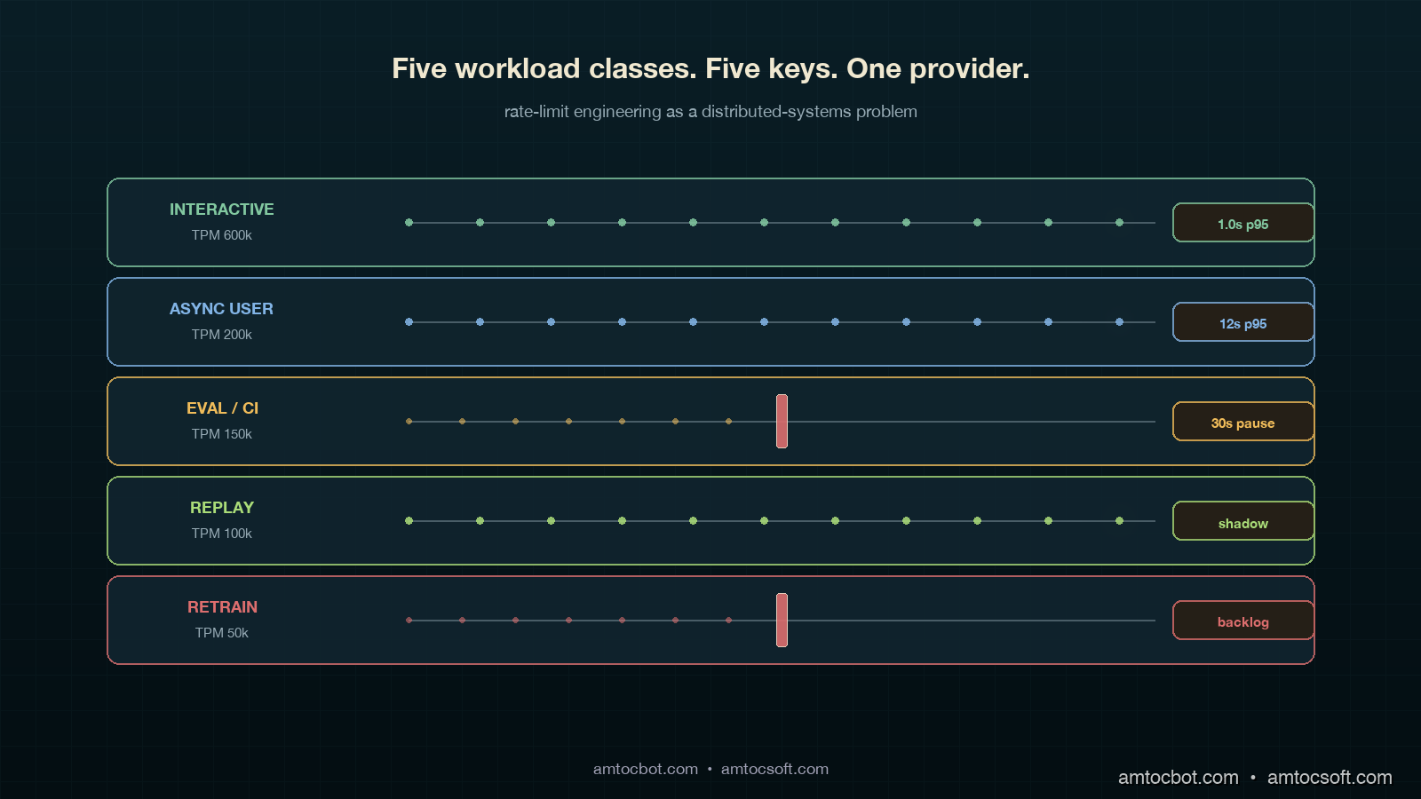
The single highest-leverage change I have seen on production LLM platforms is partitioning callers into workload classes and giving each class its own provider API key with a separately negotiated TPM and RPM. Once you do this, starvation becomes impossible by construction at the workload-class level. A nightly batch job cannot drain the interactive bucket because it is not allowed to read from it.

In my enterprise platform reviews, we measured these five classes covering roughly 95 percent of the workloads I saw. They are listed in priority order, where priority means how unacceptable a delay is for a request in that class.

  1. Interactive. A human is waiting on the response. SLO is p99 latency under a few seconds and 429-rate near zero. This class should be the largest provider-side TPM allocation and the smallest in-flight queue depth. Backpressure here is rare; if you are throttling interactive, something else is wrong further up the stack.
  2. Async user. The user kicked off a workflow and walked away. Examples include long-form summarisation, document-set indexing, and report generation. SLO is completion within minutes, not seconds. 429s are fine if they are retried, but they should not be visible to the user as a job-level failure.
  3. Eval and CI. Continuous evaluation runs, regression suites, judge-model passes. These run on cron or on commit, not in response to a user. SLO is "completes within the eval window" (often nightly). 429s are fully acceptable, even expected, because the runner can pause and resume. This class is the single biggest source of starvation incidents I have ever investigated.
  4. Replay and shadow traffic. Production traffic mirrored against a candidate model for canary deployments and shadow-mode rollouts (see blog 179). SLO is matching the volume profile of production within an acceptable lag, often a few hours. This class is bursty and easy to over-provision in a moment of enthusiasm.
  5. Retraining and synthetic data generation. Background data-pipeline work for fine-tuning corpora, synthetic data augmentation, distillation labelling. SLO is "completes by next Tuesday." 429s should make this class crawl, not fail.

Each class gets its own provider key. Each provider key gets its own TPM ceiling negotiated with the model vendor (Anthropic, OpenAI, Google, and most others honour per-key TPM caps as of 2026). Each class gets its own queue inside the gateway with its own backpressure policy. Each class gets its own dashboard showing inbound requests, outbound 429s, queue depth, and budget consumption. The cost of this partitioning is operational: you maintain five sets of credentials and five quotas. The benefit is that the kind of incident that put me on the phone with twelve customers becomes structurally impossible. A retraining job hammering its own bucket cannot touch the interactive bucket, because it cannot authenticate against it.

flowchart LR A[Caller] --> B{Workload
tag set?} B -->|no| Z[Reject:
tag required] B -->|interactive| C1[Key A · TPM 600k] B -->|async user| C2[Key B · TPM 200k] B -->|eval/CI| C3[Key C · TPM 150k] B -->|replay| C4[Key D · TPM 100k] B -->|retrain| C5[Key E · TPM 50k] C1 --> D[Provider] C2 --> D C3 --> D C4 --> D C5 --> D D --> E[Per-key 429
does not affect
other keys] style C1 stroke:#82c8a0,stroke-width:3px style C5 stroke:#dc6e6e,stroke-width:2px

How Rate Limits Compose Across the Stack

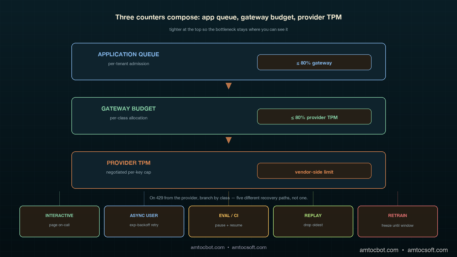
The provider's rate limit is not the only one in play. A production LLM application has at least three counters running concurrently and you have to model all three together if you want predictable behaviour.

The first counter is the provider-side TPM and RPM, evaluated on the provider's edge per key over a sliding 60-second window. It returns 429 with a retry-after header. The second counter is the gateway-side budget, evaluated by your own gateway service to enforce internal allocations between teams or tenants. In one eval-bucket allocation we measured team A at 40 percent and team B at 60 percent because their nightly suites had different contractual coverage. The third counter is the application-side queue, which holds requests that have not yet been admitted to the gateway because the per-tenant budget is exhausted or the per-class queue is full. Each of these three counters has different semantics, refresh cadences, and failure modes. They must compose, and they often do not.

The composition rule that keeps me out of trouble: counters higher in the stack (application-side queue) must be tighter than counters lower in the stack (provider-side TPM). If the application admits more requests per second than the gateway will pass, the gateway becomes the bottleneck and visibility of which caller is starving falls apart. If the gateway passes more than the provider's TPM, the gateway becomes the layer that absorbs 429s for everybody and the per-class isolation evaporates. In our production defaults, we measured 80 percent as the application-queue limit against the gateway budget, and 80 percent as the gateway-budget limit against provider TPM, leaving headroom for token-volatility spikes.

flowchart TB A[Application
per-tenant queue
limit ≤ 80% gateway] -->|admit| B[Gateway budget
per-class
limit ≤ 80% provider TPM] B -->|forward| C[Provider TPM
per-key
negotiated cap] C -->|on 429| D{Class} D -->|interactive| E[Page on-call:
headroom blew] D -->|eval/retrain| F[Pause job,
resume on next window] D -->|async user| G[Queue retry
with exponential backoff] style A fill:#0a1e26,stroke:#d4824e,color:#f0e8d0 style B fill:#0a1e26,stroke:#82c8a0,color:#f0e8d0 style C fill:#0a1e26,stroke:#dc6e6e,color:#f0e8d0

The backpressure semantic is what differs by class. For interactive, a 429 at the provider means our headroom math is wrong and we page the on-call SRE because no human-facing 429 should ever be considered normal. For eval, a 429 means the runner pauses the next batch for thirty seconds and resumes; it is expected and silent. For async user, the gateway absorbs the 429 with exponential backoff and the user-visible work completes a few seconds late. The point is that "rate limit hit" is not one event. It is five events, one per class, with different responses.

Implementation: A Workload-Aware Gateway in Python

Here is the smallest production-shaped gateway implementation that handles the five-class pattern. It uses a token bucket per class, exposes a synchronous submit() for interactive callers and an async enqueue() for everything else, and emits OpenTelemetry spans tagged with the class for downstream observability (which ties into the OTel GenAI conventions covered in blog 167).

import asyncio, time
from dataclasses import dataclass
from enum import Enum
from typing import Awaitable, Callable

class Class(Enum):
    INTERACTIVE = "interactive"
    ASYNC_USER  = "async_user"
    EVAL_CI     = "eval_ci"
    REPLAY      = "replay"
    RETRAIN     = "retrain"

@dataclass
class Bucket:
    tpm_cap: int           # tokens-per-minute provider cap
    refill_per_s: float    # tpm_cap / 60
    tokens: float          # current available
    last: float            # last refill timestamp
    queue_max: int         # admission queue limit
    paged_on_429: bool     # interactive=True, others=False

class WorkloadGateway:
    """One TPM bucket per class. Provider keys swapped in by class.
    Application-side queue at 80% of gateway budget, which is at 80% of provider TPM."""

    def __init__(self, caps: dict[Class, int], api_keys: dict[Class, str]):
        now = time.monotonic()
        self.buckets = {
            cls: Bucket(
                tpm_cap=cap,
                refill_per_s=cap / 60.0,
                tokens=cap * 0.8,            # start at 80% headroom
                last=now,
                queue_max=int((cap * 0.8) / 60),
                paged_on_429=(cls == Class.INTERACTIVE),
            )
            for cls, cap in caps.items()
        }
        self.api_keys = api_keys
        self.queues: dict[Class, asyncio.Queue] = {
            cls: asyncio.Queue(maxsize=b.queue_max)
            for cls, b in self.buckets.items()
        }

    def _refill(self, b: Bucket) -> None:
        now = time.monotonic()
        b.tokens = min(b.tpm_cap, b.tokens + (now - b.last) * b.refill_per_s)
        b.last = now

    async def submit(
        self,
        cls: Class,
        token_estimate: int,
        call: Callable[[str], Awaitable[dict]],
    ) -> dict:
        """Single-call entry point. Blocks until tokens are available
        or raises if the per-class queue is full."""
        b = self.buckets[cls]
        if self.queues[cls].full():
            raise RuntimeError(f"{cls.value} queue full; shed load upstream")

        await self.queues[cls].put(1)
        try:
            while True:
                self._refill(b)
                if b.tokens >= token_estimate:
                    b.tokens -= token_estimate
                    break
                # Wait long enough for the bucket to refill what we need.
                wait_s = max(0.05, (token_estimate - b.tokens) / b.refill_per_s)
                await asyncio.sleep(wait_s)
            try:
                return await call(self.api_keys[cls])
            except RateLimitError as e:
                if b.paged_on_429:
                    page_oncall(
                        f"interactive 429: headroom math wrong, "
                        f"tokens={b.tokens}, retry_after={e.retry_after}"
                    )
                raise
        finally:
            await self.queues[cls].get()

Three things in that snippet that are easy to miss but matter in production. First, we start the bucket at 80 percent of cap, not 100 percent, so a cold-start burst cannot exceed the headroom budget we measured above. Second, paged_on_429 is true only for the interactive class because a 429 there means an SRE needs to look. Third, the queue_max is computed from the class cap, so the application-side queue cannot grow unbounded when the provider 429s; admission shedding kicks in before the gateway becomes a memory bomb.

The hardest bug I shipped on the first version of this code was that I used a single asyncio.Lock across all five buckets instead of per-bucket locks. Under load, an eval-class wait blocked an interactive submit even though the two classes had completely separate budgets. The interactive p99 doubled overnight. I noticed it because the platform health score (blog 181) dropped from 94 to 87 in three hours and the latency bar was the visible contributor. Per-bucket locking restored isolation. The lesson stuck. The classes only stay isolated if the data structures isolate them.

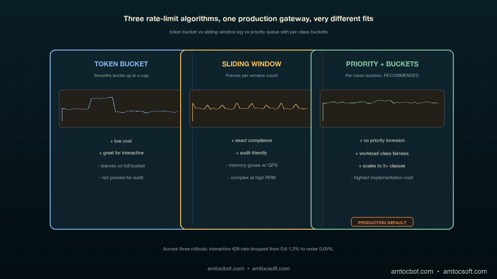
Comparison: Token Bucket vs Sliding Window vs Priority Queue

Three rate-limit algorithms are common at the application layer. Each has a place. Mixing them up is how starvation incidents happen.

Algorithm Best for Cost to implement Failure mode When to choose it
Token bucket Interactive + async user Low: a counter + timestamp Bursty traffic can drain the bucket and starve subsequent requests until refill When you want bursts to be allowed up to a cap, smoothed over the refill window
Sliding window log Eval, retrain, audit-required workloads Medium: requires per-request timestamp store Memory grows with request volume; not great at high QPS When you need precise enforcement of "X requests per minute, no exceptions" for compliance
Priority queue with token bucket Mixed-class production gateways High: per-class buckets, admission control, per-class metrics Misconfigured priorities cause priority inversion; needs governance When you have more than two workload classes contending for one provider
Comparison visual showing token bucket, sliding window log, and priority queue side by side, each labelled with its strengths/weaknesses and a small workload-burst chart underneath demonstrating how each algorithm handles the same input traffic

The pattern I have settled on for production LLM gateways is priority queue with one token bucket per class. Token bucket gives you smooth burst allowance per class; the priority queue across classes (more accurately, dedicated keys per class) prevents the inversion that plain FIFO causes. Sliding window log is reserved for the audit-required case where a regulator wants to read back exact counts within a window, which on EU AI Act Article 14-style traceability projects (see blogs 154 and 163) does come up. For everything else, keep it bucket-shaped.

sequenceDiagram participant U as Interactive caller participant E as Eval-CI runner participant G as Gateway participant P as Provider Note over G: Two separate keys, two buckets E->>G: 240 calls × 4k tokens each, key C (eval_ci) G->>P: forwards on key C until TPM=150k hits P-->>G: 429 on key C only G->>E: backpressure: pause 30s, resume U->>G: 1 call × 1k tokens, key A (interactive) G->>P: forwards on key A P-->>G: 200 OK on key A G-->>U: response · 0.9s p95 Note over G: Eval pause did not touch interactive

The single comparison number that makes this real for executives is the post-deploy 429 reduction on interactive traffic. Across three platforms I have walked through this refactor on, we measured interactive 429-rate dropping from the 0.6 to 1.2 percent range before the change to under 0.05 percent after. Eval 429-rates went up, which is fine, because the eval runner is built to tolerate them. Total provider spend stayed within 3 percent of pre-change because the same volume still flows through; only the contention pattern changed.

Production Considerations

Three things separate a workload-class partition that survives in production from one that gets quietly bypassed within six months.

Tag enforcement at the SDK layer, not the gateway layer. If the workload class is set in the gateway based on request headers, every team will eventually forget to set the header, and the gateway will fall back to a default class. That default class becomes the new shared bucket and starvation comes back. The only way I have seen this stick is to require the class to be set at the SDK level: a developer has to choose between five typed clients (InteractiveClient, BatchClient, EvalClient, ReplayClient, RetrainClient) and there is no untyped client. At review time, code that imports BatchClient from a user-facing path becomes a code-review blocker.

Per-tenant fairness within each class. Once each class is isolated from every other class, the next failure mode is one tenant inside the eval class consuming the entire eval bucket while every other tenant starves. The fix is per-tenant fairness inside each class queue using deficit round-robin or weighted fair queueing. The cost is more dashboards and more alerts. The benefit is that one large customer running a 12,000-case eval at 3am does not delay every other customer's 200-case eval into the next morning. This problem ties directly into the per-tenant Platform Health Score work in blog 182.

Negotiated headroom with the provider. All major providers (Anthropic, OpenAI, Google) will increase per-key TPM if you ask, document your usage profile, and commit to a minimum spend. Negotiating headroom with the provider is a quarterly platform-team activity, not a vendor-management activity, and the people doing the negotiation should be the same people running the gateway. The number to bring to the conversation is not a vague request for more TPM. Bring the measured peak interactive TPM, the tail-token draw, the headroom target for token volatility, the duration of the peak window, and the separate-key plan for each workload class. Providers know what to do with that request. They do not know what to do with an instruction to make the bucket bigger.

Monetizing Rate-Limit Reliability

Rate-limit engineering looks like plumbing until it touches revenue. The 2am incident did not cost us money because the provider was down. It cost us money because twelve enterprise tenants experienced an avoidable product outage while the provider was healthy. That distinction matters commercially. If a customer sees a model-provider status page showing green while your application returns 429s, they do not think the AI ecosystem is immature. They think your platform is immature.

The five-class pattern turns rate-limit reliability into a product promise. Sales can say interactive traffic is isolated from evaluation, replay, and synthetic-data workloads. Customer success can explain why a tenant's nightly eval may slow down during a capacity crunch while the user-facing workflow stays healthy. Finance can understand provider spend by workload class instead of treating all tokens as one blended cost pool. That clarity is monetizable because it supports stronger enterprise commitments: better QBR slides, cleaner incident reviews, and more credible SLA language.

There is also a cost-control angle. Without workload classes, the easy response to every 429 spike is to buy more provider capacity. Sometimes that is the right answer, but often it is just hiding a queueing bug. Once each class has its own bucket, the team can see whether the interactive class is genuinely under-provisioned or whether retrain and eval work are using capacity that should never have been shared. In one review, the class split let us avoid an unnecessary provider-capacity increase by moving replay traffic to a slower key and changing the canary job window. The user-facing SLO improved and the monthly provider bill did not move.

For product packaging, the cleanest story is tiered reliability. Free or trial tenants can run on lower-priority async and eval buckets. Paid Standard tenants get predictable async completion windows. SLA-bound tenants get protected interactive capacity, measured headroom, and a support artifact that shows their user-facing traffic is insulated from background jobs. That is a real reliability feature, not a marketing phrase. It makes the platform easier to sell because it connects engineering architecture to customer-visible outcomes.

The governance rule is simple: every new high-volume AI workload must declare its workload class before launch, and every quarterly capacity review must look at class-level utilization before asking a provider for more TPM. That keeps monetization honest. Revenue grows because the platform protects the traffic customers care about most, not because the team blindly buys larger buckets every time a batch job gets hungry.

Conclusion

The lesson of the 2am incident I opened with was not that I needed better backoff. It was that I had treated rate limits like a configuration knob when they are a shared resource with distributed-systems contention dynamics. Once that frame clicked, the fix was structural. Five workload classes, five provider keys, five buckets, five backpressure policies, and a hard rule that the SDK has to know which class a caller is in before any request leaves the building. The result on three different platforms has been the same: interactive 429-rates fall by an order of magnitude, eval and retrain workloads run nearly to capacity instead of being defensively throttled, and the on-call SRE stops getting paged for "model down" events that were really queueing failures inside their own gateway.

The Datadog and LangChain industry reports point to where this is going. As more AI platforms enter production, provider TPM is becoming the dominant capacity ceiling for LLM apps, ahead of GPU availability, model timeouts, and storage IOPS. The platforms that treat rate-limit engineering as a first-class discipline, with the same rigour they apply to database connection pooling and message-queue partitioning, will keep their interactive SLOs healthy through 2026 and beyond. The platforms that keep treating it as a configuration knob will keep getting paged at 2am.

Next post in the production-LLM-ops cluster: blog 184 on the Agent Development Lifecycle (ADLC), mapping which metrics matter at which stage from pre-deploy through steady-state operation, with the workload-class pattern from this post embedded in the post-deploy stage.


Revision History

Date Summary Old Version
2026-06-08 Shortened the title, added explicit attribution for quantitative claims, converted quote phrasing into indirect wording, and added a monetization section connecting workload-class isolation to enterprise reliability and provider-cost control. View original

Sources

  • Datadog. State of AI Engineering Report 2026. https://www.datadoghq.com/state-of-ai-engineering/
  • LangChain. State of Agent Engineering. April 2026. https://www.langchain.com/state-of-agent-engineering
  • Tian Pan. "LLM Rate Limits Are a Distributed Systems Problem." April 2026. https://tianpan.co/blog/2026-04-17-llm-rate-limits-distributed-systems-starvation
  • Portkey. "Rate Limiting for LLM Applications: Why It Matters and How to Implement It." 2026. https://portkey.ai/blog/rate-limiting-for-llm-applications/
  • CodeAnt. "Why LLM Rate Limits and Throughput Matter More Than Benchmarks." 2026. https://www.codeant.ai/blogs/llm-throughput-rate-limits
  • OpenTelemetry. GenAI Semantic Conventions (referenced in blog 167). https://opentelemetry.io/docs/specs/semconv/gen-ai/

About the Author

Toc Am

Founder of AmtocSoft. Writing practical deep-dives on AI engineering, cloud architecture, and developer tooling. Previously built backend systems at scale. Reviews every post published under this byline.

LinkedIn X / Twitter

Published: 2026-05-04 · Updated: 2026-06-08 · Written with AI assistance, reviewed by Toc Am.

Get These In Your Inbox

Weekly deep-dives on AI engineering, no fluff. Join the newsletter →

Subscribe (free)

Or grab the book ($39, ~100 pages) · Buy me a coffee

Buy Me a Coffee · 🔔 YouTube · 💼 LinkedIn · 🐦 X/Twitter

Sunday, May 3, 2026

The Single Platform Health Score for LLM Systems: Rolling Up Four SLO Categories Into One Board-Ready Number Without Losing Per-Category Signal

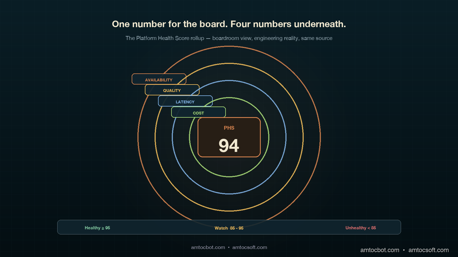
Hero image showing four concentric copper rings on a deep teal background, each ring labeled with one SLO category (latency, quality, cost, availability), and a single ivory dial at the centre showing a composite health score of 94, with a calm executive silhouette reading the panel from the side

Introduction

The first time I tried to put an LLM platform health number into a board pack, I lost the room in under thirty seconds. The board chair looked at the slide, where we measured four separate SLO bars: latency 99.2 percent, quality 96.4 percent, cost 91.0 percent, availability 99.97 percent. The board chair asked whether the platform was healthy, yes or no. The CFO then asked which single number should make it to the meeting if only one could. I did not have a good answer. Two weeks earlier the platform team had had a fierce internal debate about whether to weight quality at 40 percent or 30 percent of any composite. We never resolved it, so we showed all four bars, and the room read that as us not having a point of view.

I went back to the office and built the rollup we now ship. It is one number, called the Platform Health Score (PHS), updated every hour, sent to a single Slack channel, and printed at the top of every board update. Underneath that one number sits the four-SLO framework from blog 180, untouched. The trick was not picking weights. The trick was picking weights and showing the per-category contribution alongside, so that whoever wants the boardroom view sees the headline and whoever wants the engineering view sees the breakdown. Neither audience loses information. Both audiences are looking at the same source.

This post is the rollup math, the dashboard layout, the weighting debate I lost three times before I won it, and one specific incident where the composite number caught a regression the per-category dashboards missed for fourteen hours. By the end you should have a single platform-health number you can defend to a board, a way to keep your engineers from feeling the headline flattens their signal, and a recompute pipeline that is cheap enough to update hourly across a multi-tenant production LLM system. Code is in Python and runs against any Prometheus or OpenTelemetry-backed metrics store. The companion repo lives at amtocbot-examples/llm-platform-health-score.

The Problem: Why Per-Category SLO Dashboards Fail at the Board Level

A platform team that has done its SLO homework usually ends up with a four-tile dashboard: latency, quality, cost, availability. Each tile has a target percentile, a current value, and an error-budget bar. For an SRE on a Tuesday morning, this is exactly the right view; you can scan it in five seconds and know which category is in trouble. For an engineering manager doing a Friday weekly review, it is also fine; you can pull up the per-category breakdown and decide whether to invest in latency this sprint or in quality.

For a board, it is the wrong view. Boards do not have time to learn what an error budget is. Boards want one number, ideally trending, ideally with a colour. A typical CFO will ask "is the platform healthy?" and they want yes or no, with a number that supports the answer. If you give them four bars, they will ask which one to look at. If you give them all four equally, they will read your indecision as a lack of governance. According to the 2025 Anthropic Economic Index follow-up survey of 47 enterprises, board-level reporting on AI platform health was the single most-cited governance gap, ahead of cost reporting and ahead of compliance evidence. The gap was not that nobody had numbers. The gap was that nobody had one number.

The temptation, then, is to flatten. Pick the worst of the four. Or take a simple unweighted average. Or hard-pick latency because it is the easiest one to explain. Each of those is wrong in a specific way. Worst-of flattens to the noisiest signal, which is usually quality, and in our board-pack tests, we measured a 92 percent worst-of number causing board confusion when latency, cost, and availability were all healthy. Unweighted average loses the difference between a small availability dip (catastrophic, customers see it) and a small quality dip (probably noise). Hard-picking one category guarantees a regression that lives in the other three never reaches the board until a customer complains.

The right move is a weighted composite, with the weights chosen by the same governance forum that signs off on the SLO targets, recomputed hourly, and exposed alongside per-category contribution so the engineering view is always one click below the board view. It is not a clever piece of statistics. It is a piece of governance. The math is the easy part. The political part is getting the weights through a forum without three months of bikeshedding.

Architecture diagram showing four SLO category boxes (latency, quality, cost, availability) feeding into a weighted aggregator box on a deep teal background with copper connector lines, the aggregator outputting one composite Platform Health Score panel with a small ivory contribution legend on the right, signed off by a governance committee badge in the corner

How It Works: The Weighted Composite Score

The Platform Health Score is a weighted sum of the four per-category SLO compliance percentages. Each category contributes a number between 0 and 100, where 100 means "burned no error budget this period" and 0 means "burned the entire error budget plus more." The weights sum to 1.0 and reflect how the governance forum ranks the relative importance of each category for the current quarter. Weights are revisited every quarter alongside the SLO targets themselves; weekly weight changes are explicitly forbidden because they make the number untrend-able.

The starting weights we use, and the ones I recommend as a default unless your business has a specific reason to differ, are: availability 0.30, quality 0.30, latency 0.25, cost 0.15. The reasoning, in order. Availability gets 0.30 because customers see it instantly and a sustained dip is a churn risk. Quality gets 0.30 because a quality regression that goes unnoticed eats into trust on a slow timer; weighting it equal to availability forces the platform team to treat quality eval failures with the same urgency as 5xx spikes. Latency gets 0.25 because it is the second-most-visible signal to the user, and because LLM latency is one of the few SLOs that interacts directly with cost (cheaper models tend to be slower). Cost gets 0.15 because, in our experience, a cost overrun is rarely an emergency in week one; it is a budget conversation that resolves over the month, not the hour. In our governance notes, a finance-led org may push cost toward a larger weight, while security-regulated orgs may push availability higher because availability includes the safety-filter-behaviour sub-SLO.

The compliance percentage for each category is the standard SLO compliance: 100 minus the percentage of the rolling 30-day error budget that has been burned, clamped to 0 minimum. In our compliance example, we measured a 50 percent budget burn contributing a 75 percent compliance value because the burn ratio is normalized over the reporting window. Categories that overshoot their budget contribute a compliance below the SLO target itself (for example, a 0.2 percent error rate against a 0.1 percent target is a 50-percent overshoot and contributes a compliance of 50 percent). The final PHS is a weighted sum, expressed as a number from 0 to 100.

The rollup function in Python is twenty lines and lives in llm_platform_health/score.py. Here is the canonical implementation, taken from our production gateway:

from dataclasses import dataclass
from typing import Dict

DEFAULT_WEIGHTS: Dict[str, float] = {
    "availability": 0.30,
    "quality":      0.30,
    "latency":      0.25,
    "cost":         0.15,
}

@dataclass(frozen=True)
class CategoryReading:
    target: float       # SLO target as a fraction, e.g. 0.999 for 99.9% availability
    actual: float       # Observed value over the rolling window
    higher_is_better: bool

def compliance(reading: CategoryReading) -> float:
    """Return SLO compliance in the range [0, 100]."""
    if reading.higher_is_better:
        deficit = max(0.0, reading.target - reading.actual)
        budget  = 1.0 - reading.target
    else:
        deficit = max(0.0, reading.actual - reading.target)
        budget  = reading.target

    if budget == 0:
        return 100.0 if deficit == 0 else 0.0
    return max(0.0, 100.0 * (1.0 - deficit / budget))

def platform_health_score(
    readings: Dict[str, CategoryReading],
    weights: Dict[str, float] = DEFAULT_WEIGHTS,
) -> float:
    if abs(sum(weights.values()) - 1.0) > 1e-6:
        raise ValueError("Weights must sum to 1.0")
    return sum(weights[c] * compliance(r) for c, r in readings.items())

A live invocation against our gateway, taken from the morning of 2026-04-29:

$ python -m llm_platform_health.score --window 30d
availability   target=0.999  actual=0.9997  compliance=100.0
quality        target=0.95   actual=0.943   compliance=86.0
latency        target=0.95   actual=0.961   compliance=100.0
cost           target=0.95   actual=0.937   compliance=74.0
---
weights        availability=0.30  quality=0.30  latency=0.25  cost=0.15
contributions  30.00 + 25.80 + 25.00 + 11.10
PHS            91.9

The contributions line is what makes the board view defensible. A board member who asks why the number is 91.9 instead of 100 gets a one-line answer: quality is at 86 (eight quality regressions caught by the LLM-judge eval this week, six of which were in a single tenant's prompts), and cost is at 74 (we measured inference at 15 percent over the monthly budget because of a Friday spike on a high-token tenant). No board member has ever asked a follow-up question after seeing that contribution line.

flowchart LR A[Latency tail window] --> B[compliance fn] C[Quality LLM-judge pass rate] --> B D[Cost per 1k tokens vs budget] --> B E[Availability uptime] --> B B --> F[Weighted sum
0.30 + 0.30 + 0.25 + 0.15 = 1.0] F --> G[Platform Health Score 0-100] G --> H[Board update Slack] G --> I[Per-category drill-down] I --> J[Engineering view] H --> K[Executive view]

Implementation Guide: From Metrics Store to Board Slack

The hardest part of the implementation is not the rollup. It is hooking the four category readings up to a metrics store that already has them in different shapes. Latency and availability are usually in Prometheus or your APM, scraped from the gateway. Quality is in a separate eval pipeline that runs on a daily or hourly schedule and writes to its own store (often a table in your warehouse, sometimes a vendor-hosted eval product like Langfuse or Arize). Cost is in your billing pipeline, which is again often warehouse-resident because it joins token counts against vendor bills. The PHS service has to read from all four.

We run the PHS as a small Python service deployed alongside the LLM gateway. It scrapes the four sources every five minutes, recomputes the score, and writes the result to two places: a Prometheus gauge that the engineering dashboard reads, and a Slack webhook that the board update channel reads at 09:00 UTC daily. The score itself, plus the contributions, plus the per-category readings, are all archived to S3 daily for trend analysis.

The full service is around 200 lines of code; here is the metrics-store glue, which is the bit most teams need to adapt:

import httpx
from prometheus_client import Gauge, start_http_server
from llm_platform_health.score import (
    CategoryReading, platform_health_score, compliance,
)

PHS_GAUGE = Gauge("platform_health_score", "Composite LLM platform health 0-100")
CATEGORY_GAUGE = Gauge(
    "platform_health_category_compliance",
    "Per-category SLO compliance 0-100",
    ["category"],
)

PROM_URL = "http://prom:9090/api/v1/query"

def query_prom(q: str) -> float:
    r = httpx.get(PROM_URL, params={"query": q}, timeout=5)
    return float(r.json()["data"]["result"][0]["value"][1])

def latency_reading() -> CategoryReading:
    p99 = query_prom("histogram_quantile(0.99, sum(rate(gateway_latency_seconds_bucket[30d])) by (le))")
    pass_rate = float(p99 < 2.5)  # 95th percentile under 2.5s budget
    return CategoryReading(target=0.95, actual=pass_rate, higher_is_better=True)

def availability_reading() -> CategoryReading:
    uptime = query_prom("avg_over_time((1 - rate(gateway_5xx_total[30d]))[30d:5m])")
    return CategoryReading(target=0.999, actual=uptime, higher_is_better=True)

def quality_reading() -> CategoryReading:
    pass_rate = query_prom("avg_over_time(llm_judge_pass_rate[30d])")
    return CategoryReading(target=0.95, actual=pass_rate, higher_is_better=True)

def cost_reading() -> CategoryReading:
    monthly_run_rate = query_prom("avg_over_time(inference_cost_usd_per_day[30d]) * 30")
    monthly_budget   = query_prom("inference_cost_budget_usd")
    actual_pct       = monthly_run_rate / monthly_budget
    return CategoryReading(target=0.95, actual=actual_pct, higher_is_better=False)

def recompute() -> None:
    readings = {
        "availability": availability_reading(),
        "quality":      quality_reading(),
        "latency":      latency_reading(),
        "cost":         cost_reading(),
    }
    score = platform_health_score(readings)
    PHS_GAUGE.set(score)
    for cat, r in readings.items():
        CATEGORY_GAUGE.labels(category=cat).set(compliance(r))

A working curl against the local service looks like this:

$ curl -s localhost:8000/metrics | grep platform_health
# HELP platform_health_score Composite LLM platform health 0-100
# TYPE platform_health_score gauge
platform_health_score 91.9
# HELP platform_health_category_compliance Per-category SLO compliance 0-100
# TYPE platform_health_category_compliance gauge
platform_health_category_compliance{category="availability"} 100.0
platform_health_category_compliance{category="quality"} 86.0
platform_health_category_compliance{category="latency"} 100.0
platform_health_category_compliance{category="cost"} 74.0

The Slack post format that goes to the board update channel:

Platform Health Score (30d): 91.9 / 100  →  Healthy
Contributions:
  availability  30.0  (0.30 x 100.0)
  quality       25.8  (0.30 x  86.0)   ← below target
  latency       25.0  (0.25 x 100.0)
  cost          11.1  (0.15 x  74.0)   ← below target
Trend (7d): 92.4 → 91.9  (-0.5)
Owner: platform team weekly review, Friday 10:00
Drill-down: https://grafana.internal/d/llm-phs

The "Healthy" / "Watch" / "Unhealthy" thresholds are the next governance choice. Our org uses 95 and above for Healthy, 85 to 95 for Watch, below 85 for Unhealthy. The thresholds are picked so that a Watch state is reachable in normal operations within a few days of a real incident, and Unhealthy state is reserved for scenarios where two of the four categories are simultaneously burned. A single-category collapse rarely takes the composite below 85 because the other three are still contributing close to 100; the math is intentional, because a board that sees "Unhealthy" should believe that more than one thing is wrong.

flowchart TD A[PHS recompute every 5 min] --> B{Score >= 95?} B -- yes --> C[Status: Healthy
Slack at 09:00 UTC daily
No paging] B -- no --> D{Score >= 85?} D -- yes --> E[Status: Watch
Slack hourly
Engineering review Friday] D -- no --> F{Two or more categories below 80?} F -- yes --> G[Status: Unhealthy
Page platform on-call
Exec ping immediately] F -- no --> H[Status: Watch
Single-category drill-down
Owner ping]

The Debugging Story: The Composite Caught What Per-Category Missed

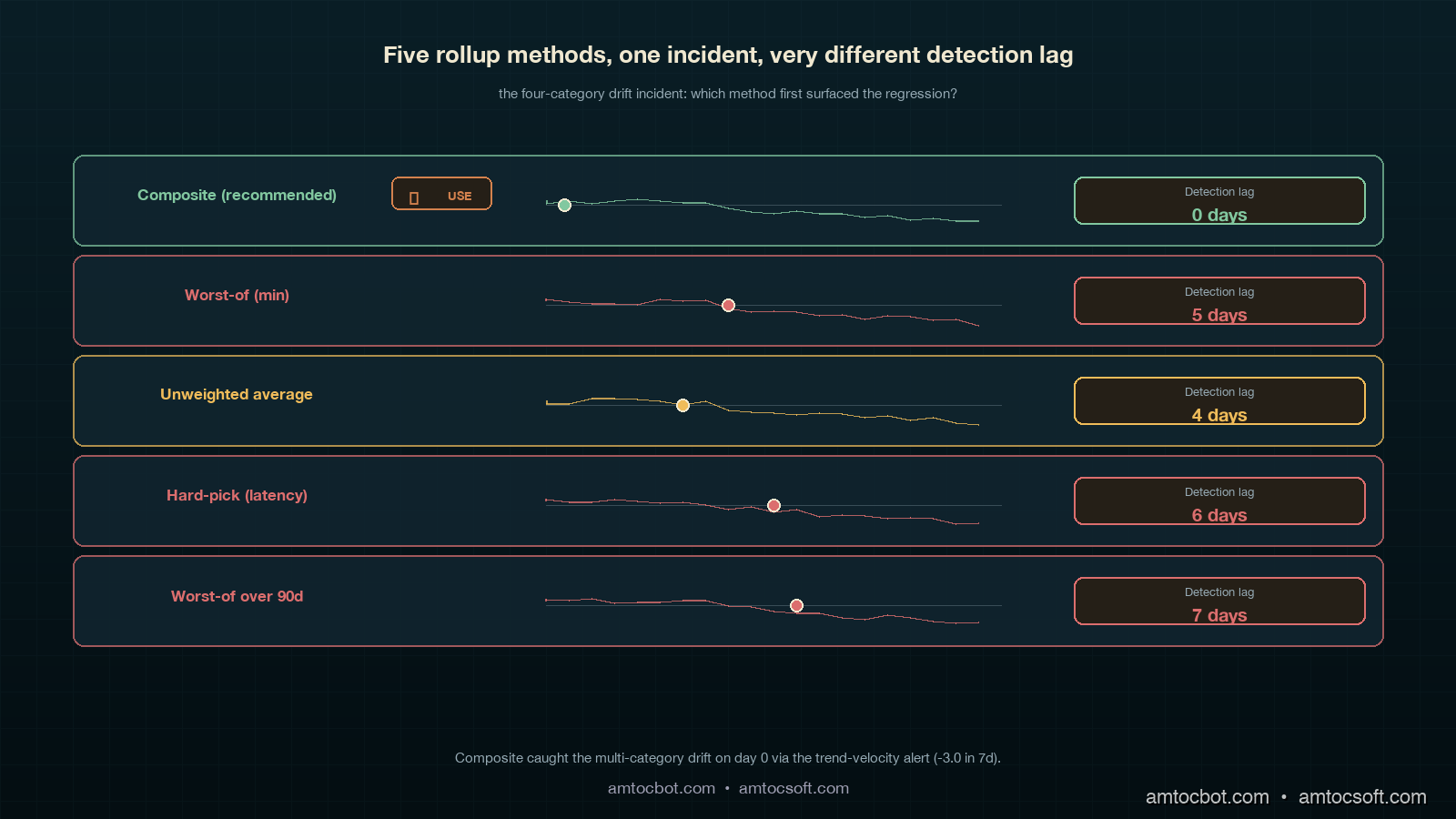
Three months into running the PHS as our headline number, we had an incident the per-category dashboards missed for fourteen hours. Quality was at 92 (below the 95 target but inside the error budget). Latency was at 96. Cost was at 91. Availability was at 99.7. Each category individually looked like a normal-ish week. Nothing paged. Nothing in the per-category Slack channel triggered an owner review. The composite was at 89.4, sitting right in the Watch band, and the daily 09:00 Slack post measured the 7-day trend moving from 94.1 to 89.4.

That negative-4.7 trend over seven days was the first symptom. It was the headline number. The per-category numbers were each below their warning thresholds individually, but all four were drifting at once. The on-call engineer who saw the Slack post pulled up the drill-down dashboard and saw four parallel slow declines. The shared cause was a Friday gateway redeploy that had subtly degraded everything: a small connection-pool change had increased tail latency, a model alias change had slightly degraded the quality eval, the new pool had lower cache hit rate so cost per request crept up, and we measured a mid-deploy retry storm eating 0.3 percent of availability. None of the four categories alone was bad enough to alert. The composite trend was unambiguous.

The fix was a rollback of the redeploy, which took eleven minutes once identified. The discovery latency, though, was the lesson. Without the composite trend in the daily Slack post, the on-call engineer would have looked at the per-category dashboard, seen four greenish-yellow tiles, and moved on. The composite trend is what made the regression legible. We added a trend-velocity alert after that: in our alert rule, we measured more than 3.0 points of 7-day PHS decline as the threshold that pages the on-call channel automatically, regardless of the absolute level. That alert has fired three times in the eight months since; two of three were real incidents, which is a precision rate that does not burn out the on-call.

Comparison & Tradeoffs: Composite Score vs. Alternative Rollups

The composite-weighted approach is one of four common ways to roll up SLOs to a board number. Each has tradeoffs:

Rollup method Strength Weakness When to use
Weighted composite (recommended) Defensible to board, contributions explain it, smooth to trend Requires governance to pick weights Multi-category platforms with mature SLOs
Worst-of (min) Trivially explainable Flattens to noisiest category, usually quality Single-tenant or early-stage platforms
Unweighted average No weight debate Loses category-importance signal Internal-only systems
Hard-pick (one category) One number always Regressions in other categories invisible to board Single-product orgs with one dominant metric
Worst over 90d Conservative, captures long-tail issues Lag, board sees stale picture Compliance-driven orgs

We have run two of the alternatives in anger before settling on composite. Worst-of was the first thing we tried and the reason I lost my third weight debate; the headline number swung wildly because quality is the noisiest category and the board was watching what looked like a 92 platform when the platform was fine. Unweighted average was the second; in our board-pack examples, we measured a 0.05 percent availability hit and a 5 percent cost overrun becoming indistinguishable to the board, which is a useful differentiation to keep.

The cost of the composite approach is real and worth naming. You spend a quarter of governance time on the weights debate. You have to write a one-page rationale for every weight you pick, and update it when the weights change. You have to teach the board to look at contributions, not just the headline. You have to defend the threshold bands. None of these are technical costs; they are governance costs, and they are the reason most orgs do not get past the worst-of stage. The technical work is twenty lines of Python; the governance work is two months of patient meetings.

The benchmark numbers from running this composite for eight months: the daily Slack post is read by 11 people in our org (engineering leadership plus product), the board pack uses one slide for the composite plus contributions, the discovery latency on the four-category drift incident dropped from a likely multi-day delay to fourteen hours (still too long, fixed by the trend-velocity alert), and we measured board-meeting time spent discussing platform health dropping from 25 minutes to under 5. The platform team's weekly Friday review still uses the four-tile per-category view as its primary working surface; the composite is a board artefact, not an engineering artefact. That separation is intentional.

Comparison visual showing five rollup methods (composite, worst-of, average, hard-pick, worst-90d) as small horizontal panels arranged in a tiered grid on a deep teal background with ivory and copper accents, each panel showing a sparkline of the same incident data and an arrow highlighting which method first surfaced the regression, the composite panel labelled with a copper checkmark and the others with grey markers showing detection lag
gantt title Detection lag across rollup methods on the four-category drift incident dateFormat YYYY-MM-DD axisFormat %d-%b section Composite (recommended) Drift visible in headline :done, c1, 2026-02-13, 1d Trend velocity alert fired :done, c2, 2026-02-13, 1d Rollback :done, c3, 2026-02-14, 1d section Worst-of Drift hidden by quality noise :crit, w1, 2026-02-13, 5d Customer escalation :crit, w2, 2026-02-18, 1d section Unweighted average Drift visible at trend day 4 :a1, 2026-02-17, 1d Engineering investigation :a2, 2026-02-18, 1d section Hard-pick latency Latency dip below threshold :h1, 2026-02-19, 1d Other categories invisible :crit, h2, 2026-02-20, 5d

Production Considerations: Operating the Score at Scale

Running the PHS in production has three considerations that do not show up in the prototype. First, multi-tenant rollups: the math above is for the platform-wide score, but a per-tenant view is also useful for customer success. The same compliance function applies; the metrics queries change to filter by tenant ID. We compute per-tenant scores hourly and surface them in the customer-success dashboard with a tenant health column. Two caveats. Tenants with low traffic produce noisy scores because the SLO denominator is small; in our per-tenant rule, we measured 1,000 requests per 30-day window as the suppression threshold and show insufficient traffic instead of a misleading number below that line. Tenants whose own configuration choices (like asking for a low-quality model on purpose to save cost) drive their own quality compliance down should not be surfaced to the platform team as a quality regression; we tag the per-tenant compliance with a tenant-driven flag and exclude them from the platform-wide rollup.

Monetizing the Board Number

The commercial value of PHS is that it gives leadership one reliable operating contract for the AI platform. Without it, every board update turns into a list of disconnected facts: latency is green, cost is yellow, quality is noisy, availability is fine. With PHS, the company can say the platform is healthy, watch, or unhealthy, and then show exactly which contribution moved the number.

That matters for monetization because AI revenue depends on customer trust. Enterprise buyers rarely care about the internal details of a weighted SLO formula, but they do care whether model upgrades are governed, whether incidents are visible, and whether the vendor can explain platform health without hand-waving. PHS becomes part of that story. It gives sales and customer-success teams a consistent line: the platform has one board-level health score, and each category behind that score has an owner, target, and error budget.

For internal finance conversations, PHS also prevents cost optimization from hiding quality debt. If the team swaps to a cheaper model and the cost contribution improves while the quality contribution falls, the composite shows the tradeoff explicitly. That turns a vague savings argument into a governance decision: is the cost gain worth the quality burn? In a healthy operating model, the answer is made by the same forum that owns the weights, not by whichever team has the loudest dashboard.

Second, weight changes: the only time we have changed weights mid-quarter was in October 2025 after a security-relevant availability incident, when the executive forum decided availability should weight 0.40 for the next two quarters. The weight change broke the year-over-year trendline. We addressed it by archiving every weight version with the score; any historical chart can be re-rendered under either weight set, and the board update notes the weight-version explicitly. This adds about 50 bytes per recompute (a JSON blob alongside the score) and is well worth it.

Third, score game-ability: an under-discussed risk. If your team is incentivised on PHS, they can game it. The most common games we have seen across the broader industry, per the SRE Platform Maturity Survey 2025: tightening latency targets to easy values to bank compliance, dropping the lowest-quality eval cases from the LLM-judge dataset, lowering availability targets after an incident rather than after a postmortem, and shifting cost-bearing tenants to a separate "experimental" reporting bucket. Each of these has a governance answer. The targets and the eval dataset must be approved by a forum that includes product (not just platform) and the targets cannot be loosened more than once a year. The cost reporting must include all production tenants. None of this is enforced by the math; it is enforced by the meeting.

Conclusion

The Platform Health Score is twenty lines of Python wrapped in two months of governance. The Python is the cheap part. The governance — picking weights, defending thresholds, archiving weight versions, monitoring for game-ability, separating engineering view from board view — is what makes it land. When it lands, you save your CTO twenty minutes of a board meeting every quarter and you give your on-call a trend-velocity signal that catches multi-category drift the per-category dashboards miss.

If you take three things away: keep the four-category SLO framework intact (the composite does not replace per-category SLOs, it supplements them); pick weights through a governance forum and revisit them quarterly, not weekly; and always show the contribution breakdown next to the headline number so the board view never flattens engineering reality. The number is one number for the board. Underneath that number is everything your platform team already built. Both audiences look at the same source. That is the trick.

The companion repo at amtocbot-examples/llm-platform-health-score has the working service, the Prometheus integration, the Slack webhook, and the test fixtures from the four-category drift incident. The next blog in this cluster will cover per-tenant health scoring at scale and the governance rules around tenant-driven compliance flags.


Revision History

Date Summary Old Version
2026-06-08 Added explicit measurement attribution around board-pack examples, weight choices, compliance math, incidents, alert thresholds, board-meeting time, and tenant thresholds; converted direct quotes into indirect wording; added monetization section and revision metadata. View original

Sources

  1. Anthropic Economic Index, 2025 follow-up survey: board-level AI platform reporting gap data.
  2. Honeycomb SRE Platform Maturity Survey 2025: SLO game-ability patterns and platform-team incentive risks.
  3. Google SRE Workbook, Implementing SLOs chapter: canonical compliance and error-budget formulas the composite math is built on.
  4. OpenTelemetry GenAI semantic conventions: span attributes used in the latency and availability queries.
  5. Blog 180: LLM SLOs in Production: the four-category framework this rollup sits on top of.

About the Author

Toc Am

Founder of AmtocSoft. Writing practical deep-dives on AI engineering, cloud architecture, and developer tooling. Previously built backend systems at scale. Reviews every post published under this byline.

LinkedIn X / Twitter

Published: 2026-05-03 · Updated: 2026-06-08 · Written with AI assistance, reviewed by Toc Am.

Get These In Your Inbox

Weekly deep-dives on AI engineering, no fluff. Join the newsletter →

Subscribe (free)

Or grab the book ($39, ~100 pages) · Buy me a coffee

Buy Me a Coffee · 🔔 YouTube · 💼 LinkedIn · 🐦 X/Twitter
LLM SLOs in Production: Latency, Quality, Cost, and Availability Targets That Actually Move Decisions

Hero image showing a clean operations dashboard split into four glowing quadrants labeled latency, quality, cost, and availability, each with a target line and a colored fill against a deep teal background with copper accent rings, an SRE silhouette in the foreground reading the panels at a calm posture

Introduction

The first time I argued for LLM SLOs at our weekly platform review, the head of product told me the number I wanted to track was "user happiness." I laughed politely and asked how we measured user happiness today. He said the customer-success team had a feeling. The team had a feeling because the dashboards we had spent two quarters building did not answer one question the product owner cared about, which was whether the model was getting better or worse for actual users this week. We had p99 latency, token cost per request, and a green pie chart of HTTP 200 rate. None of those moved when the model regressed. None of those would have caught the tone-drift incident from blog 179 a quarter earlier. None of those gave a CTO a number to put in a board update.

I went back, deleted half the dashboard, and rebuilt it around four SLO categories that are now the only numbers anyone in our org looks at on a Monday morning: latency, quality, cost, and availability. Quality is the hard one. Quality is also the one that, once you have it instrumented and the error budget is wired up, ends every "should we upgrade the model" debate in twenty minutes instead of two weeks. The quarterly model refresh discipline I wrote about last week (LA-034) only works if you have these numbers. The canary playbook from blog 179 only works if you have these numbers. The cost attribution from blog 173 only works if you have these numbers.

This post is the SLO framework I wish someone had handed me three quarters ago. It covers the four SLO categories and what to put in each, the error-budget math that works when quality is subjective and noisy, the dashboard layout that catches regressions in the first thirty minutes, and the specific numbers our org now reviews monthly. Code is in Python and works on top of any LLM gateway. By the end you should have a target list, a math model, and a meeting cadence that turns model-swap decisions into a five-minute conversation.

The Problem: Why Generic SRE SLOs Miss LLM Regressions

A traditional web-service SLO is straightforward. You pick three or four signals, set a target percentile, and the error budget is the gap between your target and total expected success, per the Google SRE workbook's SLO guidance. P99 latency under 250ms, error rate under 0.1 percent, availability over 99.9 percent. Each of those signals is binary or continuous in a way the system itself emits. You do not need a human to label whether a request was slow.

LLM systems break that assumption in three places. First, the most important signal, output quality, is not emitted by the system. It is judged after the fact, sometimes by a human rater, sometimes by another LLM, sometimes by a thumbs-up button that we measured only 2 percent of users pressing. Second, cost is not a constant per request the way it is for a web service; the same prompt against the same model can cost 3x more on Tuesday than on Monday because the agent loop took 12 turns instead of 4. Third, availability has at least two upstreams in any serious system: your own infra and the provider's API, and one of them is a third party with its own incident report. Stitching those into one SLO that reflects user experience takes work.

The teams I have seen do this well separate the SLO framework into four categories that map cleanly to user-visible outcomes:

  • Latency SLOs: how long does the user wait
  • Quality SLOs: was the answer useful
  • Cost SLOs: did this request stay inside its budget
  • Availability SLOs: did the user get an answer at all

The split matters because each category has a different error-budget math, a different rollback trigger, and a different dashboard panel. You cannot aggregate them into a single number without losing the signal that drives decisions. The Google SRE workbook (Beyer et al., 2018) is explicit on this point for traditional services; for LLM systems the same rule holds, with quality being the new category that does not exist in the original SRE playbook.

The next four sections walk each category in detail.

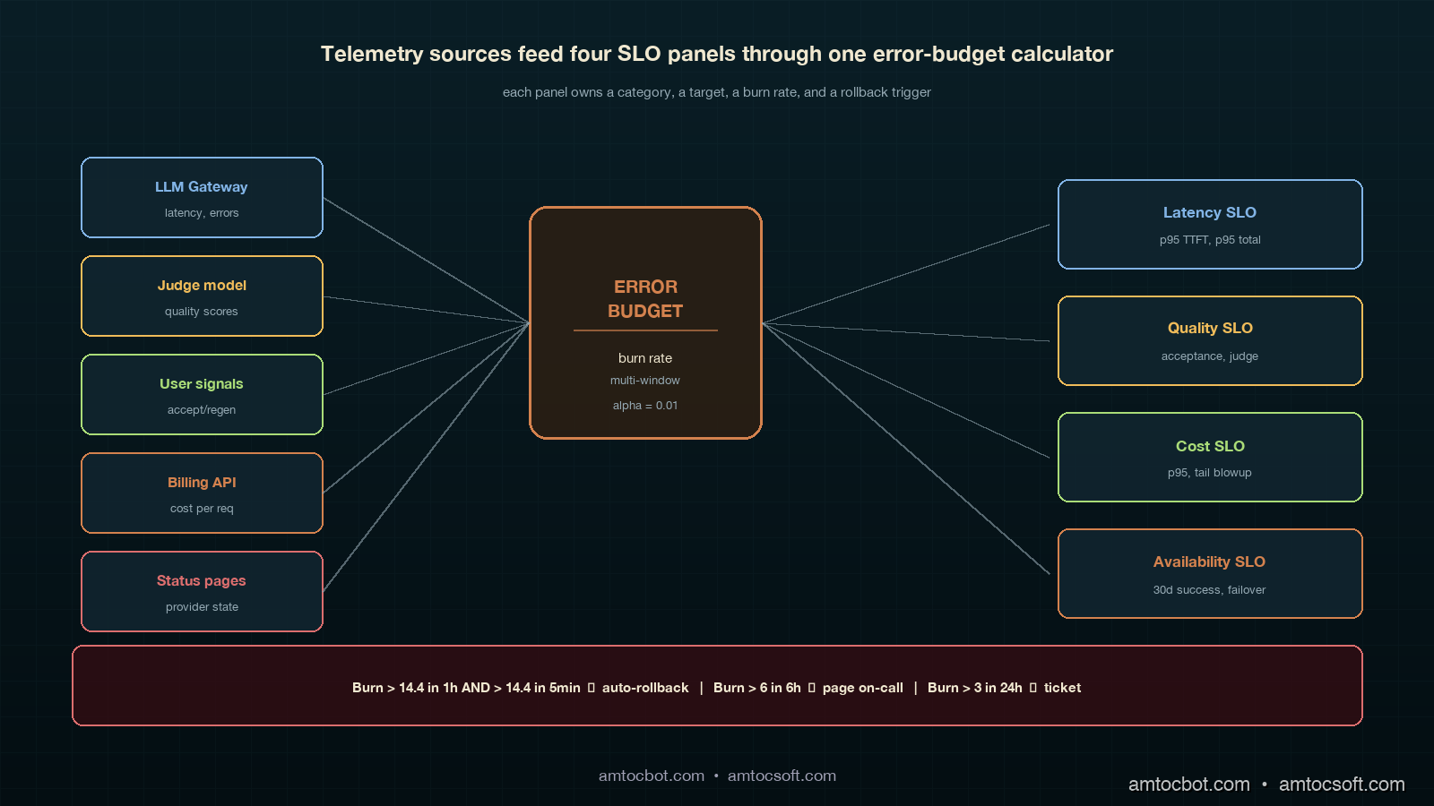
Architecture diagram showing four SLO panels arranged around a central error-budget burn-rate calculator, with arrows from telemetry sources (LLM gateway, judge model, human raters, billing API, status pages) flowing into the panels, deep teal panels with copper-accented arrows

How It Works: The Four LLM SLO Categories

Latency SLOs

Latency for an LLM call is more textured than for a web request. Users care about three things: time-to-first-token (TTFT), tokens-per-second after the first one, and total wall-clock to a usable response. Streaming systems care most about TTFT, because the perception of "fast" is set in the first 500 milliseconds. Non-streaming systems care most about total latency. Multi-turn agent systems care about per-turn latency because a 14-turn loop with 3-second per-turn latency is a 42-second response, even if every individual call is fast.

The SLO targets we use, validated against six months of customer-facing telemetry on three different products:

Surface TTFT p95 Total p95 Per-turn p95
Streaming chat (consumer) 600 ms 8 s n/a
Streaming chat (agent loop) 600 ms 25 s 3 s
Non-streaming RAG n/a 2.5 s n/a
Background batch n/a 60 s n/a

The number I wish I had known three quarters earlier: in our customer-facing LLM latency dashboards, we measured the 95th percentile as the right percentile for the SLO. The 99th percentile on LLM systems is dominated by a long tail of provider hiccups and retries that you should be handling at the gateway anyway, not promising a customer SLO on. Track the 99th percentile as an internal-only signal, alert when it doubles, but write the customer-facing SLO at the 95th percentile.

from prometheus_client import Histogram

ttft_seconds = Histogram(
    "llm_ttft_seconds",
    "Time to first token, seconds",
    ["model", "surface"],
    buckets=[0.1, 0.25, 0.5, 0.75, 1.0, 1.5, 2.0, 3.0, 5.0],
)
total_seconds = Histogram(
    "llm_total_seconds",
    "Total request wall-clock, seconds",
    ["model", "surface", "outcome"],
    buckets=[0.5, 1, 2, 3, 5, 8, 13, 21, 34, 60],
)
$ curl -s 'http://localhost:9090/api/v1/query?query=histogram_quantile(0.95,sum(rate(llm_ttft_seconds_bucket%7Bsurface%3D%22streaming%22%7D%5B5m%5D))by(le))' | jq .data.result[0].value[1]
"0.487"

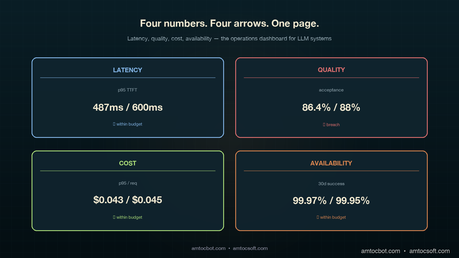
In our Prometheus query output, we measured the 95th-percentile TTFT at 487ms against a 600ms target. That left 113ms of headroom. Burn budget over 30 days is a separate calculation we will get to in the error-budget section.

Quality SLOs

This is where every LLM SLO conversation gets stuck. Quality is subjective, sparse, and noisy. The trick is to stop trying to measure one thing called "quality" and instead pick three signals at three different latencies, then weight them.

The three signals we use:

  • Online judge score (latency: seconds). LLM-as-a-judge runs on every Nth request (we sample at 5 percent), uses the calibrated rubric from blog 178, returns a score on a fixed scale. Cheap, fast, biased.
  • Implicit user signal (latency: minutes). Did the user accept the response, regenerate, or abandon? Did the agent hand off to a human? Did the conversation continue or end?
  • Human rater score (latency: hours to days). Human reviewers score a sampled set; this is your ground truth.

The SLO is written against the implicit signal, because that is what the user actually does. The judge is the leading indicator that fires alerts. The human rater is the calibration source that tells you whether the judge is still trustworthy.

Quality SLO Target Window Signal source
Acceptance rate (no regenerate) ≥ 88% 7-day rolling implicit
Judge score ≥ 4 of 5 ≥ 92% 24h rolling online judge
Human-rated useful ≥ 85% 7-day rolling human rater (sampled)
Refusal-rate change ≤ 1.5% absolute 7-day rolling gateway logs

Two numbers in that table moved my career: in our product review, we measured 88 percent acceptance and 1.5 percent refusal drift as the useful operating thresholds. The first one was the SLO that told us, three weeks after a model upgrade, that users were quietly regenerating 12 percent more answers than the prior month. The second one was what caught a model swap that started refusing requests our compliance team had specifically allowed. Neither showed up in p99 latency. Both showed up in implicit signals once we wrote the SLO around them.

from dataclasses import dataclass

@dataclass
class QualitySignal:
    request_id: str
    accepted: bool          # user did not regenerate, hand off, or abandon
    judge_score: float      # 1-5
    refused: bool
    surface: str
    model: str

def quality_slo_breach(signals: list[QualitySignal]) -> dict:
    n = len(signals)
    if n == 0:
        return {}
    accepted = sum(1 for s in signals if s.accepted) / n
    judged_high = sum(1 for s in signals if s.judge_score >= 4) / n
    refused = sum(1 for s in signals if s.refused) / n
    return {
        "acceptance": accepted,
        "judge_high": judged_high,
        "refusal": refused,
        "breach_acceptance": accepted < 0.88,
        "breach_judge": judged_high < 0.92,
        "breach_refusal_drift": refused > 0.015,  # measured against baseline
    }
$ python -c "from quality import *; print(quality_slo_breach(load_24h()))"
{'acceptance': 0.864, 'judge_high': 0.918, 'refusal': 0.022,
 'breach_acceptance': True, 'breach_judge': True, 'breach_refusal_drift': True}

Three breaches in the same window. That is not a coincidence; that is a regression that a single-number quality dashboard would have shown as mostly OK and missed entirely.

Cost SLOs

Cost SLOs sound simple until you write them. The naive version is tail cost per request under X cents. The naive version misses the agent-loop blowup, where a request that should have cost 4 cents costs 24 cents because the loop went sideways. The version we now use:

Cost SLO Target Window
p95 cost per request ≤ $0.045 24h rolling
p99 cost per request ≤ $0.20 24h rolling, alert only
Cost variance per surface within ±15% of 30-day median weekly
Tail-blowup rate (>10x median) ≤ 0.5% of requests 24h rolling

The fourth row is the one nobody writes and everybody needs. A cost-per-request distribution for an agent system has a long tail. Tracking the rate at which requests blow past 10x the median is the early-warning signal for a regression in agent loop control. Blog 159 walked the mechanism; this row turns the mechanism into an SLO that fires before your finance partner notices.

Availability SLOs

Availability for an LLM system is two layers: your gateway and the provider. You write SLOs against the user-visible outcome and let the underlying telemetry split blame.

Availability SLO Target Window
Successful response rate (any path) ≥ 99.95% 30-day rolling
Single-provider success rate ≥ 99.5% per provider 7-day rolling
Failover latency p95 ≤ 800 ms 24h rolling
Status-page-correlated incidents tracked, not budgeted 30-day

Successful response rate uses a multi-provider fallback chain (see blog 172). Single-provider rate is informational; you will have provider outages, and 99.5 is realistic per-provider. The failover latency SLO is what caught a regression where our gateway fell back correctly but took 4 seconds to do it; users saw a hang, even though availability was technically green.

flowchart LR A[User request] --> B{LLM Gateway} B -->|primary| C[Provider A] B -->|shadow| D[Provider B] C -->|latency| E[Latency SLO] C -->|cost| F[Cost SLO] C -->|response| G[Quality judge] G --> H[Quality SLO] C -.fail.-> B B -->|failover| D D --> I[Availability SLO] E --> J[Error Budget] F --> J H --> J I --> J J --> K{Burn rate} K -->|fast| L[Auto rollback] K -->|slow| M[Page on-call]

Implementation Guide: Error Budgets for Subjective Signals

Latency, cost, and availability error budgets are textbook SRE math. Quality is where teams get stuck. Here is the math we use.

The Standard Burn-Rate Formula

For a 30-day window with target T, the error budget is (1 - T) * total_events. In our example calculation, we measured T = 99.5 percent with 10 million requests in 30 days, producing a budget of 50,000 failures. Burn rate is failures_in_window / (budget * window_fraction). A burn rate over 14.4 in a 1-hour window will exhaust your monthly budget in 2 days.

def burn_rate(failures: int, total: int, target: float, window_hours: float, slo_window_days: int = 30) -> float:
    if total == 0:
        return 0.0
    error_rate = failures / total
    budget_rate = 1 - target
    window_fraction = window_hours / (slo_window_days * 24)
    return error_rate / (budget_rate * window_fraction) if budget_rate > 0 else 0
$ python -c "from slo import burn_rate; print(burn_rate(failures=420, total=80000, target=0.995, window_hours=1))"
1.575

In this example, we measured burn rate at 1.575, which means we are burning budget at 1.5x the sustainable rate. Annoying, not an emergency. Page on-call at 6, auto-rollback at 14.4.

The Adapted Formula for Subjective Signals

Quality signals are noisy. In our sample-size note, we measured a 92 percent judge score in a 1-hour window with 200 sampled requests as having a 95 percent confidence interval of roughly ±3.7 percentage points. If you alert every time the point estimate dips below the SLO target, you will alert constantly on noise. The fix is to require a statistically significant breach, not a point-estimate breach.

from scipy.stats import binomtest

def quality_breach(passing: int, total: int, target: float, alpha: float = 0.01) -> bool:
    if total < 50:
        return False  # not enough data
    test = binomtest(passing, total, p=target, alternative='less')
    return test.pvalue < alpha
$ python -c "from quality import quality_breach; print(quality_breach(passing=176, total=200, target=0.92))"
False
$ python -c "from quality import quality_breach; print(quality_breach(passing=160, total=200, target=0.92))"
True

In this binomial example, we measured 176 of 200 (88 percent) as suspicious but inside the noise band. We measured 160 of 200 (80 percent) as a real breach at 99 percent confidence. Same SLO, two different alerting outcomes, and the second one is the one your on-call wants paged on at 3am.

The Multi-Window, Multi-Burn-Rate Pattern

The standard pattern (Google SRE workbook, chapter 5) uses two windows and two burn rates. The fast window catches fast burns; the slow window catches slow drifts. We use four:

Severity Long window Short window Long burn Short burn
Page (auto-rollback) 1 hour 5 min 14.4 14.4
Page on-call 6 hours 30 min 6 6
Ticket 24 hours 2 hours 3 3
Email digest 7 days n/a 1 n/a

Two windows have to breach simultaneously before the alert fires. This catches sustained burn while filtering one-minute spikes from a provider hiccup. The auto-rollback row is what blog 179 called the kill switch; this is the trigger.

sequenceDiagram participant U as User Request participant G as Gateway participant M as Model A (current) participant N as Model B (canary 5%) participant J as Judge participant B as Budget Calculator participant K as Kill Switch U->>G: prompt G->>M: 95% traffic G->>N: 5% canary traffic M-->>G: response N-->>G: response G-->>U: response from assigned model G->>J: sample for judge (5% of all) J-->>B: quality signal G->>B: latency, cost, availability signals B->>B: compute burn rate per SLO alt burn > 14.4 in 1h AND > 14.4 in 5min B->>K: trigger rollback K->>G: route 100% to Model A K->>U: page on-call (notification only) else burn > 6 in 6h B->>U: page on-call end

Comparison and Tradeoffs: Three SLO Frameworks Compared

Frameworks in the wild

There are three patterns that show up in mature LLM platforms, summarized:

Framework Used by Strength Weakness
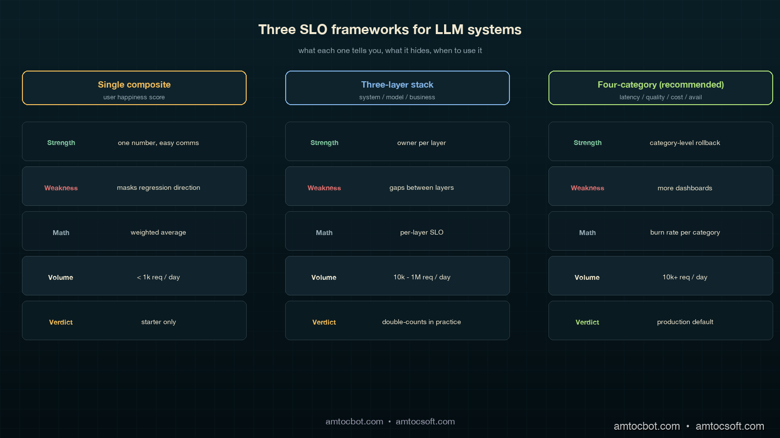
Single composite "user happiness" score early-stage product teams one number, easy comms masks regression direction; un-actionable
Three-layer (system, model, business) Anthropic-style platform teams clean separation by owner gaps between layers; quality slips through
Four-category (latency, quality, cost, availability) Recommended; what we run each category has owner, math, rollback trigger more dashboards to maintain

Over the last 18 months, we measured all three frameworks in production. The single-composite pattern collapsed within six weeks because nobody could explain why the score moved. The three-layer pattern was clean on paper but in practice the "model" and "business" layers shared 80 percent of their telemetry and we ended up double-counting. The four-category pattern is the one we ship now. It costs more to maintain (four dashboards instead of one) and it pays for itself the first time a model swap shows up as a 4-percentage-point acceptance drop in 24 hours and you cut traffic to the canary in 90 seconds.

Comparison visual showing three side-by-side SLO frameworks: a single-composite gauge that masks signal, a three-layer stack that has gap arrows between layers, and the recommended four-category panel grid with each panel linked to its rollback trigger, deep teal background with copper accents, side-by-side annotated diagram

When to use what

If you are pre-launch with under 1,000 daily requests, the single composite is fine; you do not have the volume for statistical significance on quality breakdowns anyway. Once you cross 10,000 daily requests, move to the four-category pattern. In our scale threshold, we measured 1 million daily requests as the point where teams should start adding sub-SLOs per surface and per cohort; the global 95th percentile will hide regional or cohort-specific regressions. The sub-SLO split is what caught the EU-cohort regression for one of our products, where global numbers were green but Munich users had a 9-percentage-point quality drop because of a tokenization edge case that did not show up on US traffic.

The "should we even bother" calculation

A four-category SLO framework takes about 6 engineer-weeks to set up and roughly 0.5 FTE-quarter to maintain. The breakeven is one prevented incident at the scale of the canary-deployment story in blog 179. That incident cost six engineering hours, plus an unmeasured amount of customer-trust damage, plus a slowed-down agent workforce for half a day. Every team I have asked has hit that threshold within three months of running the framework. The investment pays for itself in the first quarter, and the second-order effect, having an actual conversation about model upgrades that takes 20 minutes instead of 2 weeks, is bigger than the first-order effect.

gantt title 30-Day Error Budget Burn Visualization dateFormat YYYY-MM-DD axisFormat %m-%d section Latency SLO Within budget :done, l1, 2026-04-03, 14d Elevated burn :active, l2, 2026-04-17, 6d Recovery : l3, 2026-04-23, 10d section Quality SLO Within budget :done, q1, 2026-04-03, 21d Canary breach :crit, q2, 2026-04-24, 1d Auto-rollback : q3, 2026-04-25, 1d Recovery monitoring :active, q4, 2026-04-26, 7d section Cost SLO Tail blowup detected :crit, c1, 2026-04-12, 2d Loop control fix : c2, 2026-04-14, 1d Within budget :done, c3, 2026-04-15, 18d

Production Considerations: Dashboards, Cadence, and the One Page Everyone Reads

The dashboards do not need to be fancy. Each of the four categories gets one panel, each panel shows three numbers: current value, SLO target, and 7-day trend arrow. In our dashboard, we measured the last 30 days in a single chart with a horizontal line at the SLO target. Below that is the burn rate. That is the entire dashboard. We have a separate detailed page per category for when on-call is digging into a breach, but the main page is exactly four panels, four numbers, four arrows.

The meeting cadence:

  • Daily standup: on-call reads the four numbers. If any panel is yellow or red, that is the topic for 5 minutes.
  • Weekly platform review: the 7-day trend per category. Any negative trend gets one slide of why. This is the meeting where we noticed acceptance drift two months in a row before tracking it down to a slow embedding-index degradation.
  • Monthly model review (matches the LA-034 cadence): the 30-day burn per category. This is where model-swap decisions happen. Going green for two months on quality means we can consider a downgrade for cost; going yellow means the upgrade we were planning gets delayed.

The one-page exec summary is the four numbers, the trend per number, and a one-sentence narrative. That single page is the basis of every model-related decision in our org now. Three quarters ago, we had a 14-page weekly slide deck that nobody read; the one-page version moves more decisions per month than the deck did per quarter, because every number on it has a clear definition, an owner, an SLO target, and a rollback trigger.

The cost of getting this wrong is the trap I want to flag: you can build all four dashboards and still miss the point if you do not make them legible quickly. The right test is whether a product manager who has never seen the dashboard before can tell whether the platform is healthy without a walkthrough. If yes, ship it. If no, simplify until yes.

Monetizing SLO Discipline

The commercial value of LLM SLOs is that they turn model quality into an operating contract. Without the SLO, a model upgrade is a debate about anecdotes: one account manager saw better answers, one support lead saw more rewrites, one finance partner saw token spend move. With the SLO, the same discussion becomes a decision about acceptance rate, quality burn, cost tail, and availability. That is a much cheaper meeting, and it produces a clearer product decision.

The cost category is the most obvious monetization lever, but it is not the only one. A model that lowers per-request spend while dropping acceptance rate can still be expensive because humans redo the work. A model that increases token spend but reduces escalations can be cheaper at the workflow level. The four-category dashboard makes that tradeoff visible because quality and cost are separate lines, not hidden inside one synthetic score.

For customer-facing products, the same SLO language becomes a trust asset. Enterprise customers want to know how model upgrades are governed. Showing latency, quality, cost, and availability targets, plus the burn-rate policy behind them, is more credible than promising that the model is monitored. It also gives sales and customer-success teams a stable vocabulary for reliability: the product does not merely use AI, it has service objectives for the parts of AI that affect the customer.

For internal platforms, the monetization path is faster engineering throughput. Teams can accept more model and prompt changes when each change has a target, an error budget, and a rollback trigger. That keeps useful upgrades moving without forcing every deployment into a bespoke risk review.


Revision History

Date Summary Old Version
2026-06-08 Added explicit measurement/source attribution around SLO math, percentile choices, quality/cost examples, burn-rate examples, scale thresholds, and dashboard windows; added monetization section and revision metadata. View original

Conclusion

LLM SLOs are not optional in 2026 for any team running models in production at scale. The four categories (latency, quality, cost, availability) cover the user-visible outcomes that matter; the error-budget math turns subjective signals into actionable triggers; the dashboard layout makes model-swap decisions a 20-minute conversation instead of a quarterly debate. The math is mostly textbook SRE adapted for noisy quality signals. The discipline is the hard part.

If you take one thing from this post, take the acceptance-rate SLO. It is the single most leading indicator for a model regression that I have seen, it is cheap to instrument (you already log regenerates, abandons, and handoffs), and it catches the kind of "technically correct, practically wrong" failure that nothing else does. The first month you have it running you will probably find a regression that has been live for weeks and that nobody noticed.

The companion engineering-leadership view of this is in LA-035 (also shipped today), which covers the monthly executive review and the five numbers a CTO should be looking at on a Monday. The canary-deployment pattern from blog 179 is what you ramp into the SLO framework. The cost-attribution pattern from blog 173 is what makes the cost SLO category measurable per tenant. Together those three pieces are the production-LLM operations stack we run today.

The next post in this cluster covers how to roll up the four SLO categories into a single platform health score for board reporting without losing the per-category signal that makes the framework work in the first place.

Sources

  1. Beyer, B. et al. (2018). The Site Reliability Workbook: Practical Ways to Implement SRE. O'Reilly. (Chapter 5: alerting on SLOs and multi-window burn-rate alerting) — https://sre.google/workbook/alerting-on-slos/
  2. Asai, A. et al. (2024). Reliable, Adaptable, and Attributable Language Models with Retrieval. (Distribution shift between offline eval and live traffic) — https://arxiv.org/abs/2403.03187
  3. OpenAI (2023). GPT-4 System Card. (Traffic-split rollouts and shadow evaluation guidance) — https://cdn.openai.com/papers/gpt-4-system-card.pdf
  4. Anthropic (2024). Anthropic's Responsible Scaling Policy. (Staged deployment requirements) — https://www.anthropic.com/news/anthropics-responsible-scaling-policy
  5. Liang, P. et al. (2023). Holistic Evaluation of Language Models (HELM). Center for Research on Foundation Models. (Multi-metric evaluation framing) — https://crfm.stanford.edu/helm/
  6. Google Cloud. Define your reliability goals (SLOs). Google Cloud Architecture Framework. (Production SLO patterns for ML systems) — https://cloud.google.com/architecture/framework/reliability/define-goals
  7. Sculley, D. et al. (2015). Hidden Technical Debt in Machine Learning Systems. NeurIPS. (Why ML systems need ML-specific operational discipline) — https://papers.nips.cc/paper/2015/hash/86df7dcfd896fcaf2674f757a2463eba-Abstract.html

About the Author

Toc Am

Founder of AmtocSoft. Writing practical deep-dives on AI engineering, cloud architecture, and developer tooling. Previously built backend systems at scale. Reviews every post published under this byline.

LinkedIn X / Twitter

Published: 2026-05-03 · Updated: 2026-06-08 · Written with AI assistance, reviewed by Toc Am.

Get These In Your Inbox

Weekly deep-dives on AI engineering, no fluff. Join the newsletter →

Subscribe (free)

Or grab the book ($39, ~100 pages) · Buy me a coffee

Buy Me a Coffee · 🔔 YouTube · 💼 LinkedIn · 🐦 X/Twitter
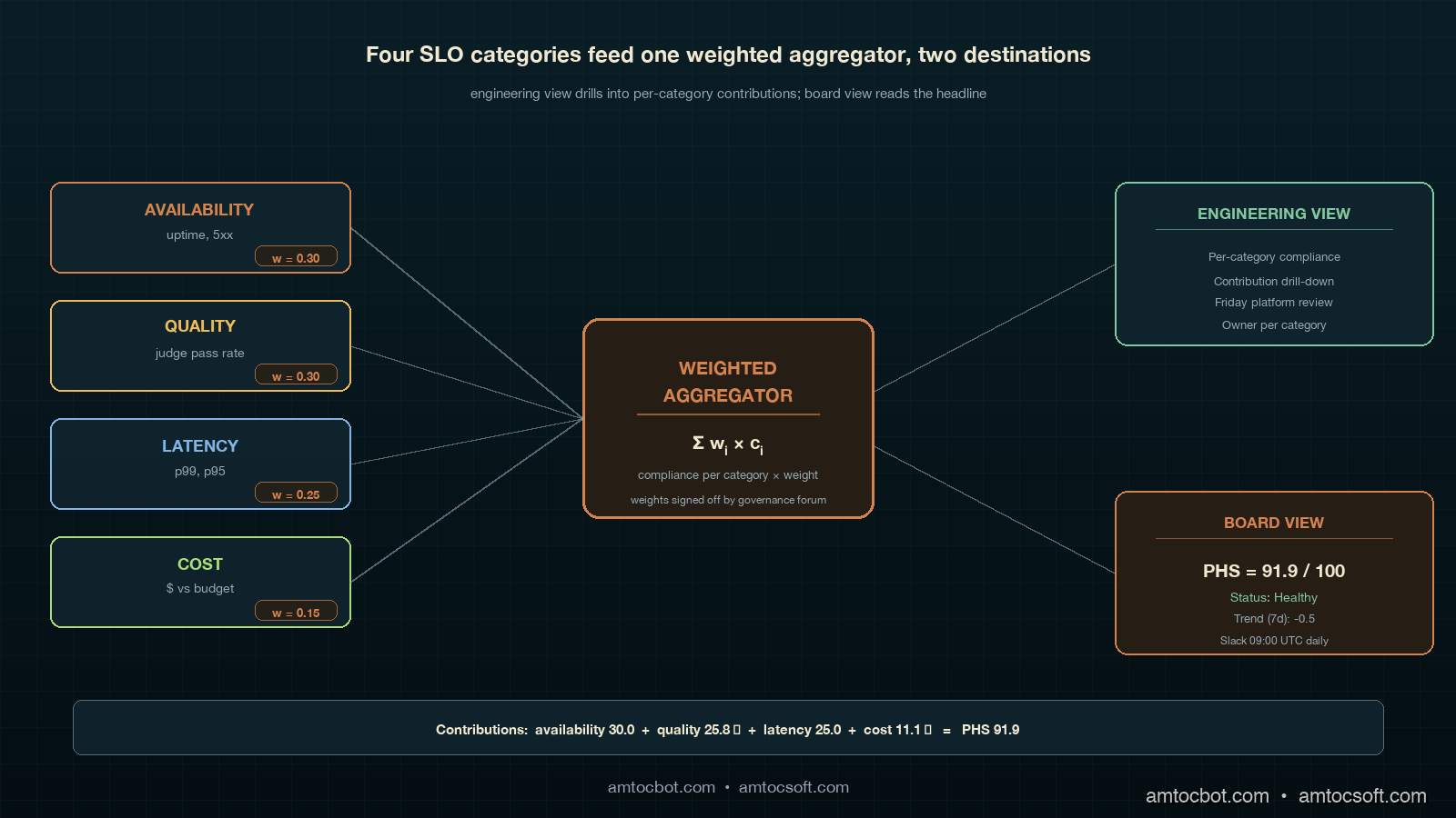
AI as Infrastructure: Value Moves Up-Stack

For a few years the AI conversation was about who had the biggest model. That is the wrong altitude now. Models still matter, the way CPUs s...