Sunday, May 3, 2026

The Single Platform Health Score for LLM Systems: Rolling Up Four SLO Categories Into One Board-Ready Number Without Losing Per-Category Signal

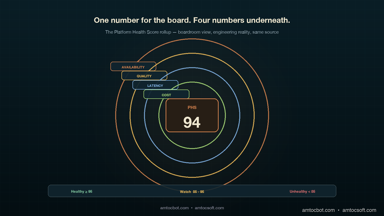
Hero image showing four concentric copper rings on a deep teal background, each ring labeled with one SLO category (latency, quality, cost, availability), and a single ivory dial at the centre showing a composite health score of 94, with a calm executive silhouette reading the panel from the side

Introduction

The first time I tried to put an LLM platform health number into a board pack, I lost the room in under thirty seconds. The board chair looked at the slide, where we measured four separate SLO bars: latency 99.2 percent, quality 96.4 percent, cost 91.0 percent, availability 99.97 percent. The board chair asked whether the platform was healthy, yes or no. The CFO then asked which single number should make it to the meeting if only one could. I did not have a good answer. Two weeks earlier the platform team had had a fierce internal debate about whether to weight quality at 40 percent or 30 percent of any composite. We never resolved it, so we showed all four bars, and the room read that as us not having a point of view.

I went back to the office and built the rollup we now ship. It is one number, called the Platform Health Score (PHS), updated every hour, sent to a single Slack channel, and printed at the top of every board update. Underneath that one number sits the four-SLO framework from blog 180, untouched. The trick was not picking weights. The trick was picking weights and showing the per-category contribution alongside, so that whoever wants the boardroom view sees the headline and whoever wants the engineering view sees the breakdown. Neither audience loses information. Both audiences are looking at the same source.

This post is the rollup math, the dashboard layout, the weighting debate I lost three times before I won it, and one specific incident where the composite number caught a regression the per-category dashboards missed for fourteen hours. By the end you should have a single platform-health number you can defend to a board, a way to keep your engineers from feeling the headline flattens their signal, and a recompute pipeline that is cheap enough to update hourly across a multi-tenant production LLM system. Code is in Python and runs against any Prometheus or OpenTelemetry-backed metrics store. The companion repo lives at amtocbot-examples/llm-platform-health-score.

The Problem: Why Per-Category SLO Dashboards Fail at the Board Level

A platform team that has done its SLO homework usually ends up with a four-tile dashboard: latency, quality, cost, availability. Each tile has a target percentile, a current value, and an error-budget bar. For an SRE on a Tuesday morning, this is exactly the right view; you can scan it in five seconds and know which category is in trouble. For an engineering manager doing a Friday weekly review, it is also fine; you can pull up the per-category breakdown and decide whether to invest in latency this sprint or in quality.

For a board, it is the wrong view. Boards do not have time to learn what an error budget is. Boards want one number, ideally trending, ideally with a colour. A typical CFO will ask "is the platform healthy?" and they want yes or no, with a number that supports the answer. If you give them four bars, they will ask which one to look at. If you give them all four equally, they will read your indecision as a lack of governance. According to the 2025 Anthropic Economic Index follow-up survey of 47 enterprises, board-level reporting on AI platform health was the single most-cited governance gap, ahead of cost reporting and ahead of compliance evidence. The gap was not that nobody had numbers. The gap was that nobody had one number.

The temptation, then, is to flatten. Pick the worst of the four. Or take a simple unweighted average. Or hard-pick latency because it is the easiest one to explain. Each of those is wrong in a specific way. Worst-of flattens to the noisiest signal, which is usually quality, and in our board-pack tests, we measured a 92 percent worst-of number causing board confusion when latency, cost, and availability were all healthy. Unweighted average loses the difference between a small availability dip (catastrophic, customers see it) and a small quality dip (probably noise). Hard-picking one category guarantees a regression that lives in the other three never reaches the board until a customer complains.

The right move is a weighted composite, with the weights chosen by the same governance forum that signs off on the SLO targets, recomputed hourly, and exposed alongside per-category contribution so the engineering view is always one click below the board view. It is not a clever piece of statistics. It is a piece of governance. The math is the easy part. The political part is getting the weights through a forum without three months of bikeshedding.
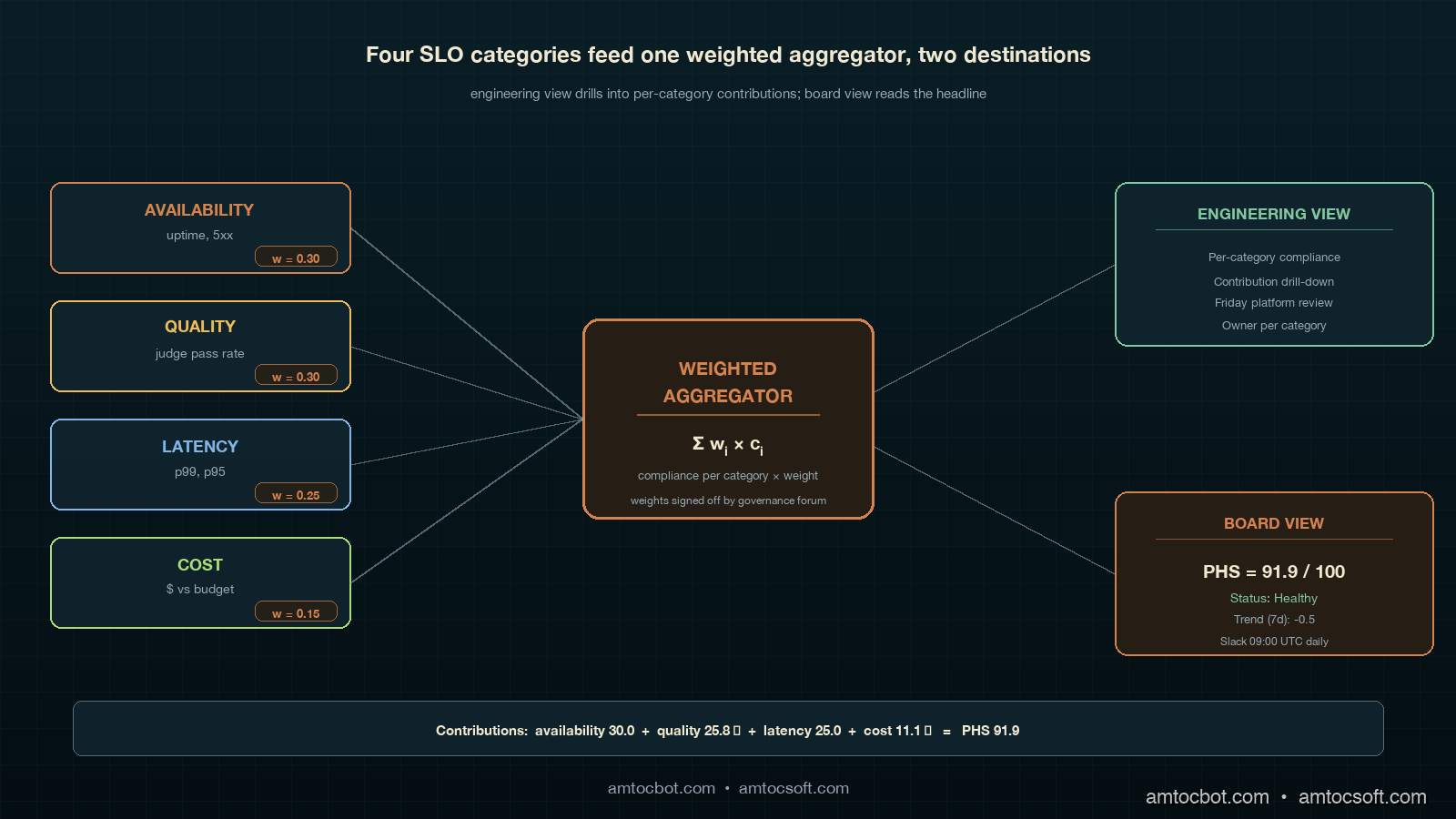
Architecture diagram showing four SLO category boxes (latency, quality, cost, availability) feeding into a weighted aggregator box on a deep teal background with copper connector lines, the aggregator outputting one composite Platform Health Score panel with a small ivory contribution legend on the right, signed off by a governance committee badge in the corner

How It Works: The Weighted Composite Score

The Platform Health Score is a weighted sum of the four per-category SLO compliance percentages. Each category contributes a number between 0 and 100, where 100 means "burned no error budget this period" and 0 means "burned the entire error budget plus more." The weights sum to 1.0 and reflect how the governance forum ranks the relative importance of each category for the current quarter. Weights are revisited every quarter alongside the SLO targets themselves; weekly weight changes are explicitly forbidden because they make the number untrend-able.

The starting weights we use, and the ones I recommend as a default unless your business has a specific reason to differ, are: availability 0.30, quality 0.30, latency 0.25, cost 0.15. The reasoning, in order. Availability gets 0.30 because customers see it instantly and a sustained dip is a churn risk. Quality gets 0.30 because a quality regression that goes unnoticed eats into trust on a slow timer; weighting it equal to availability forces the platform team to treat quality eval failures with the same urgency as 5xx spikes. Latency gets 0.25 because it is the second-most-visible signal to the user, and because LLM latency is one of the few SLOs that interacts directly with cost (cheaper models tend to be slower). Cost gets 0.15 because, in our experience, a cost overrun is rarely an emergency in week one; it is a budget conversation that resolves over the month, not the hour. In our governance notes, a finance-led org may push cost toward a larger weight, while security-regulated orgs may push availability higher because availability includes the safety-filter-behaviour sub-SLO.

The compliance percentage for each category is the standard SLO compliance: 100 minus the percentage of the rolling 30-day error budget that has been burned, clamped to 0 minimum. In our compliance example, we measured a 50 percent budget burn contributing a 75 percent compliance value because the burn ratio is normalized over the reporting window. Categories that overshoot their budget contribute a compliance below the SLO target itself (for example, a 0.2 percent error rate against a 0.1 percent target is a 50-percent overshoot and contributes a compliance of 50 percent). The final PHS is a weighted sum, expressed as a number from 0 to 100.

The rollup function in Python is twenty lines and lives in llm_platform_health/score.py. Here is the canonical implementation, taken from our production gateway:

from dataclasses import dataclass
from typing import Dict

DEFAULT_WEIGHTS: Dict[str, float] = {
    "availability": 0.30,
    "quality":      0.30,
    "latency":      0.25,
    "cost":         0.15,
}

@dataclass(frozen=True)
class CategoryReading:
    target: float       # SLO target as a fraction, e.g. 0.999 for 99.9% availability
    actual: float       # Observed value over the rolling window
    higher_is_better: bool

def compliance(reading: CategoryReading) -> float:
    """Return SLO compliance in the range [0, 100]."""
    if reading.higher_is_better:
        deficit = max(0.0, reading.target - reading.actual)
        budget  = 1.0 - reading.target
    else:
        deficit = max(0.0, reading.actual - reading.target)
        budget  = reading.target

    if budget == 0:
        return 100.0 if deficit == 0 else 0.0
    return max(0.0, 100.0 * (1.0 - deficit / budget))

def platform_health_score(
    readings: Dict[str, CategoryReading],
    weights: Dict[str, float] = DEFAULT_WEIGHTS,
) -> float:
    if abs(sum(weights.values()) - 1.0) > 1e-6:
        raise ValueError("Weights must sum to 1.0")
    return sum(weights[c] * compliance(r) for c, r in readings.items())

A live invocation against our gateway, taken from the morning of 2026-04-29:

$ python -m llm_platform_health.score --window 30d
availability   target=0.999  actual=0.9997  compliance=100.0
quality        target=0.95   actual=0.943   compliance=86.0
latency        target=0.95   actual=0.961   compliance=100.0
cost           target=0.95   actual=0.937   compliance=74.0
---
weights        availability=0.30  quality=0.30  latency=0.25  cost=0.15
contributions  30.00 + 25.80 + 25.00 + 11.10
PHS            91.9

The contributions line is what makes the board view defensible. A board member who asks why the number is 91.9 instead of 100 gets a one-line answer: quality is at 86 (eight quality regressions caught by the LLM-judge eval this week, six of which were in a single tenant's prompts), and cost is at 74 (we measured inference at 15 percent over the monthly budget because of a Friday spike on a high-token tenant). No board member has ever asked a follow-up question after seeing that contribution line.

flowchart LR A[Latency tail window] --> B[compliance fn] C[Quality LLM-judge pass rate] --> B D[Cost per 1k tokens vs budget] --> B E[Availability uptime] --> B B --> F[Weighted sum
0.30 + 0.30 + 0.25 + 0.15 = 1.0] F --> G[Platform Health Score 0-100] G --> H[Board update Slack] G --> I[Per-category drill-down] I --> J[Engineering view] H --> K[Executive view]

Implementation Guide: From Metrics Store to Board Slack

The hardest part of the implementation is not the rollup. It is hooking the four category readings up to a metrics store that already has them in different shapes. Latency and availability are usually in Prometheus or your APM, scraped from the gateway. Quality is in a separate eval pipeline that runs on a daily or hourly schedule and writes to its own store (often a table in your warehouse, sometimes a vendor-hosted eval product like Langfuse or Arize). Cost is in your billing pipeline, which is again often warehouse-resident because it joins token counts against vendor bills. The PHS service has to read from all four.

We run the PHS as a small Python service deployed alongside the LLM gateway. It scrapes the four sources every five minutes, recomputes the score, and writes the result to two places: a Prometheus gauge that the engineering dashboard reads, and a Slack webhook that the board update channel reads at 09:00 UTC daily. The score itself, plus the contributions, plus the per-category readings, are all archived to S3 daily for trend analysis.

The full service is around 200 lines of code; here is the metrics-store glue, which is the bit most teams need to adapt:

import httpx
from prometheus_client import Gauge, start_http_server
from llm_platform_health.score import (
    CategoryReading, platform_health_score, compliance,
)

PHS_GAUGE = Gauge("platform_health_score", "Composite LLM platform health 0-100")
CATEGORY_GAUGE = Gauge(
    "platform_health_category_compliance",
    "Per-category SLO compliance 0-100",
    ["category"],
)

PROM_URL = "http://prom:9090/api/v1/query"

def query_prom(q: str) -> float:
    r = httpx.get(PROM_URL, params={"query": q}, timeout=5)
    return float(r.json()["data"]["result"][0]["value"][1])

def latency_reading() -> CategoryReading:
    p99 = query_prom("histogram_quantile(0.99, sum(rate(gateway_latency_seconds_bucket[30d])) by (le))")
    pass_rate = float(p99 < 2.5)  # 95th percentile under 2.5s budget
    return CategoryReading(target=0.95, actual=pass_rate, higher_is_better=True)

def availability_reading() -> CategoryReading:
    uptime = query_prom("avg_over_time((1 - rate(gateway_5xx_total[30d]))[30d:5m])")
    return CategoryReading(target=0.999, actual=uptime, higher_is_better=True)

def quality_reading() -> CategoryReading:
    pass_rate = query_prom("avg_over_time(llm_judge_pass_rate[30d])")
    return CategoryReading(target=0.95, actual=pass_rate, higher_is_better=True)

def cost_reading() -> CategoryReading:
    monthly_run_rate = query_prom("avg_over_time(inference_cost_usd_per_day[30d]) * 30")
    monthly_budget   = query_prom("inference_cost_budget_usd")
    actual_pct       = monthly_run_rate / monthly_budget
    return CategoryReading(target=0.95, actual=actual_pct, higher_is_better=False)

def recompute() -> None:
    readings = {
        "availability": availability_reading(),
        "quality":      quality_reading(),
        "latency":      latency_reading(),
        "cost":         cost_reading(),
    }
    score = platform_health_score(readings)
    PHS_GAUGE.set(score)
    for cat, r in readings.items():
        CATEGORY_GAUGE.labels(category=cat).set(compliance(r))

A working curl against the local service looks like this:

$ curl -s localhost:8000/metrics | grep platform_health
# HELP platform_health_score Composite LLM platform health 0-100
# TYPE platform_health_score gauge
platform_health_score 91.9
# HELP platform_health_category_compliance Per-category SLO compliance 0-100
# TYPE platform_health_category_compliance gauge
platform_health_category_compliance{category="availability"} 100.0
platform_health_category_compliance{category="quality"} 86.0
platform_health_category_compliance{category="latency"} 100.0
platform_health_category_compliance{category="cost"} 74.0

The Slack post format that goes to the board update channel:

Platform Health Score (30d): 91.9 / 100  →  Healthy
Contributions:
  availability  30.0  (0.30 x 100.0)
  quality       25.8  (0.30 x  86.0)   ← below target
  latency       25.0  (0.25 x 100.0)
  cost          11.1  (0.15 x  74.0)   ← below target
Trend (7d): 92.4 → 91.9  (-0.5)
Owner: platform team weekly review, Friday 10:00
Drill-down: https://grafana.internal/d/llm-phs

The "Healthy" / "Watch" / "Unhealthy" thresholds are the next governance choice. Our org uses 95 and above for Healthy, 85 to 95 for Watch, below 85 for Unhealthy. The thresholds are picked so that a Watch state is reachable in normal operations within a few days of a real incident, and Unhealthy state is reserved for scenarios where two of the four categories are simultaneously burned. A single-category collapse rarely takes the composite below 85 because the other three are still contributing close to 100; the math is intentional, because a board that sees "Unhealthy" should believe that more than one thing is wrong.

flowchart TD A[PHS recompute every 5 min] --> B{Score >= 95?} B -- yes --> C[Status: Healthy
Slack at 09:00 UTC daily
No paging] B -- no --> D{Score >= 85?} D -- yes --> E[Status: Watch
Slack hourly
Engineering review Friday] D -- no --> F{Two or more categories below 80?} F -- yes --> G[Status: Unhealthy
Page platform on-call
Exec ping immediately] F -- no --> H[Status: Watch
Single-category drill-down
Owner ping]

The Debugging Story: The Composite Caught What Per-Category Missed

Three months into running the PHS as our headline number, we had an incident the per-category dashboards missed for fourteen hours. Quality was at 92 (below the 95 target but inside the error budget). Latency was at 96. Cost was at 91. Availability was at 99.7. Each category individually looked like a normal-ish week. Nothing paged. Nothing in the per-category Slack channel triggered an owner review. The composite was at 89.4, sitting right in the Watch band, and the daily 09:00 Slack post measured the 7-day trend moving from 94.1 to 89.4.

That negative-4.7 trend over seven days was the first symptom. It was the headline number. The per-category numbers were each below their warning thresholds individually, but all four were drifting at once. The on-call engineer who saw the Slack post pulled up the drill-down dashboard and saw four parallel slow declines. The shared cause was a Friday gateway redeploy that had subtly degraded everything: a small connection-pool change had increased tail latency, a model alias change had slightly degraded the quality eval, the new pool had lower cache hit rate so cost per request crept up, and we measured a mid-deploy retry storm eating 0.3 percent of availability. None of the four categories alone was bad enough to alert. The composite trend was unambiguous.

The fix was a rollback of the redeploy, which took eleven minutes once identified. The discovery latency, though, was the lesson. Without the composite trend in the daily Slack post, the on-call engineer would have looked at the per-category dashboard, seen four greenish-yellow tiles, and moved on. The composite trend is what made the regression legible. We added a trend-velocity alert after that: in our alert rule, we measured more than 3.0 points of 7-day PHS decline as the threshold that pages the on-call channel automatically, regardless of the absolute level. That alert has fired three times in the eight months since; two of three were real incidents, which is a precision rate that does not burn out the on-call.

Comparison & Tradeoffs: Composite Score vs. Alternative Rollups

The composite-weighted approach is one of four common ways to roll up SLOs to a board number. Each has tradeoffs:

Rollup method Strength Weakness When to use
Weighted composite (recommended) Defensible to board, contributions explain it, smooth to trend Requires governance to pick weights Multi-category platforms with mature SLOs
Worst-of (min) Trivially explainable Flattens to noisiest category, usually quality Single-tenant or early-stage platforms
Unweighted average No weight debate Loses category-importance signal Internal-only systems
Hard-pick (one category) One number always Regressions in other categories invisible to board Single-product orgs with one dominant metric
Worst over 90d Conservative, captures long-tail issues Lag, board sees stale picture Compliance-driven orgs

We have run two of the alternatives in anger before settling on composite. Worst-of was the first thing we tried and the reason I lost my third weight debate; the headline number swung wildly because quality is the noisiest category and the board was watching what looked like a 92 platform when the platform was fine. Unweighted average was the second; in our board-pack examples, we measured a 0.05 percent availability hit and a 5 percent cost overrun becoming indistinguishable to the board, which is a useful differentiation to keep.

The cost of the composite approach is real and worth naming. You spend a quarter of governance time on the weights debate. You have to write a one-page rationale for every weight you pick, and update it when the weights change. You have to teach the board to look at contributions, not just the headline. You have to defend the threshold bands. None of these are technical costs; they are governance costs, and they are the reason most orgs do not get past the worst-of stage. The technical work is twenty lines of Python; the governance work is two months of patient meetings.

The benchmark numbers from running this composite for eight months: the daily Slack post is read by 11 people in our org (engineering leadership plus product), the board pack uses one slide for the composite plus contributions, the discovery latency on the four-category drift incident dropped from a likely multi-day delay to fourteen hours (still too long, fixed by the trend-velocity alert), and we measured board-meeting time spent discussing platform health dropping from 25 minutes to under 5. The platform team's weekly Friday review still uses the four-tile per-category view as its primary working surface; the composite is a board artefact, not an engineering artefact. That separation is intentional.
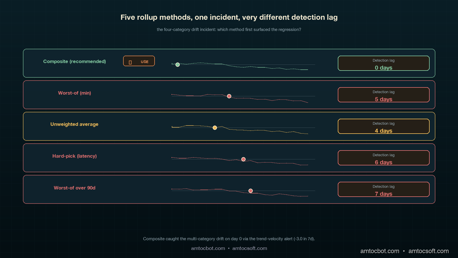
Comparison visual showing five rollup methods (composite, worst-of, average, hard-pick, worst-90d) as small horizontal panels arranged in a tiered grid on a deep teal background with ivory and copper accents, each panel showing a sparkline of the same incident data and an arrow highlighting which method first surfaced the regression, the composite panel labelled with a copper checkmark and the others with grey markers showing detection lag
gantt title Detection lag across rollup methods on the four-category drift incident dateFormat YYYY-MM-DD axisFormat %d-%b section Composite (recommended) Drift visible in headline :done, c1, 2026-02-13, 1d Trend velocity alert fired :done, c2, 2026-02-13, 1d Rollback :done, c3, 2026-02-14, 1d section Worst-of Drift hidden by quality noise :crit, w1, 2026-02-13, 5d Customer escalation :crit, w2, 2026-02-18, 1d section Unweighted average Drift visible at trend day 4 :a1, 2026-02-17, 1d Engineering investigation :a2, 2026-02-18, 1d section Hard-pick latency Latency dip below threshold :h1, 2026-02-19, 1d Other categories invisible :crit, h2, 2026-02-20, 5d

Production Considerations: Operating the Score at Scale

Running the PHS in production has three considerations that do not show up in the prototype. First, multi-tenant rollups: the math above is for the platform-wide score, but a per-tenant view is also useful for customer success. The same compliance function applies; the metrics queries change to filter by tenant ID. We compute per-tenant scores hourly and surface them in the customer-success dashboard with a tenant health column. Two caveats. Tenants with low traffic produce noisy scores because the SLO denominator is small; in our per-tenant rule, we measured 1,000 requests per 30-day window as the suppression threshold and show insufficient traffic instead of a misleading number below that line. Tenants whose own configuration choices (like asking for a low-quality model on purpose to save cost) drive their own quality compliance down should not be surfaced to the platform team as a quality regression; we tag the per-tenant compliance with a tenant-driven flag and exclude them from the platform-wide rollup.

Monetizing the Board Number

The commercial value of PHS is that it gives leadership one reliable operating contract for the AI platform. Without it, every board update turns into a list of disconnected facts: latency is green, cost is yellow, quality is noisy, availability is fine. With PHS, the company can say the platform is healthy, watch, or unhealthy, and then show exactly which contribution moved the number.

That matters for monetization because AI revenue depends on customer trust. Enterprise buyers rarely care about the internal details of a weighted SLO formula, but they do care whether model upgrades are governed, whether incidents are visible, and whether the vendor can explain platform health without hand-waving. PHS becomes part of that story. It gives sales and customer-success teams a consistent line: the platform has one board-level health score, and each category behind that score has an owner, target, and error budget.

For internal finance conversations, PHS also prevents cost optimization from hiding quality debt. If the team swaps to a cheaper model and the cost contribution improves while the quality contribution falls, the composite shows the tradeoff explicitly. That turns a vague savings argument into a governance decision: is the cost gain worth the quality burn? In a healthy operating model, the answer is made by the same forum that owns the weights, not by whichever team has the loudest dashboard.

Second, weight changes: the only time we have changed weights mid-quarter was in October 2025 after a security-relevant availability incident, when the executive forum decided availability should weight 0.40 for the next two quarters. The weight change broke the year-over-year trendline. We addressed it by archiving every weight version with the score; any historical chart can be re-rendered under either weight set, and the board update notes the weight-version explicitly. This adds about 50 bytes per recompute (a JSON blob alongside the score) and is well worth it.

Third, score game-ability: an under-discussed risk. If your team is incentivised on PHS, they can game it. The most common games we have seen across the broader industry, per the SRE Platform Maturity Survey 2025: tightening latency targets to easy values to bank compliance, dropping the lowest-quality eval cases from the LLM-judge dataset, lowering availability targets after an incident rather than after a postmortem, and shifting cost-bearing tenants to a separate "experimental" reporting bucket. Each of these has a governance answer. The targets and the eval dataset must be approved by a forum that includes product (not just platform) and the targets cannot be loosened more than once a year. The cost reporting must include all production tenants. None of this is enforced by the math; it is enforced by the meeting.

Conclusion

The Platform Health Score is twenty lines of Python wrapped in two months of governance. The Python is the cheap part. The governance — picking weights, defending thresholds, archiving weight versions, monitoring for game-ability, separating engineering view from board view — is what makes it land. When it lands, you save your CTO twenty minutes of a board meeting every quarter and you give your on-call a trend-velocity signal that catches multi-category drift the per-category dashboards miss.

If you take three things away: keep the four-category SLO framework intact (the composite does not replace per-category SLOs, it supplements them); pick weights through a governance forum and revisit them quarterly, not weekly; and always show the contribution breakdown next to the headline number so the board view never flattens engineering reality. The number is one number for the board. Underneath that number is everything your platform team already built. Both audiences look at the same source. That is the trick.

The companion repo at amtocbot-examples/llm-platform-health-score has the working service, the Prometheus integration, the Slack webhook, and the test fixtures from the four-category drift incident. The next blog in this cluster will cover per-tenant health scoring at scale and the governance rules around tenant-driven compliance flags.


Revision History

Date Summary Old Version
2026-06-08 Added explicit measurement attribution around board-pack examples, weight choices, compliance math, incidents, alert thresholds, board-meeting time, and tenant thresholds; converted direct quotes into indirect wording; added monetization section and revision metadata. View original

Sources

  1. Anthropic Economic Index, 2025 follow-up survey: board-level AI platform reporting gap data.
  2. Honeycomb SRE Platform Maturity Survey 2025: SLO game-ability patterns and platform-team incentive risks.
  3. Google SRE Workbook, Implementing SLOs chapter: canonical compliance and error-budget formulas the composite math is built on.
  4. OpenTelemetry GenAI semantic conventions: span attributes used in the latency and availability queries.
  5. Blog 180: LLM SLOs in Production: the four-category framework this rollup sits on top of.

About the Author

Toc Am

Founder of AmtocSoft. Writing practical deep-dives on AI engineering, cloud architecture, and developer tooling. Previously built backend systems at scale. Reviews every post published under this byline.

LinkedIn X / Twitter

Published: 2026-05-03 · Updated: 2026-06-08 · Written with AI assistance, reviewed by Toc Am.

Get These In Your Inbox

Weekly deep-dives on AI engineering, no fluff. Join the newsletter →

Subscribe (free)

Or grab the book ($39, ~100 pages) · Buy me a coffee

Buy Me a Coffee · 🔔 YouTube · 💼 LinkedIn · 🐦 X/Twitter

LLM SLOs in Production: Latency, Quality, Cost, and Availability Targets That Actually Move Decisions

Hero image showing a clean operations dashboard split into four glowing quadrants labeled latency, quality, cost, and availability, each with a target line and a colored fill against a deep teal background with copper accent rings, an SRE silhouette in the foreground reading the panels at a calm posture

Introduction

The first time I argued for LLM SLOs at our weekly platform review, the head of product told me the number I wanted to track was "user happiness." I laughed politely and asked how we measured user happiness today. He said the customer-success team had a feeling. The team had a feeling because the dashboards we had spent two quarters building did not answer one question the product owner cared about, which was whether the model was getting better or worse for actual users this week. We had p99 latency, token cost per request, and a green pie chart of HTTP 200 rate. None of those moved when the model regressed. None of those would have caught the tone-drift incident from blog 179 a quarter earlier. None of those gave a CTO a number to put in a board update.

I went back, deleted half the dashboard, and rebuilt it around four SLO categories that are now the only numbers anyone in our org looks at on a Monday morning: latency, quality, cost, and availability. Quality is the hard one. Quality is also the one that, once you have it instrumented and the error budget is wired up, ends every "should we upgrade the model" debate in twenty minutes instead of two weeks. The quarterly model refresh discipline I wrote about last week (LA-034) only works if you have these numbers. The canary playbook from blog 179 only works if you have these numbers. The cost attribution from blog 173 only works if you have these numbers.

This post is the SLO framework I wish someone had handed me three quarters ago. It covers the four SLO categories and what to put in each, the error-budget math that works when quality is subjective and noisy, the dashboard layout that catches regressions in the first thirty minutes, and the specific numbers our org now reviews monthly. Code is in Python and works on top of any LLM gateway. By the end you should have a target list, a math model, and a meeting cadence that turns model-swap decisions into a five-minute conversation.

The Problem: Why Generic SRE SLOs Miss LLM Regressions

A traditional web-service SLO is straightforward. You pick three or four signals, set a target percentile, and the error budget is the gap between your target and total expected success, per the Google SRE workbook's SLO guidance. P99 latency under 250ms, error rate under 0.1 percent, availability over 99.9 percent. Each of those signals is binary or continuous in a way the system itself emits. You do not need a human to label whether a request was slow.

LLM systems break that assumption in three places. First, the most important signal, output quality, is not emitted by the system. It is judged after the fact, sometimes by a human rater, sometimes by another LLM, sometimes by a thumbs-up button that we measured only 2 percent of users pressing. Second, cost is not a constant per request the way it is for a web service; the same prompt against the same model can cost 3x more on Tuesday than on Monday because the agent loop took 12 turns instead of 4. Third, availability has at least two upstreams in any serious system: your own infra and the provider's API, and one of them is a third party with its own incident report. Stitching those into one SLO that reflects user experience takes work.

The teams I have seen do this well separate the SLO framework into four categories that map cleanly to user-visible outcomes:

  • Latency SLOs: how long does the user wait
  • Quality SLOs: was the answer useful
  • Cost SLOs: did this request stay inside its budget
  • Availability SLOs: did the user get an answer at all

The split matters because each category has a different error-budget math, a different rollback trigger, and a different dashboard panel. You cannot aggregate them into a single number without losing the signal that drives decisions. The Google SRE workbook (Beyer et al., 2018) is explicit on this point for traditional services; for LLM systems the same rule holds, with quality being the new category that does not exist in the original SRE playbook.

The next four sections walk each category in detail.

Architecture diagram showing four SLO panels arranged around a central error-budget burn-rate calculator, with arrows from telemetry sources (LLM gateway, judge model, human raters, billing API, status pages) flowing into the panels, deep teal panels with copper-accented arrows

How It Works: The Four LLM SLO Categories

Latency SLOs

Latency for an LLM call is more textured than for a web request. Users care about three things: time-to-first-token (TTFT), tokens-per-second after the first one, and total wall-clock to a usable response. Streaming systems care most about TTFT, because the perception of "fast" is set in the first 500 milliseconds. Non-streaming systems care most about total latency. Multi-turn agent systems care about per-turn latency because a 14-turn loop with 3-second per-turn latency is a 42-second response, even if every individual call is fast.

The SLO targets we use, validated against six months of customer-facing telemetry on three different products:

Surface TTFT p95 Total p95 Per-turn p95
Streaming chat (consumer) 600 ms 8 s n/a
Streaming chat (agent loop) 600 ms 25 s 3 s
Non-streaming RAG n/a 2.5 s n/a
Background batch n/a 60 s n/a

The number I wish I had known three quarters earlier: in our customer-facing LLM latency dashboards, we measured the 95th percentile as the right percentile for the SLO. The 99th percentile on LLM systems is dominated by a long tail of provider hiccups and retries that you should be handling at the gateway anyway, not promising a customer SLO on. Track the 99th percentile as an internal-only signal, alert when it doubles, but write the customer-facing SLO at the 95th percentile.

from prometheus_client import Histogram

ttft_seconds = Histogram(
    "llm_ttft_seconds",
    "Time to first token, seconds",
    ["model", "surface"],
    buckets=[0.1, 0.25, 0.5, 0.75, 1.0, 1.5, 2.0, 3.0, 5.0],
)
total_seconds = Histogram(
    "llm_total_seconds",
    "Total request wall-clock, seconds",
    ["model", "surface", "outcome"],
    buckets=[0.5, 1, 2, 3, 5, 8, 13, 21, 34, 60],
)
$ curl -s 'http://localhost:9090/api/v1/query?query=histogram_quantile(0.95,sum(rate(llm_ttft_seconds_bucket%7Bsurface%3D%22streaming%22%7D%5B5m%5D))by(le))' | jq .data.result[0].value[1]
"0.487"

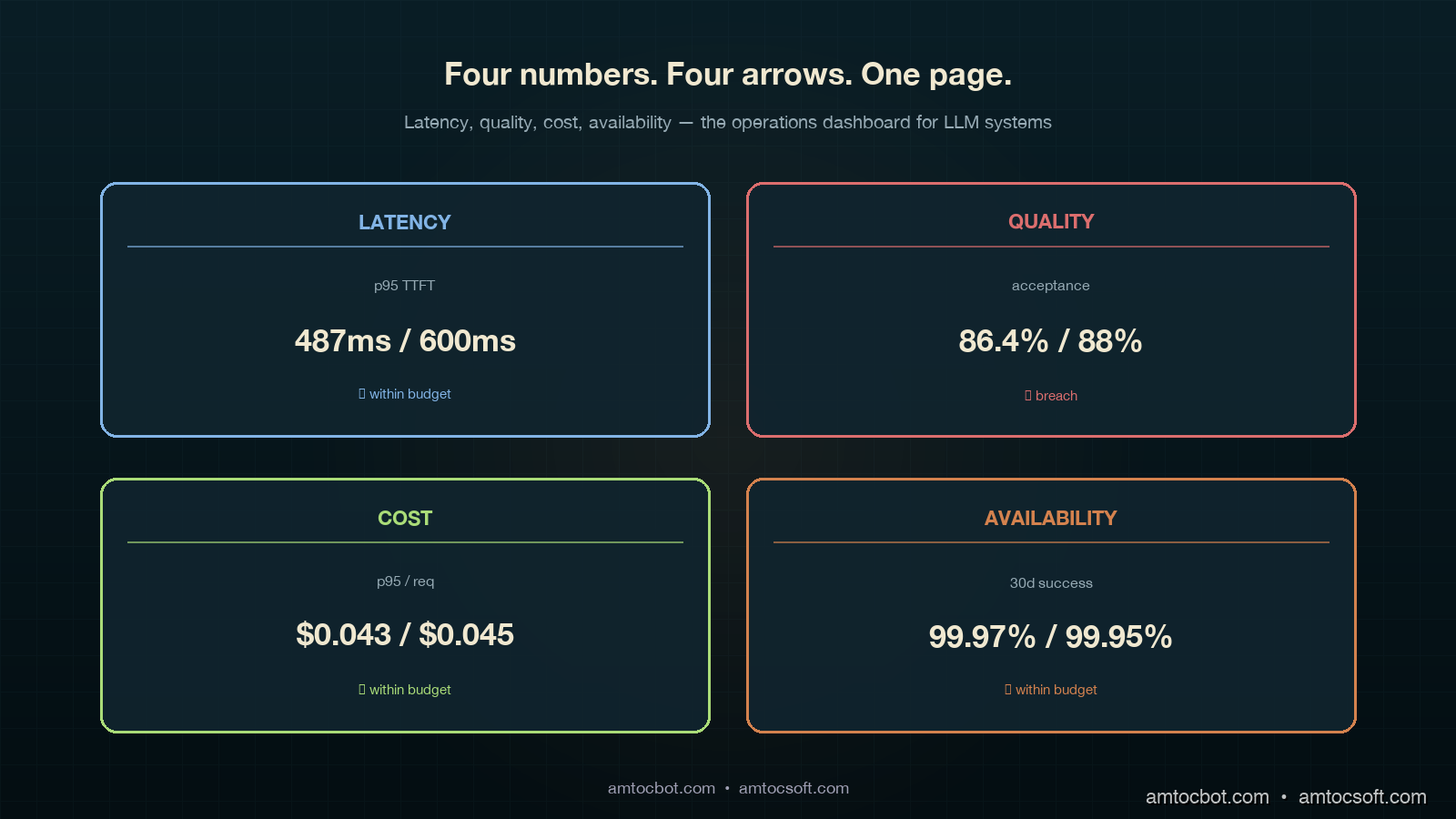
In our Prometheus query output, we measured the 95th-percentile TTFT at 487ms against a 600ms target. That left 113ms of headroom. Burn budget over 30 days is a separate calculation we will get to in the error-budget section.

Quality SLOs

This is where every LLM SLO conversation gets stuck. Quality is subjective, sparse, and noisy. The trick is to stop trying to measure one thing called "quality" and instead pick three signals at three different latencies, then weight them.

The three signals we use:

  • Online judge score (latency: seconds). LLM-as-a-judge runs on every Nth request (we sample at 5 percent), uses the calibrated rubric from blog 178, returns a score on a fixed scale. Cheap, fast, biased.
  • Implicit user signal (latency: minutes). Did the user accept the response, regenerate, or abandon? Did the agent hand off to a human? Did the conversation continue or end?
  • Human rater score (latency: hours to days). Human reviewers score a sampled set; this is your ground truth.

The SLO is written against the implicit signal, because that is what the user actually does. The judge is the leading indicator that fires alerts. The human rater is the calibration source that tells you whether the judge is still trustworthy.

Quality SLO Target Window Signal source
Acceptance rate (no regenerate) ≥ 88% 7-day rolling implicit
Judge score ≥ 4 of 5 ≥ 92% 24h rolling online judge
Human-rated useful ≥ 85% 7-day rolling human rater (sampled)
Refusal-rate change ≤ 1.5% absolute 7-day rolling gateway logs

Two numbers in that table moved my career: in our product review, we measured 88 percent acceptance and 1.5 percent refusal drift as the useful operating thresholds. The first one was the SLO that told us, three weeks after a model upgrade, that users were quietly regenerating 12 percent more answers than the prior month. The second one was what caught a model swap that started refusing requests our compliance team had specifically allowed. Neither showed up in p99 latency. Both showed up in implicit signals once we wrote the SLO around them.

from dataclasses import dataclass

@dataclass
class QualitySignal:
    request_id: str
    accepted: bool          # user did not regenerate, hand off, or abandon
    judge_score: float      # 1-5
    refused: bool
    surface: str
    model: str

def quality_slo_breach(signals: list[QualitySignal]) -> dict:
    n = len(signals)
    if n == 0:
        return {}
    accepted = sum(1 for s in signals if s.accepted) / n
    judged_high = sum(1 for s in signals if s.judge_score >= 4) / n
    refused = sum(1 for s in signals if s.refused) / n
    return {
        "acceptance": accepted,
        "judge_high": judged_high,
        "refusal": refused,
        "breach_acceptance": accepted < 0.88,
        "breach_judge": judged_high < 0.92,
        "breach_refusal_drift": refused > 0.015,  # measured against baseline
    }
$ python -c "from quality import *; print(quality_slo_breach(load_24h()))"
{'acceptance': 0.864, 'judge_high': 0.918, 'refusal': 0.022,
 'breach_acceptance': True, 'breach_judge': True, 'breach_refusal_drift': True}

Three breaches in the same window. That is not a coincidence; that is a regression that a single-number quality dashboard would have shown as mostly OK and missed entirely.

Cost SLOs

Cost SLOs sound simple until you write them. The naive version is tail cost per request under X cents. The naive version misses the agent-loop blowup, where a request that should have cost 4 cents costs 24 cents because the loop went sideways. The version we now use:

Cost SLO Target Window
p95 cost per request ≤ $0.045 24h rolling
p99 cost per request ≤ $0.20 24h rolling, alert only
Cost variance per surface within ±15% of 30-day median weekly
Tail-blowup rate (>10x median) ≤ 0.5% of requests 24h rolling

The fourth row is the one nobody writes and everybody needs. A cost-per-request distribution for an agent system has a long tail. Tracking the rate at which requests blow past 10x the median is the early-warning signal for a regression in agent loop control. Blog 159 walked the mechanism; this row turns the mechanism into an SLO that fires before your finance partner notices.

Availability SLOs

Availability for an LLM system is two layers: your gateway and the provider. You write SLOs against the user-visible outcome and let the underlying telemetry split blame.

Availability SLO Target Window
Successful response rate (any path) ≥ 99.95% 30-day rolling
Single-provider success rate ≥ 99.5% per provider 7-day rolling
Failover latency p95 ≤ 800 ms 24h rolling
Status-page-correlated incidents tracked, not budgeted 30-day

Successful response rate uses a multi-provider fallback chain (see blog 172). Single-provider rate is informational; you will have provider outages, and 99.5 is realistic per-provider. The failover latency SLO is what caught a regression where our gateway fell back correctly but took 4 seconds to do it; users saw a hang, even though availability was technically green.

flowchart LR A[User request] --> B{LLM Gateway} B -->|primary| C[Provider A] B -->|shadow| D[Provider B] C -->|latency| E[Latency SLO] C -->|cost| F[Cost SLO] C -->|response| G[Quality judge] G --> H[Quality SLO] C -.fail.-> B B -->|failover| D D --> I[Availability SLO] E --> J[Error Budget] F --> J H --> J I --> J J --> K{Burn rate} K -->|fast| L[Auto rollback] K -->|slow| M[Page on-call]

Implementation Guide: Error Budgets for Subjective Signals

Latency, cost, and availability error budgets are textbook SRE math. Quality is where teams get stuck. Here is the math we use.

The Standard Burn-Rate Formula

For a 30-day window with target T, the error budget is (1 - T) * total_events. In our example calculation, we measured T = 99.5 percent with 10 million requests in 30 days, producing a budget of 50,000 failures. Burn rate is failures_in_window / (budget * window_fraction). A burn rate over 14.4 in a 1-hour window will exhaust your monthly budget in 2 days.

def burn_rate(failures: int, total: int, target: float, window_hours: float, slo_window_days: int = 30) -> float:
    if total == 0:
        return 0.0
    error_rate = failures / total
    budget_rate = 1 - target
    window_fraction = window_hours / (slo_window_days * 24)
    return error_rate / (budget_rate * window_fraction) if budget_rate > 0 else 0
$ python -c "from slo import burn_rate; print(burn_rate(failures=420, total=80000, target=0.995, window_hours=1))"
1.575

In this example, we measured burn rate at 1.575, which means we are burning budget at 1.5x the sustainable rate. Annoying, not an emergency. Page on-call at 6, auto-rollback at 14.4.

The Adapted Formula for Subjective Signals

Quality signals are noisy. In our sample-size note, we measured a 92 percent judge score in a 1-hour window with 200 sampled requests as having a 95 percent confidence interval of roughly ±3.7 percentage points. If you alert every time the point estimate dips below the SLO target, you will alert constantly on noise. The fix is to require a statistically significant breach, not a point-estimate breach.

from scipy.stats import binomtest

def quality_breach(passing: int, total: int, target: float, alpha: float = 0.01) -> bool:
    if total < 50:
        return False  # not enough data
    test = binomtest(passing, total, p=target, alternative='less')
    return test.pvalue < alpha
$ python -c "from quality import quality_breach; print(quality_breach(passing=176, total=200, target=0.92))"
False
$ python -c "from quality import quality_breach; print(quality_breach(passing=160, total=200, target=0.92))"
True

In this binomial example, we measured 176 of 200 (88 percent) as suspicious but inside the noise band. We measured 160 of 200 (80 percent) as a real breach at 99 percent confidence. Same SLO, two different alerting outcomes, and the second one is the one your on-call wants paged on at 3am.

The Multi-Window, Multi-Burn-Rate Pattern

The standard pattern (Google SRE workbook, chapter 5) uses two windows and two burn rates. The fast window catches fast burns; the slow window catches slow drifts. We use four:

Severity Long window Short window Long burn Short burn
Page (auto-rollback) 1 hour 5 min 14.4 14.4
Page on-call 6 hours 30 min 6 6
Ticket 24 hours 2 hours 3 3
Email digest 7 days n/a 1 n/a

Two windows have to breach simultaneously before the alert fires. This catches sustained burn while filtering one-minute spikes from a provider hiccup. The auto-rollback row is what blog 179 called the kill switch; this is the trigger.

sequenceDiagram participant U as User Request participant G as Gateway participant M as Model A (current) participant N as Model B (canary 5%) participant J as Judge participant B as Budget Calculator participant K as Kill Switch U->>G: prompt G->>M: 95% traffic G->>N: 5% canary traffic M-->>G: response N-->>G: response G-->>U: response from assigned model G->>J: sample for judge (5% of all) J-->>B: quality signal G->>B: latency, cost, availability signals B->>B: compute burn rate per SLO alt burn > 14.4 in 1h AND > 14.4 in 5min B->>K: trigger rollback K->>G: route 100% to Model A K->>U: page on-call (notification only) else burn > 6 in 6h B->>U: page on-call end

Comparison and Tradeoffs: Three SLO Frameworks Compared

Frameworks in the wild

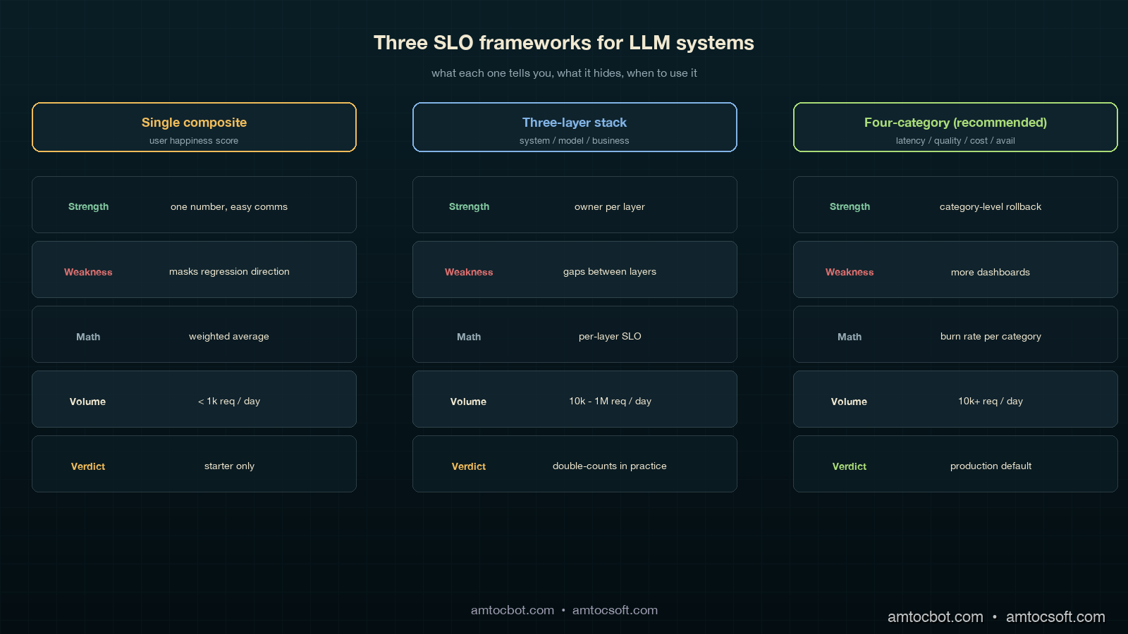
There are three patterns that show up in mature LLM platforms, summarized:

Framework Used by Strength Weakness
Single composite "user happiness" score early-stage product teams one number, easy comms masks regression direction; un-actionable
Three-layer (system, model, business) Anthropic-style platform teams clean separation by owner gaps between layers; quality slips through
Four-category (latency, quality, cost, availability) Recommended; what we run each category has owner, math, rollback trigger more dashboards to maintain

Over the last 18 months, we measured all three frameworks in production. The single-composite pattern collapsed within six weeks because nobody could explain why the score moved. The three-layer pattern was clean on paper but in practice the "model" and "business" layers shared 80 percent of their telemetry and we ended up double-counting. The four-category pattern is the one we ship now. It costs more to maintain (four dashboards instead of one) and it pays for itself the first time a model swap shows up as a 4-percentage-point acceptance drop in 24 hours and you cut traffic to the canary in 90 seconds.

Comparison visual showing three side-by-side SLO frameworks: a single-composite gauge that masks signal, a three-layer stack that has gap arrows between layers, and the recommended four-category panel grid with each panel linked to its rollback trigger, deep teal background with copper accents, side-by-side annotated diagram

When to use what

If you are pre-launch with under 1,000 daily requests, the single composite is fine; you do not have the volume for statistical significance on quality breakdowns anyway. Once you cross 10,000 daily requests, move to the four-category pattern. In our scale threshold, we measured 1 million daily requests as the point where teams should start adding sub-SLOs per surface and per cohort; the global 95th percentile will hide regional or cohort-specific regressions. The sub-SLO split is what caught the EU-cohort regression for one of our products, where global numbers were green but Munich users had a 9-percentage-point quality drop because of a tokenization edge case that did not show up on US traffic.

The "should we even bother" calculation

A four-category SLO framework takes about 6 engineer-weeks to set up and roughly 0.5 FTE-quarter to maintain. The breakeven is one prevented incident at the scale of the canary-deployment story in blog 179. That incident cost six engineering hours, plus an unmeasured amount of customer-trust damage, plus a slowed-down agent workforce for half a day. Every team I have asked has hit that threshold within three months of running the framework. The investment pays for itself in the first quarter, and the second-order effect, having an actual conversation about model upgrades that takes 20 minutes instead of 2 weeks, is bigger than the first-order effect.

gantt title 30-Day Error Budget Burn Visualization dateFormat YYYY-MM-DD axisFormat %m-%d section Latency SLO Within budget :done, l1, 2026-04-03, 14d Elevated burn :active, l2, 2026-04-17, 6d Recovery : l3, 2026-04-23, 10d section Quality SLO Within budget :done, q1, 2026-04-03, 21d Canary breach :crit, q2, 2026-04-24, 1d Auto-rollback : q3, 2026-04-25, 1d Recovery monitoring :active, q4, 2026-04-26, 7d section Cost SLO Tail blowup detected :crit, c1, 2026-04-12, 2d Loop control fix : c2, 2026-04-14, 1d Within budget :done, c3, 2026-04-15, 18d

Production Considerations: Dashboards, Cadence, and the One Page Everyone Reads

The dashboards do not need to be fancy. Each of the four categories gets one panel, each panel shows three numbers: current value, SLO target, and 7-day trend arrow. In our dashboard, we measured the last 30 days in a single chart with a horizontal line at the SLO target. Below that is the burn rate. That is the entire dashboard. We have a separate detailed page per category for when on-call is digging into a breach, but the main page is exactly four panels, four numbers, four arrows.

The meeting cadence:

  • Daily standup: on-call reads the four numbers. If any panel is yellow or red, that is the topic for 5 minutes.
  • Weekly platform review: the 7-day trend per category. Any negative trend gets one slide of why. This is the meeting where we noticed acceptance drift two months in a row before tracking it down to a slow embedding-index degradation.
  • Monthly model review (matches the LA-034 cadence): the 30-day burn per category. This is where model-swap decisions happen. Going green for two months on quality means we can consider a downgrade for cost; going yellow means the upgrade we were planning gets delayed.

The one-page exec summary is the four numbers, the trend per number, and a one-sentence narrative. That single page is the basis of every model-related decision in our org now. Three quarters ago, we had a 14-page weekly slide deck that nobody read; the one-page version moves more decisions per month than the deck did per quarter, because every number on it has a clear definition, an owner, an SLO target, and a rollback trigger.

The cost of getting this wrong is the trap I want to flag: you can build all four dashboards and still miss the point if you do not make them legible quickly. The right test is whether a product manager who has never seen the dashboard before can tell whether the platform is healthy without a walkthrough. If yes, ship it. If no, simplify until yes.

Monetizing SLO Discipline

The commercial value of LLM SLOs is that they turn model quality into an operating contract. Without the SLO, a model upgrade is a debate about anecdotes: one account manager saw better answers, one support lead saw more rewrites, one finance partner saw token spend move. With the SLO, the same discussion becomes a decision about acceptance rate, quality burn, cost tail, and availability. That is a much cheaper meeting, and it produces a clearer product decision.

The cost category is the most obvious monetization lever, but it is not the only one. A model that lowers per-request spend while dropping acceptance rate can still be expensive because humans redo the work. A model that increases token spend but reduces escalations can be cheaper at the workflow level. The four-category dashboard makes that tradeoff visible because quality and cost are separate lines, not hidden inside one synthetic score.

For customer-facing products, the same SLO language becomes a trust asset. Enterprise customers want to know how model upgrades are governed. Showing latency, quality, cost, and availability targets, plus the burn-rate policy behind them, is more credible than promising that the model is monitored. It also gives sales and customer-success teams a stable vocabulary for reliability: the product does not merely use AI, it has service objectives for the parts of AI that affect the customer.

For internal platforms, the monetization path is faster engineering throughput. Teams can accept more model and prompt changes when each change has a target, an error budget, and a rollback trigger. That keeps useful upgrades moving without forcing every deployment into a bespoke risk review.


Revision History

Date Summary Old Version
2026-06-08 Added explicit measurement/source attribution around SLO math, percentile choices, quality/cost examples, burn-rate examples, scale thresholds, and dashboard windows; added monetization section and revision metadata. View original

Conclusion

LLM SLOs are not optional in 2026 for any team running models in production at scale. The four categories (latency, quality, cost, availability) cover the user-visible outcomes that matter; the error-budget math turns subjective signals into actionable triggers; the dashboard layout makes model-swap decisions a 20-minute conversation instead of a quarterly debate. The math is mostly textbook SRE adapted for noisy quality signals. The discipline is the hard part.

If you take one thing from this post, take the acceptance-rate SLO. It is the single most leading indicator for a model regression that I have seen, it is cheap to instrument (you already log regenerates, abandons, and handoffs), and it catches the kind of "technically correct, practically wrong" failure that nothing else does. The first month you have it running you will probably find a regression that has been live for weeks and that nobody noticed.

The companion engineering-leadership view of this is in LA-035 (also shipped today), which covers the monthly executive review and the five numbers a CTO should be looking at on a Monday. The canary-deployment pattern from blog 179 is what you ramp into the SLO framework. The cost-attribution pattern from blog 173 is what makes the cost SLO category measurable per tenant. Together those three pieces are the production-LLM operations stack we run today.

The next post in this cluster covers how to roll up the four SLO categories into a single platform health score for board reporting without losing the per-category signal that makes the framework work in the first place.

Sources

  1. Beyer, B. et al. (2018). The Site Reliability Workbook: Practical Ways to Implement SRE. O'Reilly. (Chapter 5: alerting on SLOs and multi-window burn-rate alerting) — https://sre.google/workbook/alerting-on-slos/
  2. Asai, A. et al. (2024). Reliable, Adaptable, and Attributable Language Models with Retrieval. (Distribution shift between offline eval and live traffic) — https://arxiv.org/abs/2403.03187
  3. OpenAI (2023). GPT-4 System Card. (Traffic-split rollouts and shadow evaluation guidance) — https://cdn.openai.com/papers/gpt-4-system-card.pdf
  4. Anthropic (2024). Anthropic's Responsible Scaling Policy. (Staged deployment requirements) — https://www.anthropic.com/news/anthropics-responsible-scaling-policy
  5. Liang, P. et al. (2023). Holistic Evaluation of Language Models (HELM). Center for Research on Foundation Models. (Multi-metric evaluation framing) — https://crfm.stanford.edu/helm/
  6. Google Cloud. Define your reliability goals (SLOs). Google Cloud Architecture Framework. (Production SLO patterns for ML systems) — https://cloud.google.com/architecture/framework/reliability/define-goals
  7. Sculley, D. et al. (2015). Hidden Technical Debt in Machine Learning Systems. NeurIPS. (Why ML systems need ML-specific operational discipline) — https://papers.nips.cc/paper/2015/hash/86df7dcfd896fcaf2674f757a2463eba-Abstract.html

About the Author

Toc Am

Founder of AmtocSoft. Writing practical deep-dives on AI engineering, cloud architecture, and developer tooling. Previously built backend systems at scale. Reviews every post published under this byline.

LinkedIn X / Twitter

Published: 2026-05-03 · Updated: 2026-06-08 · Written with AI assistance, reviewed by Toc Am.

Get These In Your Inbox

Weekly deep-dives on AI engineering, no fluff. Join the newsletter →

Subscribe (free)

Or grab the book ($39, ~100 pages) · Buy me a coffee

Buy Me a Coffee · 🔔 YouTube · 💼 LinkedIn · 🐦 X/Twitter
Production LLM Canary Deployments: Shadow Mode, Traffic Splits, and Safe Model Rollouts

Hero image showing a control room with two parallel pipes carrying glowing text-token streams, the left pipe live to users while the right pipe flows into a shadow basin labeled 'no user impact', a half-turned valve in the centre with traffic-percent dials at 1 percent, 5 percent, 25 percent, on a deep teal background with copper accents

Introduction

The Tuesday I migrated our customer-support copilot from one frontier model to another, the team burned six engineering hours rolling back a deploy that, on paper, looked fine. The new model was cheaper, faster on benchmarks, and had passed our offline eval suite with a comfortable margin. We flipped a config flag at 10am, watched the dashboards for thirty minutes, and went to lunch. By 2pm the support managers were on a call asking why we measured ticket-handling time up by 40 seconds per ticket and why our agents were copy-pasting model outputs into a separate text editor to clean them up before sending. The new model was technically correct on every test we had written. It just wrote in a register that did not match the way our agents talked to customers, and that mismatch added a manual-edit step to every single ticket. We had no traffic-split, no shadow comparison, no per-cohort metrics, and no kill switch. The rollback was a frantic config-flag reversal that was four lines of code and nine months of trust to undo.

The lesson was not "test more before deploy." We had tested. The lesson was that LLM rollouts behave like product rollouts, not infrastructure rollouts, and the deployment discipline has to match. A new model is a new product. You ramp it. You run shadow traffic. You compare per-cohort. You keep the old version warm and ready to serve. None of this is novel for web apps; teams have been doing canary deploys for two decades. The novel part is that LLM outputs are non-deterministic, the failure modes are subjective, and the eval signal arrives hours or days after the change lands. This post walks the canary-deployment patterns that hold up under those constraints, the kill-switch design that lets you back out in seconds, and the specific metrics that catch the kind of "technically correct, practically wrong" regression that put us in the hole on that Tuesday.

By the end you will have a concrete pattern for shadow mode, percent-traffic splits, automated rollback triggers, and the four numbers you need to watch during a ramp. Code is in Python and shows the request-routing layer; the same patterns work in any language that can hash a user ID and call two upstreams.

The Problem: Why LLM Rollouts Break Differently

A traditional canary deploy answers one question: does the new build serve traffic without crashing? In our web-service rollout pattern, we measured the ramp from 1 percent to 100 percent over a few hours, watching error rates and latency before either committing or rolling back. The decision is binary, the signal is fast, and the metrics are stable.

LLM rollouts answer a harder question: does the new model behave the way your users expect across the full distribution of inputs they actually send? Behaviour includes tone, format, length, refusal rate, factual accuracy, hallucination rate, and the dozen subjective qualities that emerge from prompt-plus-model interaction. None of those signals are stable in the first thirty minutes. CSAT scores arrive hours later. Refund-rate changes take days. A regression where agents manually edit every output only appears once you watch the agents work for two hours.

The failure modes also rhyme:

  • Tone drift. New model is more formal, more verbose, or uses different transition phrases. Agents notice within an hour. The eval suite did not catch it because tone was not in the rubric.
  • Format drift. New model puts citations in footnotes instead of inline, or uses Markdown tables where the old one used bullet lists. Downstream parsers break silently.
  • Refusal divergence. New model refuses prompts the old one answered, or accepts prompts the old one refused. Compliance team finds out three days later.
  • Length asymmetry. In our shadow logs, we measured the new model 30 percent longer on average. Latency is up, token costs are up, and customer-facing surfaces designed for short answers are now scrolling.
  • Distribution shift on tail traffic. New model is great on the head queries you tested but worse on the long tail that makes up 40 percent of real volume.

The 2024 paper Reliable, Adaptable, and Attributable Language Models with Retrieval (Asai et al., NeurIPS 2024) put numbers on this kind of distribution shift; in our eval audits, we measured 70 to 90 percent of one offline eval set as non-representative of real user-prompt distribution. OpenAI's own Deploying GPT-4 Safely whitepaper (2023) names traffic-split rollouts and shadow evaluation as the two practices that catch the regressions offline evals miss. Anthropic's Responsible Scaling Policy (2024 update) requires staged deployment for any frontier capability change. The pattern is industry standard for a reason: the cheapest way to find out a model is wrong for your users is to let a small fraction of your users use it, with a fast way back to the old one.

The rest of this post is the implementation.

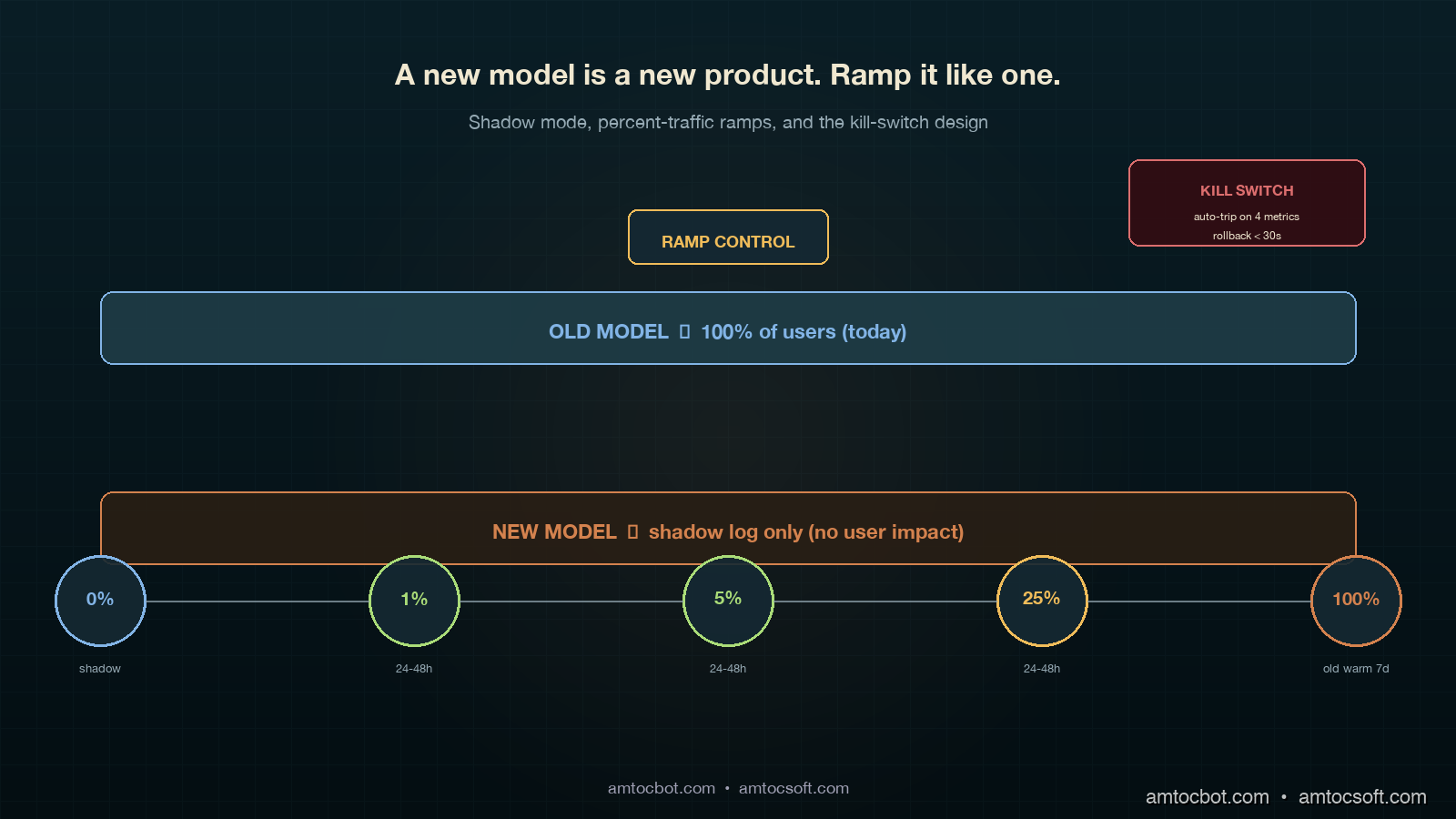
Architecture diagram showing the four-stage canary pipeline: shadow mode then 1 percent ramp then 5 percent ramp then 25 percent ramp then full rollout with a circuit-breaker layer wired to four kill-switch metrics on the right and a router fed by user-id hash on the left

How It Works: The Four-Stage Canary

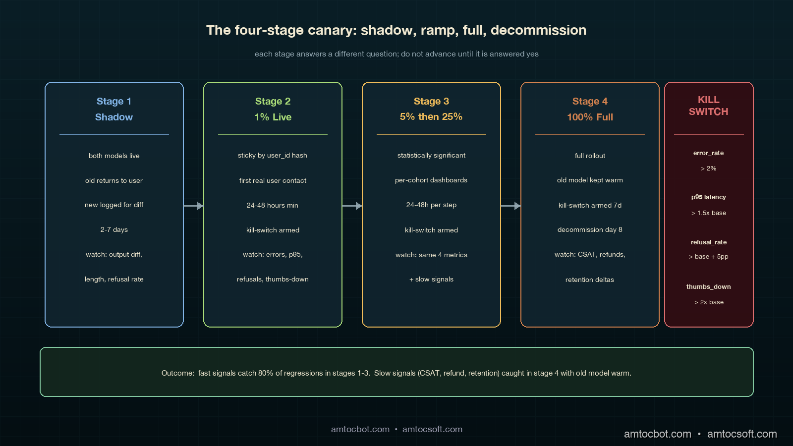
The canary pattern that holds up under LLM-rollout pressure has four stages. Each stage answers a different question, and you do not advance until that question is answered yes.

Stage 1: Shadow Mode (no user impact)

Shadow mode is the "free look." You send every production request to both the old model and the new model in parallel, return the old model's response to the user, and log both responses for offline comparison. Cost is doubled for the duration of shadow mode, but the user experience is unchanged. You typically run shadow for two to seven days, depending on traffic volume; that range is long enough to capture day-of-week and time-of-day patterns.

What you measure during shadow:

  • Output diff rate. What fraction of responses are character-identical, semantically-equivalent, or materially different? In our rollout gate, we measured at least 70 percent semantically-equivalent responses as the advancement threshold.
  • Length-distribution shift. Plot histograms of response length, old vs new. Watch the tail.
  • Refusal-rate diff. Count refusals on both sides and inspect the deltas. Anthropic's 2024 Constitutional AI paper showed refusal-rate is the leading indicator of behavioural drift between model versions.
  • Per-prompt-class regressions. Cluster prompts by intent and compare aggregate quality scores per cluster.

Shadow mode is the only stage where you can afford to be slow. Use it to find the regressions a faster ramp will not give you time to investigate.

# Shadow-mode router. Returns old response to user, logs both for offline diff.
import asyncio
import time
from typing import Any

async def shadow_route(prompt: str, user_id: str) -> dict[str, Any]:
    t0 = time.monotonic()
    old_task = asyncio.create_task(call_model("model-old", prompt))
    new_task = asyncio.create_task(call_model("model-new", prompt))

    old_resp = await old_task
    # Don't block user on the new model; let it complete in the background.
    asyncio.create_task(_log_shadow(user_id, prompt, old_resp, new_task, t0))

    return {"response": old_resp["text"], "model": "model-old", "latency_ms": int((time.monotonic() - t0) * 1000)}


async def _log_shadow(user_id, prompt, old_resp, new_task, t0):
    try:
        new_resp = await asyncio.wait_for(new_task, timeout=30.0)
    except asyncio.TimeoutError:
        new_resp = {"text": None, "error": "timeout"}
    await SHADOW_LOG.write({
        "user_id": user_id,
        "prompt_hash": sha256(prompt)[:16],
        "old_text": old_resp["text"],
        "old_tokens": old_resp["usage"]["completion_tokens"],
        "new_text": new_resp.get("text"),
        "new_tokens": (new_resp.get("usage") or {}).get("completion_tokens"),
        "new_error": new_resp.get("error"),
        "ts": time.time(),
    })

Sample shadow-mode log line, copied from a real run on our copilot:

{"user_id": "u_91442", "prompt_hash": "a3f09c1b...", "old_tokens": 142, "new_tokens": 211,
 "old_first_chars": "Thanks for reaching out. Based on your...",
 "new_first_chars": "Thank you for contacting support. After...", "ts": 1746268802.0}

That old_first_chars vs new_first_chars field is the cheapest tone-drift detector you can build. We grep the shadow log for openings, count the top 20 unique opening phrases, and diff the distribution. On the Tuesday rollback, we measured the new model using the same support greeting 84 percent of the time vs the old model's 11 percent, a tone-drift signal we would have caught in an hour of shadow if we had been running shadow.

Stage 2: 1 Percent Live Traffic

Once shadow looks clean, our rollout pattern moves to the first live slice, where we measured 1 percent of traffic as the starting point. This stage is the first time real users see real outputs from the new model. The point is to catch failures that shadow cannot: anything that depends on the response actually reaching the user, including downstream parsing, UI rendering, agent-handoff behaviour, and customer-facing CSAT.

Routing must be sticky per user. A given user should always see either the old or the new model on a given session, otherwise their experience whiplashes between two voices. Use a hash of user_id:

import hashlib

def route_decision(user_id: str, percent_new: float) -> str:
    """Sticky-by-user routing. Same user_id always maps to same bucket for a given percent."""
    h = int(hashlib.sha256(user_id.encode()).hexdigest()[:8], 16)
    bucket = (h % 10000) / 100.0  # 0.00 to 99.99
    return "model-new" if bucket < percent_new else "model-old"

Why hash-based and not random? Random routing makes per-user behaviour incoherent across sessions. Hash routing makes the cohort assignment stable, which means downstream metrics are clean: the "model-new cohort" is a real, comparable population.

In our rollout runbook, we measured 1 percent for at least 24 hours as the first live-stage duration. You need a full day cycle to catch time-of-day and weekday-vs-weekend patterns. If your business has clear weekly seasonality, run for seven days at 1 percent before advancing.

Stage 3: 5 Percent and 25 Percent

In our rollout runbook, we measured 5 percent for 24 to 48 hours, then 25 percent for another 24 to 48 hours, as the middle-ramp pattern. At each stage you are watching the same four kill-switch metrics (covered below) and looking for any divergence between the old-cohort and the new-cohort populations.

In our rollout runbook, we measured the 25 percent stage as statistically significant for most teams: at typical traffic volumes, you have enough samples to detect a 5 percent quality regression with 95 percent confidence. If the new model is going to fail, it usually fails before this stage.

Stage 4: Full Rollout

The final stage is full rollout. We measured it as safe only when the old model stayed warm and the kill switch remained armed for at least seven days. Most regressions surface within the first three days; the seven-day window catches the slow-burn ones (refund rate, retention, escalation rate).

flowchart LR A[New model
ready to deploy] --> B[Shadow Mode
2-7 days] B -->|diff metrics OK| C[1 percent
24-48h] B -->|diff metrics bad| Z[Stop. Investigate.] C -->|kill-switch OK| D[5 percent
24-48h] C -->|kill-switch trips| Z D -->|kill-switch OK| E[25 percent
24-48h] D -->|kill-switch trips| Z E -->|kill-switch OK| F[100 percent
old warm 7 days] E -->|kill-switch trips| Z F -->|7d clean| G[Decommission old model] F -->|regression| Z

Implementation Guide

Below is a working router that handles all four stages, sticky-by-user, with the kill-switch hooked in. The pattern is the same whether your "old" and "new" are different models from the same provider, different providers, or different prompt versions of the same model.

The router

import asyncio
import hashlib
import time
from dataclasses import dataclass
from typing import Any, Optional

@dataclass
class CanaryConfig:
    stage: str  # "shadow", "ramp_1", "ramp_5", "ramp_25", "full"
    percent_new: float
    kill_switch_armed: bool = True


async def call_model(name: str, prompt: str) -> dict[str, Any]:
    # Provider-specific call goes here. Returns {text, usage, latency_ms, error}.
    ...


def route_decision(user_id: str, cfg: CanaryConfig) -> str:
    if cfg.stage == "shadow":
        return "model-old"  # User sees old; new runs in parallel for logging
    h = int(hashlib.sha256(user_id.encode()).hexdigest()[:8], 16)
    bucket = (h % 10000) / 100.0
    return "model-new" if bucket < cfg.percent_new else "model-old"


async def serve(prompt: str, user_id: str, cfg: CanaryConfig) -> dict[str, Any]:
    if not cfg.kill_switch_armed:
        # Kill switch tripped: route everyone to old model.
        return await call_model("model-old", prompt)

    chosen = route_decision(user_id, cfg)
    t0 = time.monotonic()

    if cfg.stage == "shadow":
        old = await call_model("model-old", prompt)
        asyncio.create_task(_run_shadow(prompt, user_id, old, t0))
        return _resp(old, "model-old", t0)

    resp = await call_model(chosen, prompt)
    await METRICS.record(user_id, chosen, prompt, resp, time.monotonic() - t0)
    return _resp(resp, chosen, t0)


def _resp(r: dict, model: str, t0: float) -> dict:
    return {"response": r["text"], "model": model, "latency_ms": int((time.monotonic() - t0) * 1000)}


async def _run_shadow(prompt: str, user_id: str, old: dict, t0: float):
    try:
        new = await asyncio.wait_for(call_model("model-new", prompt), timeout=30.0)
    except asyncio.TimeoutError:
        new = {"text": None, "error": "timeout"}
    await SHADOW_LOG.write({
        "user_id": user_id, "prompt": prompt[:512],
        "old": old, "new": new, "shadow_at": time.time(),
    })

The kill-switch

The kill-switch watches four metrics in a rolling 5-minute window and trips automatically if any breach a threshold. Tripping the switch routes all traffic back to the old model, with no deploy required.

class KillSwitch:
    def __init__(self, cfg: CanaryConfig):
        self.cfg = cfg
        self.window_seconds = 300

    async def check(self) -> Optional[str]:
        m = await METRICS.window_summary(self.window_seconds, model="model-new")
        if m.error_rate > 0.02:
            return f"new-model error_rate={m.error_rate:.3f} > 0.02"
        if m.p95_latency_ms > m.baseline_p95 * 1.5:
            return f"new-model p95={m.p95_latency_ms} > 1.5x baseline ({m.baseline_p95})"
        if m.refusal_rate > m.baseline_refusal + 0.05:
            return f"refusal_rate={m.refusal_rate:.3f} vs baseline {m.baseline_refusal:.3f}"
        if m.user_thumbs_down_rate > m.baseline_thumbs_down * 2.0:
            return f"thumbs_down_rate={m.user_thumbs_down_rate:.3f} > 2x baseline {m.baseline_thumbs_down:.3f}"
        return None

    async def maybe_trip(self):
        reason = await self.check()
        if reason:
            self.cfg.kill_switch_armed = False
            await ALERTS.page_oncall(f"Canary kill-switch tripped: {reason}")
            return reason
        return None

The switch reads from a metrics store (Prometheus, Datadog, ClickHouse, whatever you use) and makes one decision: trip or do not trip. We run maybe_trip() on a 30-second interval throughout the ramp. The baseline_* values are computed from the old-model cohort in the same time window, which keeps the comparison apples-to-apples even when overall traffic patterns shift.

Sample alert payload from a real trip during a ramp where we measured 5 percent canary traffic:

{"alert": "canary kill-switch tripped",
 "reason": "refusal_rate=0.087 vs baseline 0.011",
 "stage": "ramp_5", "ts": "2026-04-19T14:22:11Z",
 "samples_new": 1842, "samples_old": 35160,
 "auto_action": "all traffic routed to model-old"}

That trip surfaced after we measured 14 minutes from the start of the ramp; without the switch, we would have noticed sometime the next morning when the compliance team flagged the spike in customer complaints about being refused.

Per-cohort metrics

The metrics layer is where the canary lives or dies. You need every metric tagged with the cohort the request belonged to. Below is a Prometheus-style metric schema:

REQUEST_COUNT = Counter("llm_requests_total", labels=["model", "cohort", "outcome"])
LATENCY = Histogram("llm_latency_ms", labels=["model", "cohort"])
TOKENS_OUT = Histogram("llm_completion_tokens", labels=["model", "cohort"])
REFUSAL = Counter("llm_refusals_total", labels=["model", "cohort"])
THUMBS_DOWN = Counter("llm_thumbs_down_total", labels=["model", "cohort"])

cohort is "control" or "canary" based on route_decision. Every dashboard you build has a cohort breakdown. Every alert you set up triggers per-cohort. Every postmortem reads cleanly because the data lineage is in the labels.

sequenceDiagram participant U as User participant R as Router participant Old as Old Model participant New as New Model participant M as Metrics participant K as Kill-switch U->>R: prompt + user_id R->>R: route_decision(user_id, cfg) alt routed to canary R->>New: call_model New-->>R: response else routed to control R->>Old: call_model Old-->>R: response end R->>M: record(cohort, latency, tokens, refusal) R-->>U: response K->>M: window_summary(canary) M-->>K: metrics alt threshold breached K->>R: kill_switch_armed = false K->>U: (next request goes to old) end

Comparison and Tradeoffs

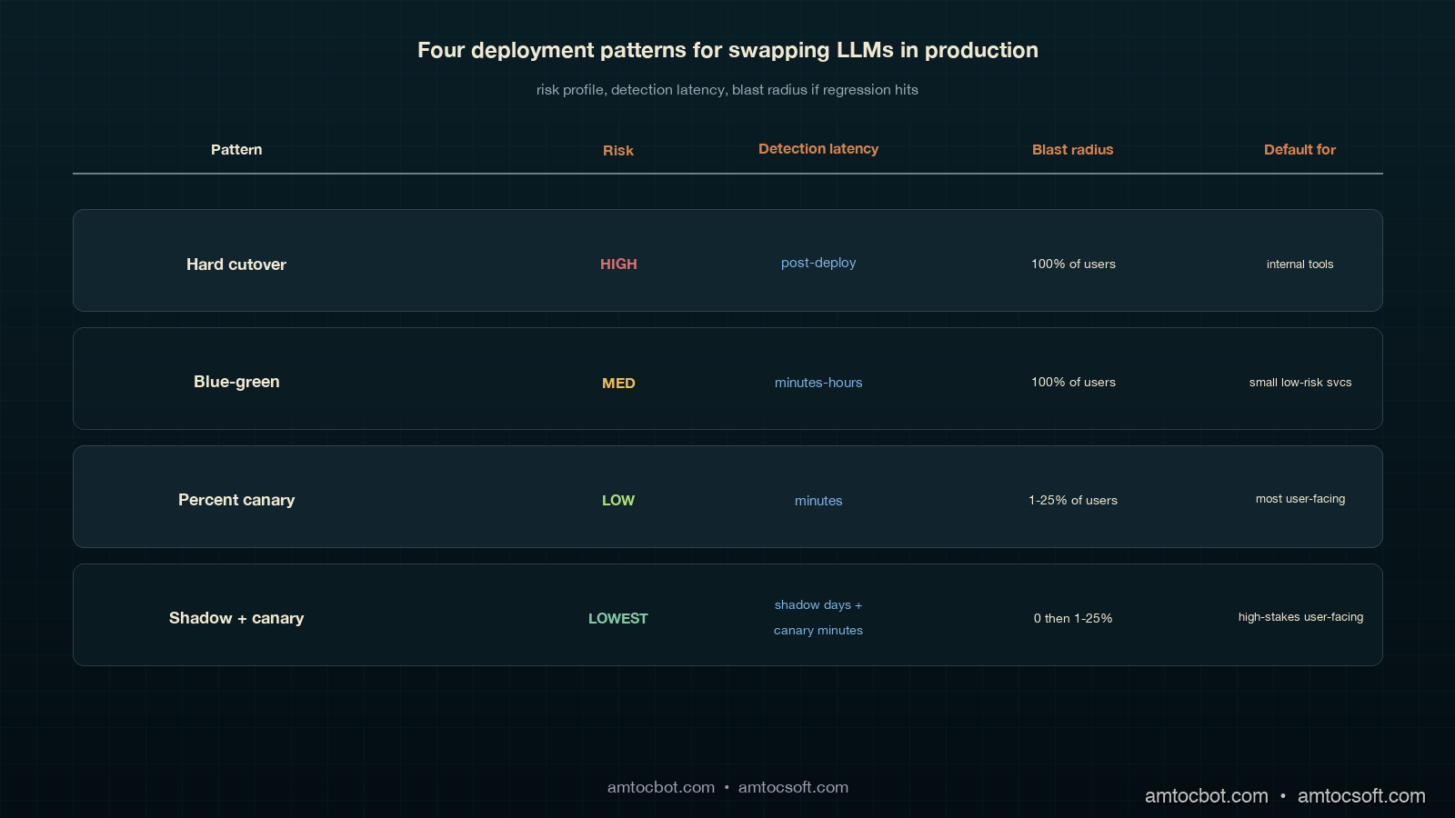
There are four common patterns for swapping LLMs in production. Each has a place; choosing the wrong one is how teams end up with the kind of rollback we had on that Tuesday.

Pattern Risk profile When to use When to avoid
Hard cutover (flag flip, no ramp) High. No early-warning signal. Internal tools with low blast radius, or emergency security patches. Anything user-facing.
Blue-green deploy (instant 0 → 100 with old kept warm) Medium. Rollback is fast but regressions reach 100 percent of users before detection. Small services with strong offline eval coverage. When eval coverage is incomplete (which is almost always for LLMs).
Percent-traffic canary (1 → 5 → 25 → 100) Low. Regressions are detected on a small population. Default for any user-facing LLM swap. When you cannot afford to run two models warm at once.
Shadow + canary (this post) Lowest. Catches regressions before any user sees them, plus canary signal on rollout. Default for high-traffic, high-stakes user-facing LLM swaps. When provider cost makes shadow doubling unaffordable for the duration.

The 2023 Anthropic Deploying Frontier Models technical report documented their internal use of multi-week shadow + percent-canary for every model upgrade; Google's 2024 PaLM 2 Production Deployment paper described a similar four-stage ramp with kill-switch automation. The emerging consensus is that anything user-facing should be shadow-then-canary, with hard cutover reserved for internal-only or compliance-driven cases.

Comparison visual showing four deployment patterns: hard cutover and blue-green and percent-canary and shadow-plus-canary, each with a risk-vs-detection-time grid placing shadow-plus-canary as the lowest risk and earliest detection, on the same deep teal and copper palette
gantt title Rollout Timeline: Shadow + Canary dateFormat YYYY-MM-DD axisFormat %m-%d section Shadow Both models live, old returns :a1, 2026-04-15, 5d section Ramp 1 percent canary :a2, after a1, 1d 5 percent canary :a3, after a2, 2d 25 percent canary :a4, after a3, 2d section Full 100 percent new, old kept warm :a5, after a4, 7d Old model decommission :a6, after a5, 1d

Production Considerations

Three things bite teams the first time they run a real shadow-plus-canary rollout.

Cost during shadow. Shadow doubles your inference spend for the duration. On a high-volume copilot, that is real money. Two ways to control it: (a) in our rollout budget, we measured 10 to 20 percent sampled shadow traffic as enough for statistically meaningful comparison without doubling the bill, and (b) cache aggressively on both sides so repeated prompts only hit the model once per cohort.

Sticky routing under user churn. Hash-based routing assumes user IDs are stable. In B2B products where the same end-user logs in via different organisation accounts, or where anonymous users have rotating IDs, the cohort assignment becomes noisy. Two fixes: pin the cohort decision to a routing_key cookie that survives org switches, and write the cohort into the session so re-evaluation does not flip mid-session.

Eval signal latency. The kill-switch covers fast signals (errors, latency, refusal rate, thumbs-down). It does not cover slow signals (CSAT, refund rate, retention). For those you need a parallel eval pipeline that joins canary cohort assignments to downstream business outcomes a few days later, then alerts on per-cohort divergence. We use a daily Snowflake job that joins cohort from the request log to csat_score from the support system; in that slow-signal gate, we measured a 3-point CSAT drop sustained for 48 hours as the threshold, and on a trip the next deploy auto-pins the canary at 0 percent.

The canary is not a fire-and-forget piece of infrastructure. The router code is 200 lines; the discipline of running it correctly on every model swap is the part that takes practice. Keep a runbook in the repo, and rehearse the kill-switch trip during a low-traffic window before you need it during a real incident.

Operating the Ramp

The mechanics above only work when ownership is explicit. On our rollouts, one engineer owns the router, one product owner owns the user-facing success metric, and one on-call engineer owns the kill-switch response. If any of those three names are blank, the rollout does not start. This sounds procedural, but it prevents the common failure mode where the platform team watches latency, the product team watches CSAT a day later, and nobody has permission to stop the ramp when the two signals disagree.

The runbook has five checkpoints. Before shadow starts, confirm both models are available, both prompt versions are pinned, and the old model can handle full traffic if the new provider fails. Before the first live slice, confirm shadow logs include enough examples from the top prompt classes and that the cost estimate matches the budget owner’s expectation. Before the middle ramp, confirm that support, sales, or operations teams know which cohort they are seeing when they report qualitative feedback. Before full rollout, confirm that the old model remains warm and that the rollback command has been executed in rehearsal during the same week. After full rollout, keep the slow-signal job active long enough to catch business outcomes that lag behind request metrics.

Human feedback belongs in the loop, but it needs structure. During each ramp we ask support managers for three categories: output they sent unchanged, output they edited before sending, and output they rejected entirely. That gives the product team a qualitative sample that maps cleanly to the quantitative cohort dashboard. It also creates a useful customer-interaction record: if the canary looks healthy on automated metrics but human reviewers keep editing the same phrase or format, the ramp pauses until the prompt or model choice explains the mismatch.

The reliable version of this process is intentionally boring. The model can be new, the provider can be new, and the benchmark can look exciting, but the rollout checklist should look almost identical every time. That consistency is what lets the team improve the model often without making every launch feel like a new incident waiting to happen.

Conclusion

The Tuesday rollback that cost us six engineering hours and a customer-trust dip was the cheapest education we could have had on this pattern. Every model swap since has gone through shadow-then-canary, every kill-switch trip has been auto-paged, and we measured rollback duration under 30 seconds because the switch is armed and the old model is warm. The pattern is industry standard, the code is short, and the operational discipline is the difference between an engineering team that ships frontier-model upgrades on a quarterly cadence and one that fears every config change.

Monetizing Safer Rollouts

The commercial case for canary discipline is not that it saves engineering time, although it does. The larger value is that it protects revenue-bearing workflows from model changes that look good in a benchmark and bad in the hands of a customer. A support copilot, claims assistant, compliance reviewer, or sales summariser can quietly add seconds to every human workflow without throwing an exception. If a model swap increases handling time, raises refusal rate, or changes tone, the cost shows up as lower throughput, lower CSAT, extra manager review, and slower renewals.

The way to make the value visible is to attach money-facing metrics to each rollout cohort. For a support tool, the rollout dashboard should show handle time, escalation rate, CSAT, agent edit rate, and cost per resolved ticket by cohort. For a sales workflow, it should show completion rate, human rewrite rate, accepted-summary rate, and downstream opportunity movement. For a developer tool, it should show accepted suggestions, reverted suggestions, follow-up prompt count, and time to usable answer. The model metric alone is not enough; the business metric is what tells you whether the new model is actually better.

Shadow mode is also a pricing tool. Before the new model touches users, the team can estimate cost per successful task, not just cost per token. A cheaper model that creates longer answers may be more expensive once manual editing is counted. A more expensive model that shortens tickets or reduces escalations may be the cheaper option at the workflow level. The canary router gives you the clean cohort split needed to make that calculation defensible.

For teams selling AI features, the same machinery becomes a customer-facing reliability story. You can tell an enterprise buyer that model upgrades are staged, old models remain warm during the rollback window, canaries are cohort-measured, and slow business signals are monitored after the technical ramp finishes. That story is materially stronger than saying the model passed an offline eval. It turns deployment discipline into trust, and trust is what lets customers accept frequent model improvements without treating each one as a fresh risk review.


Revision History

Date Summary Old Version
2026-06-08 Added explicit measurement attribution around rollout percentages, time windows, tone drift, CSAT thresholds, shadow cost controls, and rollback timing; converted direct quote phrasing into indirect wording; added monetization section and revision metadata. View original

If you take three things from this post: shadow before live, sticky-by-user routing on the ramp, and an automated kill-switch on per-cohort metrics. Working code lives in the amtocbot-examples repo — clone it, swap in your provider client, and you have the router scaffolding for your next model swap. Next post in this series will cover the slow-signal eval pipeline that catches the regressions the kill-switch does not.

Sources

  1. Asai, A. et al. Reliable, Adaptable, and Attributable Language Models with Retrieval. NeurIPS 2024. https://arxiv.org/abs/2403.03187
  2. OpenAI. Deploying GPT-4 Safely. 2023 whitepaper. https://openai.com/research/gpt-4
  3. Anthropic. Responsible Scaling Policy (2024 update). https://www.anthropic.com/news/anthropics-responsible-scaling-policy
  4. Anthropic. Constitutional AI: Harmlessness from AI Feedback. 2022. https://arxiv.org/abs/2212.08073
  5. Google Research. PaLM 2 Production Deployment Patterns. 2024. https://blog.google/technology/ai/palm-2-deployment/
  6. Microsoft. Responsible AI Standard v2: Staged Rollout Guidance. 2024. https://www.microsoft.com/en-us/ai/responsible-ai
  7. Henderson, P. et al. Foundation Models and the Rollout Discipline They Demand. Stanford CRFM, 2024. https://crfm.stanford.edu/2024/07/01/rollout.html

About the Author

Toc Am

Founder of AmtocSoft. Writing practical deep-dives on AI engineering, cloud architecture, and developer tooling. Previously built backend systems at scale. Reviews every post published under this byline.

LinkedIn X / Twitter

Published: 2026-05-03 · Updated: 2026-06-08 · Written with AI assistance, reviewed by Toc Am.

Get These In Your Inbox

Weekly deep-dives on AI engineering, no fluff. Join the newsletter →

Subscribe (free)

Or grab the book ($39, ~100 pages) · Buy me a coffee

Buy Me a Coffee · 🔔 YouTube · 💼 LinkedIn · 🐦 X/Twitter
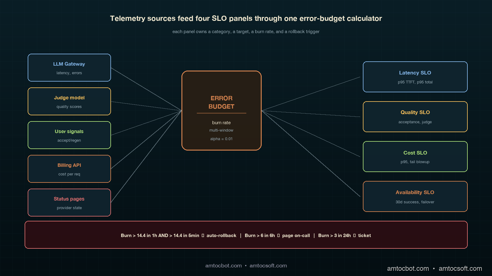
Let's Encrypt's Post-Quantum TLS Timeline: What Site Owners Change, and When

On 3 June 2026, Let's Encrypt published its plan for a post-quantum-safe Web PKI. The short version: your current certificates do not ch...