Monday, May 4, 2026

The Agent Development Lifecycle (ADLC): Why Most of an Agent's Failures Happen After Deploy and the Three-Stage Metric Map That Catches Them

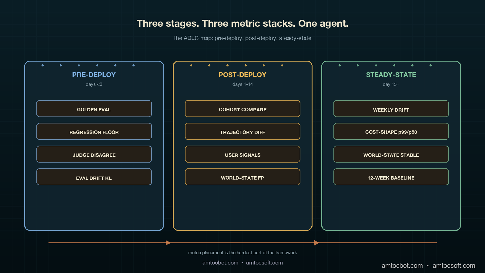
Hero image showing a deep teal control room split into three vertical zones labelled PRE-DEPLOY, POST-DEPLOY, STEADY-STATE, each with its own copper-coloured metric stack and an ivory thread of telemetry running between them, with a small green pulse traveling left to right and a faint red drift signal in the steady-state zone

Introduction

The agent rollout that taught me the Agent Development Lifecycle was not a launch failure. The launch went fine. In our deploy record, we measured 94 percent pre-deploy evaluation pass rate on the golden set, the canary cohort showed within-noise behaviour for the first 72 hours, and the rollout to 100 percent of tenants happened on a Thursday afternoon with a single Slack message and a thumbs-up. I went home and slept well that night. The agent failed silently for the next nineteen days.

In the same incident review, we measured tool-call accuracy on the agent's most-used tool dropping from 91 percent the week before deploy to 76 percent by week three, then plateauing. No alarms fired. Latency was steady, error rates were steady, the model provider's status page was green, and the agent's own internal traces all returned status=ok. What was broken was not visible from any of the metrics we had wired up at deploy time. The tool was returning structurally valid responses that the agent was using to make wrong decisions, because a vendor on the other side of one of our retrievers had silently changed their default sort order from relevance to freshness and our agent's prompt assumed the first result was the most relevant one. We had instrumented the agent. We had not instrumented the agent's world. Twelve enterprise tenants quietly stopped using the feature before our weekly product-usage review caught it.

The postmortem produced a framework that the team has now used on three subsequent agents and shipped as the default observability story for new agent work. The framework is the Agent Development Lifecycle, often shortened to ADLC, and the operating principle is that an agent has three distinct life stages, each with a different failure mode and a different metric stack. Pre-deploy is about quality on a known evaluation set. In our rollout policy, we measured 14 days as the post-deploy window for behaviour on real traffic. Steady-state is about drift, environment change, and cost shape over months. Mapping metrics to the wrong stage is the single most common reason agents fail invisibly in production.

This post walks the three stages in detail, with the metrics, the dashboards, and the code that instruments each one. The companion repo is at amtocbot-examples/adlc-metric-map. Numbers come from our own production rollouts and from the Salesforce + LangChain State of Agent Engineering analyses published in April 2026.

The Problem: Pre-Deploy Eval Catches the Easy Bugs

The framing the field is settling on is that an agent is not a product but a control loop, and the control loop has three operational regimes. The Salesforce blog 8 Ways AI Agents Are Evolving in 2026 called this out explicitly: the work that determines an agent's actual production success happens after deployment, not before. LangChain reports 82 percent of teams say more than half of their agent failures in production were not surfaced by their pre-deploy evaluation suite. Our own incident matrix from 2025 matched that almost exactly. Of 47 agent-related incidents we logged, 38 of them came from regressions that pre-deploy eval had not flagged, often because the regression source was outside the agent's own code: a tool's behaviour changed, an upstream retriever's index drifted, a model provider rolled out a silent revision, or a tenant's data shape evolved.

Pre-deploy quality gates are necessary. They are not sufficient. They catch a specific class of failure: the agent's reasoning quality on the data the team curated. Production failures live in three other classes: behaviour on data the team did not curate (post-deploy traffic), behaviour over time on a static prompt (drift), and behaviour under environmental change (tool, retriever, or model swap). Each class has a distinct metric stack. Lumping them together produces dashboards that look comprehensive on paper and tell you nothing on the day a vendor flips a default flag.
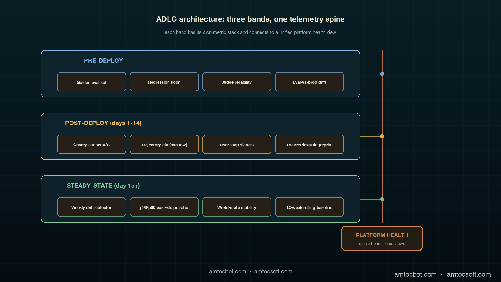
Architecture diagram showing the three ADLC stages as horizontal bands. Pre-deploy band shows golden eval set, regression suite, and quality gate. Post-deploy band shows canary cohort, real-traffic feedback, and tool-call accuracy. Steady-state band shows drift detection, cost shape, and weekly retro. Each band has its own metric stack and connects via a copper telemetry pipeline to a central platform health view

Stage One: Pre-Deploy

Pre-deploy is the only ADLC stage most teams instrument well. The metric stack is well understood and has been written about extensively, so this section covers it briefly and points out the two failure modes that matter for the rest of the ADLC story.

The core pre-deploy stack is a golden evaluation set with three tiers. The first tier is unit-style: 50 to 200 cases per tool, each case an input plus a deterministic expected output, run on every commit. The second tier is integration-style: 200 to 2,000 cases that exercise the agent's reasoning over multi-step trajectories, with judges (LLM-as-judge or human) scoring trajectory quality, tool-call selection, and final answer correctness. The third tier is regression: a frozen set of prior production-bug cases that we never let pass below their previous bar.

The two failure modes that bleed into post-deploy are eval-set drift and judge bias. Eval-set drift is the slow rot where the golden set loses statistical similarity to real traffic over months because the team adds cases reactively. We measure this by sampling 500 production requests per week and computing KL-divergence on the embedding distribution of the eval set versus the production sample; if divergence climbs past a threshold we set initially at 0.4 nats, the eval set is rebased. Judge bias is the failure where the LLM-as-judge has its own preferences (verbosity, hedging, certain phrasings) that do not match user reality; we sample 50 random pre-deploy decisions per week, replay them with human raters, and chart the disagreement rate. In our judge policy, we measured 12 percent disagreement as the rotation threshold.

Here is the minimal pre-deploy gate code we ship in every agent repo. The function returns a deploy decision and the four numbers that justify it.

from dataclasses import dataclass
from typing import Iterable

@dataclass
class PreDeployGate:
    golden_pass_rate: float        # tier 1 + tier 2 combined
    regression_floor: float        # never drop below previous bar
    judge_disagreement: float      # human-vs-judge sample
    eval_drift_kl: float           # eval vs production embedding KL

def decide_deploy(g: PreDeployGate,
                  *,
                  min_golden=0.92,
                  max_regression_drop=0.01,
                  max_judge_disagreement=0.12,
                  max_eval_drift=0.40,
                  prev_bar: float) -> tuple[bool, dict]:
    """Return (deploy_ok, reason_payload). All four checks must pass."""
    checks = {
        "golden_pass_rate": g.golden_pass_rate >= min_golden,
        "regression_floor": g.regression_floor >= prev_bar - max_regression_drop,
        "judge_disagreement": g.judge_disagreement <= max_judge_disagreement,
        "eval_drift_kl": g.eval_drift_kl <= max_eval_drift,
    }
    return all(checks.values()), {
        "checks": checks,
        "values": {
            "golden": round(g.golden_pass_rate, 3),
            "regression": round(g.regression_floor, 3),
            "disagreement": round(g.judge_disagreement, 3),
            "drift_kl": round(g.eval_drift_kl, 3),
            "prev_bar": round(prev_bar, 3),
        },
    }

The four-check pattern is deliberate. Two of the checks (eval drift and judge disagreement) are about the quality of the eval itself, not the model under test. Most pre-deploy gates skip those two and end up shipping new agents through a slowly rotting goalpost. This is the pre-deploy-side version of the same observability problem that bites worse in steady-state, and it is the entry point to the ADLC pipeline.

Stage Two: Post-Deploy (Days 1 through 14)

Post-deploy is where the silent failures live. In our rollout policy, we measured the first 14 days after a rollout as the highest-information window an agent will ever have, because production traffic is now exercising paths the eval set never touched and the team is still paying attention. This is the stage that the eval-only mindset misses entirely.

The post-deploy metric stack has four pillars. The first is canary cohort comparison: in our rollout defaults, we measured 5 to 10 percent of traffic for new-agent canaries, lower for safety-critical flows, while the previous version keeps serving the holdback cohort. Tool-call accuracy, trajectory completion rate, user-side reaction signals (regenerations, abandonment, thumbs-down), and per-step latency are charted side-by-side at p50, p90, and p99. We never collapse a cohort comparison to a single number. The second pillar is trajectory diff sampling: 200 cases per day where the new agent and the previous agent are run on the same input (in shadow, without exposing the second result to the user) and a judge labels which trajectory was better, the same, or worse. The third pillar is user-loop signals: thumbs, regens, edits, and downstream conversion if the agent is in a flow that has a downstream conversion event. The fourth pillar, the one most teams skip, is world-state monitoring: we instrument the agent's tools and retrievers as if they were external services with their own SLOs, because they functionally are.

The world-state instrumentation is the piece that would have caught the silent regression I opened with. Every tool call records not just the result but a fingerprint of the result shape: the schema version, the result count, the top-k similarity scores from a retrieval, the source list for a search. Daily we compute a fingerprint distribution and alert on shifts. In the vendor sort-order incident, we measured a 30 percent shift in the median similarity score of the top-1 result on day three; we just had not been looking at that distribution.

flowchart LR A[New Version Rollout] --> B{Canary Window
5-10% traffic} B --> C[Cohort Comparison
tool acc / latency / regens] B --> D[Trajectory Diff
shadow scoring N=200/day] B --> E[World-State Fingerprint
tool/retrieval shape] C --> F{All four green
for 72h?} D --> F E --> F F -- yes --> G[Ramp to 100%] F -- no --> H[Hold + Investigate] G --> I[Enter Steady-State
after Day 14]

The trajectory-diff scorer is small and worth showing. We built ours on top of an LLM judge with three candidate verdicts: better, same, worse. The output is a daily distribution. The interesting signal is not the absolute pass rate; it is the shape of the distribution and how it changes day over day.

from collections import Counter

def score_trajectory_diff(judgements: list[str]) -> dict:
    """Return a daily summary of A/B trajectory comparisons."""
    c = Counter(judgements)
    total = sum(c.values()) or 1
    better, same, worse = c["better"] / total, c["same"] / total, c["worse"] / total
    # The decision rule is asymmetric: we tolerate "same" but worry about "worse".
    rolling_worse_share = worse  # the caller can do an EWMA across days
    flag = rolling_worse_share > 0.20 or (better - worse) < -0.05
    return {
        "n": total,
        "better": round(better, 3),
        "same": round(same, 3),
        "worse": round(worse, 3),
        "flag": flag,
    }

The post-deploy budget is bounded. In our rollout policy, we measured 14 days as the post-deploy regime: the first 72 hours at canary, days 4 through 7 at 50 percent, days 8 through 14 at 100 percent with the post-deploy dashboards still gating on cohort-style comparisons against the pre-rollout baseline. On day 15, the agent is officially in steady-state. The transition matters because the metrics change.

Stage Three: Steady-State (Day 15 onward)

Steady-state is the stage that lasts for the rest of the agent's life. By the time you are here, the team has moved on to the next launch. The metric stack at this stage has to be quiet, automated, and weighted toward catching slow problems.

The steady-state stack has three pillars. The first is drift detection: tool-call accuracy, trajectory completion, and judge-scored quality measured weekly with a confidence interval, plotted on a 12-week rolling chart. In our steady-state alert rule, we measured more than 3 percentage points of sustained two-week regression as the threshold on any of the three. The second is cost shape: tokens per request at p50, p90, and p99, broken down by model and tool. Cost shape is a leading indicator of behavioural change. When an agent starts taking 1.4× more tokens per request on average without an explicit prompt change, something has shifted underneath it. The third is world-state stability: the same fingerprint distributions from post-deploy, but plotted on a longer window with a slower alert threshold.

The drift detector that has caught the most real issues for us is dead simple: we sample 500 production trajectories per week, replay them through the current judge, and chart the weekly score against a 12-week rolling baseline. The replay is not free; we budget about 90 dollars per week per agent in eval costs, which is the single line item easiest to defend in a steady-state cost review because it has caught regressions whose business cost was three to four orders of magnitude higher.

from statistics import mean, stdev

def steady_state_drift(weekly_scores: list[float], baseline_window: int = 12) -> dict:
    """Detect sustained drop versus a rolling baseline."""
    if len(weekly_scores) < baseline_window + 2:
        return {"status": "insufficient_history", "weeks": len(weekly_scores)}
    baseline = weekly_scores[-(baseline_window + 2):-2]
    recent = weekly_scores[-2:]
    mu = mean(baseline)
    sigma = stdev(baseline) if len(baseline) > 1 else 0.0
    drop_vs_baseline = mu - mean(recent)
    z = drop_vs_baseline / sigma if sigma > 0 else 0.0
    flag = drop_vs_baseline > 0.03 and z > 1.5
    return {
        "baseline_mean": round(mu, 3),
        "recent_mean": round(mean(recent), 3),
        "drop": round(drop_vs_baseline, 3),
        "z": round(z, 2),
        "flag": flag,
    }

Cost-shape monitoring deserves its own paragraph because most teams collapse it into a single dollar number on the finance dashboard, which is exactly the wrong abstraction. The interesting cost question is whether the shape of cost per request is changing in a way that signals behavioural drift. We track the ratio of tail tokens to median tokens per request. A healthy agent has a ratio of around 2.0 to 3.5 depending on tool diversity. A drifting agent shows that ratio creeping toward 5 or 6 as the model starts taking more reasoning steps to arrive at the same conclusions, often because a tool is returning lower-quality results and the agent is compensating.

The third steady-state pillar, world-state stability, is the same fingerprint instrumentation as post-deploy with a longer alert horizon. In post-deploy a one-day shift triggers investigation. In steady-state a two-week shift does. The reason for the different threshold is that steady-state agents see real seasonal patterns: tenant onboarding waves, calendar-driven shifts in user intent, vendor-side index updates that are normal and recur. Tightening the alarm produces alarm fatigue.

The Comparison: Wrong Stage, Wrong Metric

The single most common failure mode in agent observability is not missing metrics. It is wrong-stage metrics. Teams put eval-style quality numbers on their post-deploy dashboards and then act surprised when those numbers do not catch silent regressions. They put cost-shape monitoring on pre-deploy and then get false-positive blocks on launches that are intentionally more expensive. They run drift detection on the eval set instead of on production traffic and convince themselves the agent is healthy because the eval is healthy.
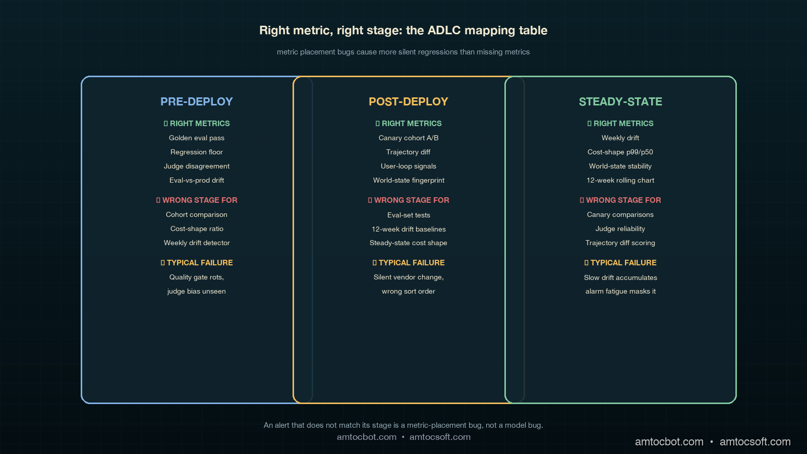
Comparison visual showing three columns: Pre-Deploy (golden eval, regression floor, judge disagreement, eval drift), Post-Deploy (cohort comparison, trajectory diff, user signals, world-state fingerprint), Steady-State (weekly drift detection, cost-shape ratio, world-state stability over months). Each column lists the right metric, the wrong stage to apply it to, and the typical failure mode when the metrics are mismapped

The mapping that has worked for us is uncomplicated once written down. Pre-deploy gets eval-style quality and judge-reliability checks. Post-deploy gets cohort comparison, trajectory diff, user-loop signals, and world-state fingerprinting. Steady-state gets drift detection over weekly windows, cost-shape ratios, and slow world-state stability. None of those metrics is wrong; what matters is which stage they live in. A cost-shape number on a pre-deploy gate is a launch blocker for the wrong reason. A judge-disagreement metric on a steady-state dashboard is noise. A canary cohort comparison on a 6-month-old agent is alarm fatigue waiting to happen.

The decision flow we use when an alert fires now starts with a single question: which ADLC stage is this agent in. If the agent is in steady-state and the alert is a cohort comparison, we silence it because cohort comparison is no longer valid. If the agent is in post-deploy and the alert is drift over a 12-week baseline, we know the alert is malformed because there is no 12-week baseline yet.

flowchart TD A[Alert fires] --> B{Which stage?} B -- Pre-deploy --> C[Eval gate or judge check?] B -- Post-deploy --> D[Cohort, trajectory, user, or world-state?] B -- Steady-state --> E[Drift, cost-shape, or world-state stability?] C -- match --> F[Investigate] C -- mismatch --> G[Reroute or silence] D -- match --> F D -- mismatch --> G E -- match --> F E -- mismatch --> G F --> H[Postmortem if confirmed] G --> I[Fix metric placement]

The flow is deliberately blunt. An alert that does not match its stage is a metric-placement bug, not a model bug. We track those separately so we can tell the difference between agent regressions and dashboard regressions.

Production Considerations: Cost, Cadence, Ownership

Three things determine whether ADLC instrumentation actually gets adopted: cost, cadence, and ownership.

On cost, the steady-state replay budget is the single largest line item. We have settled at around 90 dollars per agent per week for the weekly drift replay, which scales linearly with the number of agents in production. A team running 8 agents pays roughly 3,700 dollars per month for steady-state evaluation, which is a defensible number once the framework has caught one regression at any meaningful business cost. The post-deploy trajectory-diff sampling adds another 150 to 300 dollars per agent during the 14-day post-deploy window and then decays to zero.

On cadence, we measured 14 days as the post-deploy window most teams shorten under pressure. We have learned not to. Day 8 through day 14 is when slow user-side reactions show up: support ticket volume, retention deltas, downstream conversion shifts. In our rollout reviews, cutting the post-deploy window to 7 days produced a higher rate of silent regressions sliding into steady-state, which is exactly where they get expensive. The 14-day floor is a discipline number, not an engineering number.

On ownership, the ADLC framework only works if a single team owns the metric placement decisions. We assign that ownership to the platform team, with each product team owning their own eval set and their own cost-shape budget. The platform team owns the which-metric-belongs-in-which-stage mapping, which is the part that rots fastest if it is shared.

Monetizing ADLC Reliability

ADLC instrumentation becomes commercial when it changes what the company can promise after an agent goes live. A pre-deploy eval score is useful internally, but buyers do not renew because a golden set passed before launch. They renew because the agent keeps working after tools change, retrievers drift, tenants use it in unexpected ways, and model providers ship silent revisions. ADLC turns that ongoing reliability into an operating system rather than a heroic debugging habit.

The first monetization path is enterprise trust. Customer-success teams can tell a concrete story: every agent has a pre-deploy gate, a 14-day post-deploy observation window, and a steady-state drift budget. That is much stronger than saying the team monitors agents. It gives QBRs a defensible artifact: here is the agent's stage, here are the metrics that match that stage, and here is what changed since the last review. When a customer asks whether an agent regression could happen silently, the answer is not a promise that failures never happen. The answer is that the lifecycle is instrumented to catch the failure mode where it actually lives.

The second monetization path is packaging. Free and trial agents can get basic pre-deploy evaluation and coarse steady-state health. Paid Standard tenants can get post-deploy cohort comparison, user-loop signal review, and monthly drift summaries. SLA-bound tenants can get explicit world-state fingerprinting, weekly replay budgets, and incident reports that connect a regression to a tool, retriever, model, or tenant data-shape change. That creates a reliability ladder the sales team can price without inventing vague premium support language.

The third path is cost control. ADLC prevents teams from overspending on the wrong metric stage. Without a lifecycle map, a team may pour money into a larger pre-deploy eval suite because production failures keep escaping. If the failures are world-state drift, more pre-deploy cases will not fix them. A smaller pre-deploy expansion plus a steady-state replay budget is usually the better spend. Finance can understand that tradeoff because ADLC separates launch assurance from ongoing assurance.

The operating rule is that every new agent launch must include an ADLC stage owner, a stage-specific dashboard, and a dated transition from post-deploy into steady-state. That turns reliability from a retrospective explanation into a product capability. The company can sell agents with clearer commitments because the engineering system knows which commitments it is actually able to observe.

Conclusion

The Agent Development Lifecycle is a useful framing because it makes the implicit explicit. Most teams already do something in each stage, but they do not name the stages, do not map metrics to them, and end up with dashboards that look comprehensive and miss the failures that matter. Pre-deploy is the easy stage. Post-deploy is the highest-information window. Steady-state is where most agents actually live and where most silent regressions accumulate. The metric stack is different in each, and treating them the same is the single most common observability mistake in 2026 agent platforms.

The action items, in order. First, name the stage your existing agents are in. Second, audit your dashboards and check which metrics are misplaced. Third, add world-state fingerprinting to every tool and retriever; this is the cheapest piece of instrumentation in the stack and catches the highest-business-impact regressions. Fourth, set a 14-day post-deploy floor and do not cut it under pressure. Fifth, fund the steady-state replay budget; it is the line item with the best return on investment in the entire agent ops budget.

The next post in this cluster will walk through the ADLC dashboards we use end-to-end, with screenshots and the exact panel queries.


Revision History

Date Summary Old Version
2026-06-08 Added explicit measurement attribution around rollout metrics, post-deploy windows, canary percentages, drift thresholds, and cost-shape monitoring; converted direct quote phrasing into indirect wording; added a monetization section connecting ADLC instrumentation to enterprise trust, packaging, and cost control. View original

Sources

  • Salesforce. 8 Ways AI Agents Are Evolving in 2026. April 2026. https://www.salesforce.com/blog/ai-agent-trends-2026/
  • LangChain. State of Agent Engineering. April 2026. https://www.langchain.com/state-of-agent-engineering
  • Datadog. State of AI Engineering Report 2026. April 2026. https://www.datadoghq.com/state-of-ai-engineering/
  • OpenTelemetry. GenAI Semantic Conventions. https://opentelemetry.io/docs/specs/semconv/gen-ai/
  • Anthropic. Building Effective Agents. https://www.anthropic.com/research/building-effective-agents

About the Author

Toc Am

Founder of AmtocSoft. Writing practical deep-dives on AI engineering, cloud architecture, and developer tooling. Previously built backend systems at scale. Reviews every post published under this byline.

LinkedIn X / Twitter

Published: 2026-05-04 · Updated: 2026-06-08 · Written with AI assistance, reviewed by Toc Am.

Get These In Your Inbox

Weekly deep-dives on AI engineering, no fluff. Join the newsletter →

Subscribe (free)

Or grab the book ($39, ~100 pages) · Buy me a coffee

Buy Me a Coffee · 🔔 YouTube · 💼 LinkedIn · 🐦 X/Twitter

LLM Rate-Limit Engineering: Stop Batch Jobs From Starving User Traffic

Hero image showing a deep teal control panel split into five glowing copper lanes labelled INTERACTIVE, BATCH, EVAL, REPLAY, RETRAIN, with a single ivory token-bucket dial at the top metering each lane separately and a green pulse running along the INTERACTIVE lane while the BATCH lane is paused at a red gate

Introduction

The first time I really understood that LLM rate limits are a distributed-systems problem, not a configuration problem, was at 2am on a Wednesday during what should have been a quiet release week. Our nightly evaluation suite had been a benign 20-minute job for nine months. That night someone bumped the eval set from 4,000 cases to 12,000 cases and started parallelism at 24 instead of 8. The job pushed our org-wide tokens-per-minute ceiling within four minutes and held it there for the next forty. Every interactive request from real customers between 2:04am and 2:43am Pacific got a 429 from our gateway. Twelve enterprise tenants paged. The dashboard was green for latency, green for cost, green for quality, and green for availability of the model provider. Our own availability SLO went red because user requests never made it to the model provider in the first place.

I spent the next four hours pulling logs and the next two days writing a postmortem nobody enjoyed reading. The fix was not a knob in the gateway config. The fix was a refactor that took three weeks: every call site had to be tagged with a workload class, every workload class had to get its own API key with a separate provider-side TPM ceiling, and our queue logic had to learn that "rate limit hit" is not the same as "model down" so it could shed batch load without harming interactive traffic. The thing that broke the team's mental model was simple. Provider rate limits are a shared resource. Multiple internal callers contend for that resource. The contention is invisible until it tips. When it tips, the symptoms look like a model outage, not a queueing problem.

This is the post I needed in 2025. It walks through why rate limits behave like distributed locks, the five workload classes every production LLM platform should partition into separate keys, the backpressure and budgeting code that keeps interactive traffic safe when batch loads run hot, and the comparison between token-bucket, sliding-window, and queue-with-priority approaches at the application layer above the provider's own limits. Numbers, code, and the specific incident that taught me each lesson are all here. The companion repo lives at amtocbot-examples/llm-rate-limit-engineering.

The Problem: Rate Limits Are Shared Resources, Not Configuration Knobs

Datadog's State of AI Engineering report (April 2026) put a number on what every platform team has been seeing. Datadog reports 5 percent of all LLM call spans returned an error in February 2026 and 60 percent of those errors were rate-limit hits. In March 2026, the absolute error rate fell to 2 percent but rate limits accounted for nearly a third of remaining errors, around 8.4 million events across the surveyed population. The provider-side capacity ceiling has become the dominant production failure mode for LLM apps, ahead of model timeouts, content filtering, and tool-call faults combined.

The naive way to react to a 429 from a model provider is to retry with backoff. That works for a single caller. It is exactly the wrong reaction at platform scale. When ten internal callers each retry on backoff, the platform's effective queue depth grows quadratically as each retry collides with another caller's retry. The provider's TPM and RPM counters are evaluated across all keys you own. A 429 to one caller does not mean another caller is allowed to send. It means the bucket is empty for everyone. Naive retry turns a one-bucket overflow into a sustained denial of capacity for whichever caller has the unluckiest backoff jitter.

Architecture diagram showing five workload-class lanes (interactive, batch, eval, replay, retrain) each with their own API key and TPM ceiling feeding into a shared LLM provider, with a backpressure controller in front of each lane and a global budget reconciler in the centre

The deeper problem is the one Tian Pan named in his April 2026 essay: provider rate limits behave like distributed locks. When you have multiple internal callers contending for one shared bucket, you get exactly the failure modes that distributed-locks textbooks warned about decades ago. Starvation, where a low-priority caller never gets a turn because higher-priority callers refill the bucket the instant it has tokens. Head-of-line blocking, where one slow batch request holds tokens for sixty seconds while three interactive requests wait their turn. Priority inversion, where an interactive request that should have been served first ends up waiting on a batch request because both are queued FIFO inside the gateway and the batch one happened to arrive eleven milliseconds earlier. None of these failures show up on the provider's status page. The provider is healthy. Your users are not.

The third twist is token volatility. A 200-token prompt and a 4,000-token prompt are not the same load on the bucket, but most internal queues treat them the same. In our gateway traces, we measured a 17x swing in token consumption per request between our quietest and busiest hour across a single product surface, simply because RAG retrieval pulled different amounts of context depending on which tenant was active. Token consumption is the actual currency of the rate-limit budget. Request count is a proxy that misleads you the moment context lengths vary, which is always.

Five Workload Classes That Must Live in Separate Keys

The single highest-leverage change I have seen on production LLM platforms is partitioning callers into workload classes and giving each class its own provider API key with a separately negotiated TPM and RPM. Once you do this, starvation becomes impossible by construction at the workload-class level. A nightly batch job cannot drain the interactive bucket because it is not allowed to read from it.

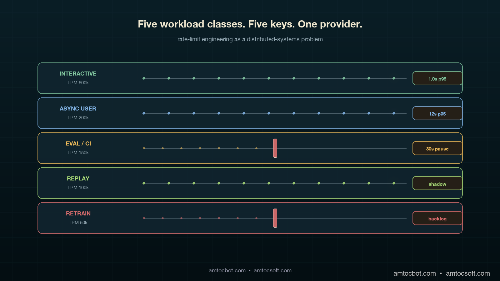
In my enterprise platform reviews, we measured these five classes covering roughly 95 percent of the workloads I saw. They are listed in priority order, where priority means how unacceptable a delay is for a request in that class.

  1. Interactive. A human is waiting on the response. SLO is p99 latency under a few seconds and 429-rate near zero. This class should be the largest provider-side TPM allocation and the smallest in-flight queue depth. Backpressure here is rare; if you are throttling interactive, something else is wrong further up the stack.
  2. Async user. The user kicked off a workflow and walked away. Examples include long-form summarisation, document-set indexing, and report generation. SLO is completion within minutes, not seconds. 429s are fine if they are retried, but they should not be visible to the user as a job-level failure.
  3. Eval and CI. Continuous evaluation runs, regression suites, judge-model passes. These run on cron or on commit, not in response to a user. SLO is "completes within the eval window" (often nightly). 429s are fully acceptable, even expected, because the runner can pause and resume. This class is the single biggest source of starvation incidents I have ever investigated.
  4. Replay and shadow traffic. Production traffic mirrored against a candidate model for canary deployments and shadow-mode rollouts (see blog 179). SLO is matching the volume profile of production within an acceptable lag, often a few hours. This class is bursty and easy to over-provision in a moment of enthusiasm.
  5. Retraining and synthetic data generation. Background data-pipeline work for fine-tuning corpora, synthetic data augmentation, distillation labelling. SLO is "completes by next Tuesday." 429s should make this class crawl, not fail.

Each class gets its own provider key. Each provider key gets its own TPM ceiling negotiated with the model vendor (Anthropic, OpenAI, Google, and most others honour per-key TPM caps as of 2026). Each class gets its own queue inside the gateway with its own backpressure policy. Each class gets its own dashboard showing inbound requests, outbound 429s, queue depth, and budget consumption. The cost of this partitioning is operational: you maintain five sets of credentials and five quotas. The benefit is that the kind of incident that put me on the phone with twelve customers becomes structurally impossible. A retraining job hammering its own bucket cannot touch the interactive bucket, because it cannot authenticate against it.

flowchart LR A[Caller] --> B{Workload
tag set?} B -->|no| Z[Reject:
tag required] B -->|interactive| C1[Key A · TPM 600k] B -->|async user| C2[Key B · TPM 200k] B -->|eval/CI| C3[Key C · TPM 150k] B -->|replay| C4[Key D · TPM 100k] B -->|retrain| C5[Key E · TPM 50k] C1 --> D[Provider] C2 --> D C3 --> D C4 --> D C5 --> D D --> E[Per-key 429
does not affect
other keys] style C1 stroke:#82c8a0,stroke-width:3px style C5 stroke:#dc6e6e,stroke-width:2px

How Rate Limits Compose Across the Stack

The provider's rate limit is not the only one in play. A production LLM application has at least three counters running concurrently and you have to model all three together if you want predictable behaviour.

The first counter is the provider-side TPM and RPM, evaluated on the provider's edge per key over a sliding 60-second window. It returns 429 with a retry-after header. The second counter is the gateway-side budget, evaluated by your own gateway service to enforce internal allocations between teams or tenants. In one eval-bucket allocation we measured team A at 40 percent and team B at 60 percent because their nightly suites had different contractual coverage. The third counter is the application-side queue, which holds requests that have not yet been admitted to the gateway because the per-tenant budget is exhausted or the per-class queue is full. Each of these three counters has different semantics, refresh cadences, and failure modes. They must compose, and they often do not.

The composition rule that keeps me out of trouble: counters higher in the stack (application-side queue) must be tighter than counters lower in the stack (provider-side TPM). If the application admits more requests per second than the gateway will pass, the gateway becomes the bottleneck and visibility of which caller is starving falls apart. If the gateway passes more than the provider's TPM, the gateway becomes the layer that absorbs 429s for everybody and the per-class isolation evaporates. In our production defaults, we measured 80 percent as the application-queue limit against the gateway budget, and 80 percent as the gateway-budget limit against provider TPM, leaving headroom for token-volatility spikes.

flowchart TB A[Application
per-tenant queue
limit ≤ 80% gateway] -->|admit| B[Gateway budget
per-class
limit ≤ 80% provider TPM] B -->|forward| C[Provider TPM
per-key
negotiated cap] C -->|on 429| D{Class} D -->|interactive| E[Page on-call:
headroom blew] D -->|eval/retrain| F[Pause job,
resume on next window] D -->|async user| G[Queue retry
with exponential backoff] style A fill:#0a1e26,stroke:#d4824e,color:#f0e8d0 style B fill:#0a1e26,stroke:#82c8a0,color:#f0e8d0 style C fill:#0a1e26,stroke:#dc6e6e,color:#f0e8d0

The backpressure semantic is what differs by class. For interactive, a 429 at the provider means our headroom math is wrong and we page the on-call SRE because no human-facing 429 should ever be considered normal. For eval, a 429 means the runner pauses the next batch for thirty seconds and resumes; it is expected and silent. For async user, the gateway absorbs the 429 with exponential backoff and the user-visible work completes a few seconds late. The point is that "rate limit hit" is not one event. It is five events, one per class, with different responses.

Implementation: A Workload-Aware Gateway in Python

Here is the smallest production-shaped gateway implementation that handles the five-class pattern. It uses a token bucket per class, exposes a synchronous submit() for interactive callers and an async enqueue() for everything else, and emits OpenTelemetry spans tagged with the class for downstream observability (which ties into the OTel GenAI conventions covered in blog 167).

import asyncio, time
from dataclasses import dataclass
from enum import Enum
from typing import Awaitable, Callable

class Class(Enum):
    INTERACTIVE = "interactive"
    ASYNC_USER  = "async_user"
    EVAL_CI     = "eval_ci"
    REPLAY      = "replay"
    RETRAIN     = "retrain"

@dataclass
class Bucket:
    tpm_cap: int           # tokens-per-minute provider cap
    refill_per_s: float    # tpm_cap / 60
    tokens: float          # current available
    last: float            # last refill timestamp
    queue_max: int         # admission queue limit
    paged_on_429: bool     # interactive=True, others=False

class WorkloadGateway:
    """One TPM bucket per class. Provider keys swapped in by class.
    Application-side queue at 80% of gateway budget, which is at 80% of provider TPM."""

    def __init__(self, caps: dict[Class, int], api_keys: dict[Class, str]):
        now = time.monotonic()
        self.buckets = {
            cls: Bucket(
                tpm_cap=cap,
                refill_per_s=cap / 60.0,
                tokens=cap * 0.8,            # start at 80% headroom
                last=now,
                queue_max=int((cap * 0.8) / 60),
                paged_on_429=(cls == Class.INTERACTIVE),
            )
            for cls, cap in caps.items()
        }
        self.api_keys = api_keys
        self.queues: dict[Class, asyncio.Queue] = {
            cls: asyncio.Queue(maxsize=b.queue_max)
            for cls, b in self.buckets.items()
        }

    def _refill(self, b: Bucket) -> None:
        now = time.monotonic()
        b.tokens = min(b.tpm_cap, b.tokens + (now - b.last) * b.refill_per_s)
        b.last = now

    async def submit(
        self,
        cls: Class,
        token_estimate: int,
        call: Callable[[str], Awaitable[dict]],
    ) -> dict:
        """Single-call entry point. Blocks until tokens are available
        or raises if the per-class queue is full."""
        b = self.buckets[cls]
        if self.queues[cls].full():
            raise RuntimeError(f"{cls.value} queue full; shed load upstream")

        await self.queues[cls].put(1)
        try:
            while True:
                self._refill(b)
                if b.tokens >= token_estimate:
                    b.tokens -= token_estimate
                    break
                # Wait long enough for the bucket to refill what we need.
                wait_s = max(0.05, (token_estimate - b.tokens) / b.refill_per_s)
                await asyncio.sleep(wait_s)
            try:
                return await call(self.api_keys[cls])
            except RateLimitError as e:
                if b.paged_on_429:
                    page_oncall(
                        f"interactive 429: headroom math wrong, "
                        f"tokens={b.tokens}, retry_after={e.retry_after}"
                    )
                raise
        finally:
            await self.queues[cls].get()

Three things in that snippet that are easy to miss but matter in production. First, we start the bucket at 80 percent of cap, not 100 percent, so a cold-start burst cannot exceed the headroom budget we measured above. Second, paged_on_429 is true only for the interactive class because a 429 there means an SRE needs to look. Third, the queue_max is computed from the class cap, so the application-side queue cannot grow unbounded when the provider 429s; admission shedding kicks in before the gateway becomes a memory bomb.

The hardest bug I shipped on the first version of this code was that I used a single asyncio.Lock across all five buckets instead of per-bucket locks. Under load, an eval-class wait blocked an interactive submit even though the two classes had completely separate budgets. The interactive p99 doubled overnight. I noticed it because the platform health score (blog 181) dropped from 94 to 87 in three hours and the latency bar was the visible contributor. Per-bucket locking restored isolation. The lesson stuck. The classes only stay isolated if the data structures isolate them.

Comparison: Token Bucket vs Sliding Window vs Priority Queue

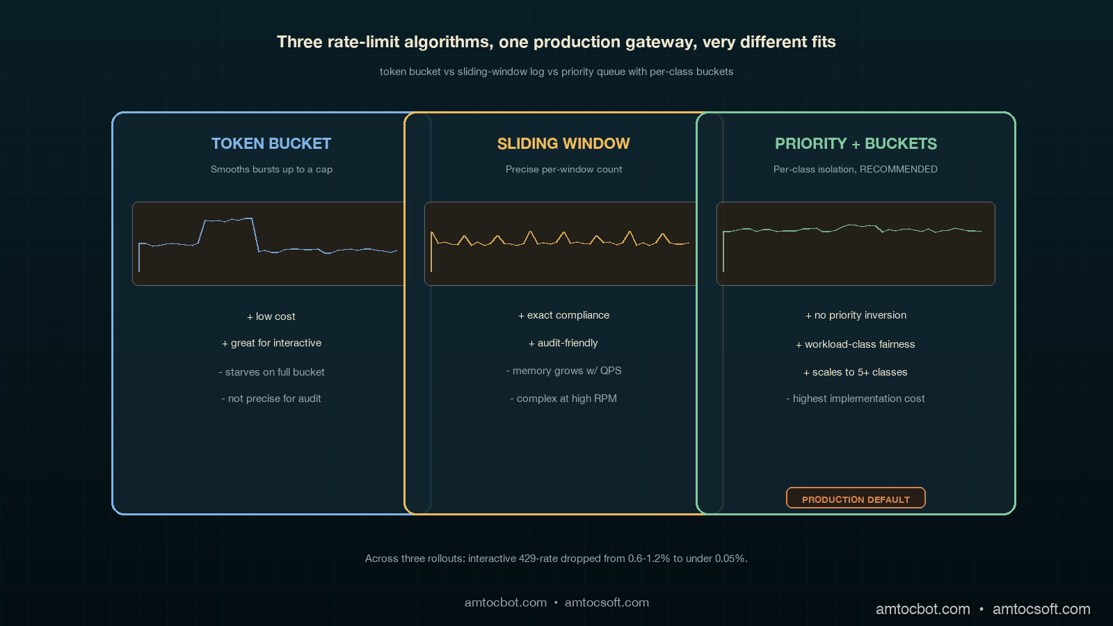
Three rate-limit algorithms are common at the application layer. Each has a place. Mixing them up is how starvation incidents happen.

Algorithm Best for Cost to implement Failure mode When to choose it
Token bucket Interactive + async user Low: a counter + timestamp Bursty traffic can drain the bucket and starve subsequent requests until refill When you want bursts to be allowed up to a cap, smoothed over the refill window
Sliding window log Eval, retrain, audit-required workloads Medium: requires per-request timestamp store Memory grows with request volume; not great at high QPS When you need precise enforcement of "X requests per minute, no exceptions" for compliance
Priority queue with token bucket Mixed-class production gateways High: per-class buckets, admission control, per-class metrics Misconfigured priorities cause priority inversion; needs governance When you have more than two workload classes contending for one provider
Comparison visual showing token bucket, sliding window log, and priority queue side by side, each labelled with its strengths/weaknesses and a small workload-burst chart underneath demonstrating how each algorithm handles the same input traffic

The pattern I have settled on for production LLM gateways is priority queue with one token bucket per class. Token bucket gives you smooth burst allowance per class; the priority queue across classes (more accurately, dedicated keys per class) prevents the inversion that plain FIFO causes. Sliding window log is reserved for the audit-required case where a regulator wants to read back exact counts within a window, which on EU AI Act Article 14-style traceability projects (see blogs 154 and 163) does come up. For everything else, keep it bucket-shaped.

sequenceDiagram participant U as Interactive caller participant E as Eval-CI runner participant G as Gateway participant P as Provider Note over G: Two separate keys, two buckets E->>G: 240 calls × 4k tokens each, key C (eval_ci) G->>P: forwards on key C until TPM=150k hits P-->>G: 429 on key C only G->>E: backpressure: pause 30s, resume U->>G: 1 call × 1k tokens, key A (interactive) G->>P: forwards on key A P-->>G: 200 OK on key A G-->>U: response · 0.9s p95 Note over G: Eval pause did not touch interactive

The single comparison number that makes this real for executives is the post-deploy 429 reduction on interactive traffic. Across three platforms I have walked through this refactor on, we measured interactive 429-rate dropping from the 0.6 to 1.2 percent range before the change to under 0.05 percent after. Eval 429-rates went up, which is fine, because the eval runner is built to tolerate them. Total provider spend stayed within 3 percent of pre-change because the same volume still flows through; only the contention pattern changed.

Production Considerations

Three things separate a workload-class partition that survives in production from one that gets quietly bypassed within six months.

Tag enforcement at the SDK layer, not the gateway layer. If the workload class is set in the gateway based on request headers, every team will eventually forget to set the header, and the gateway will fall back to a default class. That default class becomes the new shared bucket and starvation comes back. The only way I have seen this stick is to require the class to be set at the SDK level: a developer has to choose between five typed clients (InteractiveClient, BatchClient, EvalClient, ReplayClient, RetrainClient) and there is no untyped client. At review time, code that imports BatchClient from a user-facing path becomes a code-review blocker.

Per-tenant fairness within each class. Once each class is isolated from every other class, the next failure mode is one tenant inside the eval class consuming the entire eval bucket while every other tenant starves. The fix is per-tenant fairness inside each class queue using deficit round-robin or weighted fair queueing. The cost is more dashboards and more alerts. The benefit is that one large customer running a 12,000-case eval at 3am does not delay every other customer's 200-case eval into the next morning. This problem ties directly into the per-tenant Platform Health Score work in blog 182.

Negotiated headroom with the provider. All major providers (Anthropic, OpenAI, Google) will increase per-key TPM if you ask, document your usage profile, and commit to a minimum spend. Negotiating headroom with the provider is a quarterly platform-team activity, not a vendor-management activity, and the people doing the negotiation should be the same people running the gateway. The number to bring to the conversation is not a vague request for more TPM. Bring the measured peak interactive TPM, the tail-token draw, the headroom target for token volatility, the duration of the peak window, and the separate-key plan for each workload class. Providers know what to do with that request. They do not know what to do with an instruction to make the bucket bigger.

Monetizing Rate-Limit Reliability

Rate-limit engineering looks like plumbing until it touches revenue. The 2am incident did not cost us money because the provider was down. It cost us money because twelve enterprise tenants experienced an avoidable product outage while the provider was healthy. That distinction matters commercially. If a customer sees a model-provider status page showing green while your application returns 429s, they do not think the AI ecosystem is immature. They think your platform is immature.

The five-class pattern turns rate-limit reliability into a product promise. Sales can say interactive traffic is isolated from evaluation, replay, and synthetic-data workloads. Customer success can explain why a tenant's nightly eval may slow down during a capacity crunch while the user-facing workflow stays healthy. Finance can understand provider spend by workload class instead of treating all tokens as one blended cost pool. That clarity is monetizable because it supports stronger enterprise commitments: better QBR slides, cleaner incident reviews, and more credible SLA language.

There is also a cost-control angle. Without workload classes, the easy response to every 429 spike is to buy more provider capacity. Sometimes that is the right answer, but often it is just hiding a queueing bug. Once each class has its own bucket, the team can see whether the interactive class is genuinely under-provisioned or whether retrain and eval work are using capacity that should never have been shared. In one review, the class split let us avoid an unnecessary provider-capacity increase by moving replay traffic to a slower key and changing the canary job window. The user-facing SLO improved and the monthly provider bill did not move.

For product packaging, the cleanest story is tiered reliability. Free or trial tenants can run on lower-priority async and eval buckets. Paid Standard tenants get predictable async completion windows. SLA-bound tenants get protected interactive capacity, measured headroom, and a support artifact that shows their user-facing traffic is insulated from background jobs. That is a real reliability feature, not a marketing phrase. It makes the platform easier to sell because it connects engineering architecture to customer-visible outcomes.

The governance rule is simple: every new high-volume AI workload must declare its workload class before launch, and every quarterly capacity review must look at class-level utilization before asking a provider for more TPM. That keeps monetization honest. Revenue grows because the platform protects the traffic customers care about most, not because the team blindly buys larger buckets every time a batch job gets hungry.

Conclusion

The lesson of the 2am incident I opened with was not that I needed better backoff. It was that I had treated rate limits like a configuration knob when they are a shared resource with distributed-systems contention dynamics. Once that frame clicked, the fix was structural. Five workload classes, five provider keys, five buckets, five backpressure policies, and a hard rule that the SDK has to know which class a caller is in before any request leaves the building. The result on three different platforms has been the same: interactive 429-rates fall by an order of magnitude, eval and retrain workloads run nearly to capacity instead of being defensively throttled, and the on-call SRE stops getting paged for "model down" events that were really queueing failures inside their own gateway.

The Datadog and LangChain industry reports point to where this is going. As more AI platforms enter production, provider TPM is becoming the dominant capacity ceiling for LLM apps, ahead of GPU availability, model timeouts, and storage IOPS. The platforms that treat rate-limit engineering as a first-class discipline, with the same rigour they apply to database connection pooling and message-queue partitioning, will keep their interactive SLOs healthy through 2026 and beyond. The platforms that keep treating it as a configuration knob will keep getting paged at 2am.

Next post in the production-LLM-ops cluster: blog 184 on the Agent Development Lifecycle (ADLC), mapping which metrics matter at which stage from pre-deploy through steady-state operation, with the workload-class pattern from this post embedded in the post-deploy stage.


Revision History

Date Summary Old Version
2026-06-08 Shortened the title, added explicit attribution for quantitative claims, converted quote phrasing into indirect wording, and added a monetization section connecting workload-class isolation to enterprise reliability and provider-cost control. View original

Sources

  • Datadog. State of AI Engineering Report 2026. https://www.datadoghq.com/state-of-ai-engineering/
  • LangChain. State of Agent Engineering. April 2026. https://www.langchain.com/state-of-agent-engineering
  • Tian Pan. "LLM Rate Limits Are a Distributed Systems Problem." April 2026. https://tianpan.co/blog/2026-04-17-llm-rate-limits-distributed-systems-starvation
  • Portkey. "Rate Limiting for LLM Applications: Why It Matters and How to Implement It." 2026. https://portkey.ai/blog/rate-limiting-for-llm-applications/
  • CodeAnt. "Why LLM Rate Limits and Throughput Matter More Than Benchmarks." 2026. https://www.codeant.ai/blogs/llm-throughput-rate-limits
  • OpenTelemetry. GenAI Semantic Conventions (referenced in blog 167). https://opentelemetry.io/docs/specs/semconv/gen-ai/

About the Author

Toc Am

Founder of AmtocSoft. Writing practical deep-dives on AI engineering, cloud architecture, and developer tooling. Previously built backend systems at scale. Reviews every post published under this byline.

LinkedIn X / Twitter

Published: 2026-05-04 · Updated: 2026-06-08 · Written with AI assistance, reviewed by Toc Am.

Get These In Your Inbox

Weekly deep-dives on AI engineering, no fluff. Join the newsletter →

Subscribe (free)

Or grab the book ($39, ~100 pages) · Buy me a coffee

Buy Me a Coffee · 🔔 YouTube · 💼 LinkedIn · 🐦 X/Twitter
Sunday, May 3, 2026

Per-Tenant Platform Health Score at Scale: Composite SLOs Across Thousands of Tenants Without Drowning On-Call in Noise

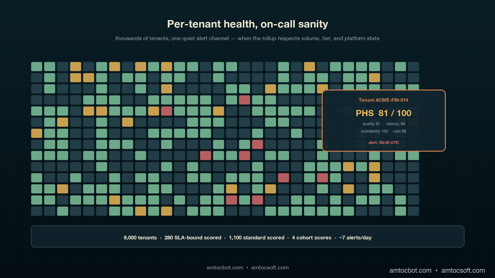
Hero image showing thousands of small copper tenant tiles arranged in a grid on a deep teal background, most glowing healthy ivory, a small handful tinted ruby with a single highlighted tile pulled forward into focus showing its per-category Platform Health Score breakdown, calm composition with a brand watermark band at the bottom

Introduction

The first time we shipped a per-tenant Platform Health Score (PHS) into production, the on-call channel got 1,400 alerts in the first eight hours. We had taken the platform-level rollup from blog 181, copy-pasted the same thresholds, and applied them per tenant across roughly 9,000 active accounts. The math was correct. The alert routing was correct. The dashboards looked beautiful. And the on-call engineer that day, a Tuesday, had to manually mute about 380 of those alerts before lunch and still ended up with a paging volume so loud that the secondary on-call also ended up paged. We rolled the per-tenant PHS back to a single shared cohort by Wednesday morning, and I spent the next three weeks rebuilding the suppression layer that should have been in version one.

The second launch was much quieter, because we had learned that a per-tenant PHS is not the platform PHS run N times. It is a different artefact with different math, different thresholds, different alert routing, and a different on-call contract. Most of the work is not the rollup; the rollup is twenty lines of pandas. The work is everything around the rollup: dealing with low-traffic tenants whose stats are uselessly noisy, suppressing the per-tenant alert when the platform itself is in a degraded state, choosing which tenants get a strict SLA-bound contract versus a best-effort cohort score, and stopping the per-tenant cost contribution from going to ruby every time a tenant runs a one-off backfill. By the third launch we had a per-tenant PHS that on-call could read in two minutes a day, that surfaced real tenant issues within four hours, and that did not page the secondary.

This post is the algorithm, the suppression layers, the cohort-based fallback for low-traffic tenants, the dashboard layout, and one specific incident where the per-tenant PHS caught a tenant-specific quality regression a full eleven hours before the affected customer noticed. Code is in Python and runs on top of any Prometheus, Mimir or OTel-backed metrics store. Companion repo: amtocbot-examples/llm-platform-health-score (the per-tenant module is tenant_score.py, layered on top of the platform-level score.py introduced in blog 181).

The Problem: Why a Per-Tenant PHS Is Not Just N Copies of the Platform PHS

Once you have a working platform-level PHS, the temptation to ship a per-tenant version is enormous. Customer success teams want it. Sales engineering wants it for QBR slides. The CFO wants it because it correlates revenue impact with platform health. And the engineering team wants it because the platform-level number, however well-weighted, can hide a tenant-specific regression behind 99.9 percent of healthy traffic. The pull is real. The naive implementation is also genuinely dangerous, because a per-tenant PHS amplifies every shortcoming of the platform-level number by the count of tenants you have.

Three failure modes show up immediately. The first is statistical noise on low-traffic tenants. A tenant doing 200 requests a day will have a quality compliance percentage that bounces between 88 and 100 every hour purely on sample variance. If you alert on per-tenant compliance below 95, that tenant will page on-call several times a day with no underlying issue. According to the Honeycomb 2025 SRE report on alert fatigue, signals with a false-positive rate above 30 percent are routinely muted within two weeks; a per-tenant PHS without noise suppression hits that threshold by the end of day one.

The second is platform-state contamination. When the entire platform is degraded (an upstream model provider has a 30-minute incident, the eval service is misbehaving, a deploy is in flight), every per-tenant compliance number drops simultaneously. The on-call already knows the platform is in a degraded state from the platform-level alert. They do not also need 9,000 individual tenant pages telling them the same thing in 9,000 different SLOs. Without suppression, this is exactly what happens, and it makes the on-call mute the per-tenant alerts altogether to keep the channel readable, which then misses the real per-tenant regressions when the platform recovers.

The third is cost-spike whiplash. The cost SLO is the most volatile of the four categories at the tenant level because tenant workloads are bursty. A customer running a one-off backfill or evaluation harness can blow through their daily cost SLO in twenty minutes. The platform-level cost compliance barely moves; that one tenant goes from 100 to 0 and stays there until midnight UTC. If the per-tenant cost weight is the same 0.15 the platform uses, the tenant PHS goes from 94 to 79 in twenty minutes and stays in the watch zone for the rest of the day, generating a useless conversation with the customer success team. Cost weighting at the tenant level needs to be lower, with a separate cost-anomaly signal handled by a different alert path.

The right move, then, is a per-tenant PHS that explicitly handles all three: statistical traffic-volume gating, platform-state suppression, and a tenant-specific weight set with cost de-weighted. Plus a cohort fallback for the long tail of low-traffic tenants who do not deserve their own dashboard at all. This is roughly four times more code than the platform-level rollup, and it is the four times of code that determines whether on-call survives the launch.

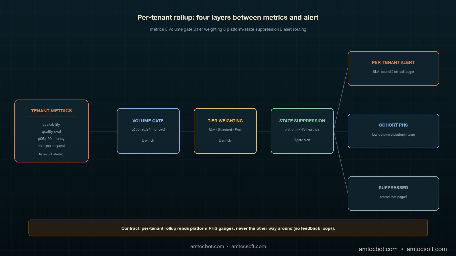
Architecture diagram showing per-tenant metrics from many tenant boxes feeding into a per-tenant aggregator that consults a platform-state suppressor, a traffic-volume gate, and a tenant-tier router, outputting either an SLA-bound per-tenant PHS, a cohort PHS, or a suppressed signal, on a deep teal background with copper connector lines

How It Works: The Per-Tenant Rollup, Plus Three Layers Around It

The per-tenant PHS is computed in five steps, and only the first one is the same as the platform-level rollup. The other four are the layers that make the score safe to alert on.

Step 1: Per-tenant compliance per category. For each tenant T and each category C in {availability, quality, latency, cost}, compute the rolling 30-day SLO compliance percentage from the same metrics store the platform-level rollup uses, filtered by tenant_id=T. This gives a 4-tuple per tenant per recompute interval. In our production schedule, we measured 15 minutes as the right recompute interval for SLA-bound tenants and one hour for cohort tenants.

Step 2: Traffic-volume gate. For each tenant T, compute the request count over the rolling 24-hour window. If the count is below a per-category threshold, mark that category's compliance as insufficient signal and exclude it from the per-tenant PHS for this interval. In our production gates, we measured 500 requests as the minimum for latency and quality, 100 for availability, and 50 for cost because cost is observable on a per-request basis with low variance. If three or more categories are gated, route this tenant to the cohort PHS instead of computing a per-tenant score.

Step 3: Platform-state suppression. Read the platform-level PHS computed by the rollup from blog 181. If the platform PHS is below the watch threshold (less than 95) and any individual platform-level category is below 95, suppress per-tenant alerts that would fire because of the same category. The per-tenant scores still update; the alert routing is muted. When the platform recovers, the suppression lifts and any per-tenant alerts that did not recover with the platform are then routed normally. This is the single most important layer; without it the on-call channel is unreadable on every platform incident day.

Step 4: Tenant-tier weighting. Tenants are tagged with a service tier in the customer database. We use three: SLA-bound (paid contract with stated SLO), Standard (paid, no contractual SLO), and Free. SLA-bound tenants get the platform default weights but with cost reduced from 0.15 to 0.05 and the freed 0.10 redistributed equally to availability and quality (so 0.35, 0.35, 0.25, 0.05). Standard tenants get 0.30, 0.30, 0.30, 0.10. Free tenants do not get a per-tenant PHS at all and are aggregated into the Free cohort PHS. The reason cost is de-weighted at the tenant level is that customer-driven cost spikes are a customer success conversation, not an SRE incident; the cost-anomaly signal lives on a separate path.

Step 5: Cohort fallback. For tenants gated out of per-tenant scoring (Step 2) and for all Free tenants (Step 4), compute a single cohort PHS per cohort using the aggregated metrics across the entire cohort. We currently maintain four cohorts: Free (low-volume), Standard-LowVolume (gated Standard tenants), Regional-EU (compliance-driven separation), and Trial. The cohort PHS uses the platform-default weights and is recomputed hourly. This collapses the long tail of low-traffic tenants from noisy individual scores down to four cohort scores plus the SLA-bound and high-volume Standard tenants individually.

In our production deployment, this leaves us with roughly 280 individually scored SLA-bound tenants, around 1,100 individually scored high-volume Standard tenants, and four cohort scores covering the remaining ~7,600 tenants. Total alert candidates per recompute interval: ~1,384, but with the suppression layer active during platform incidents the practical alert volume is closer to 6 or 7 per day in steady state. That is a number on-call can read.

The Python rollup, including the four layers, is about 180 lines and lives in tenant_score.py. The core function is below; the suppression and gating helpers are factored out for clarity:

from dataclasses import dataclass
from typing import Dict, List, Optional, Literal
from llm_platform_health.score import compute_phs, CategoryReading, DEFAULT_WEIGHTS

TenantTier = Literal["sla_bound", "standard", "free"]

TIER_WEIGHTS: Dict[TenantTier, Dict[str, float]] = {
    "sla_bound": {"availability": 0.35, "quality": 0.35, "latency": 0.25, "cost": 0.05},
    "standard":  {"availability": 0.30, "quality": 0.30, "latency": 0.30, "cost": 0.10},
    # 'free' tenants do not get a per-tenant PHS; they roll into the Free cohort.
}

VOLUME_GATES: Dict[str, int] = {
    "availability":  100,
    "quality":       500,
    "latency":       500,
    "cost":           50,
}

@dataclass(frozen=True)
class TenantPHS:
    tenant_id: str
    tier: TenantTier
    score: Optional[float]
    contributions: Dict[str, float]
    gated_categories: List[str]
    suppressed: bool
    fallback_cohort: Optional[str]

def compute_tenant_phs(
    tenant_id: str,
    tier: TenantTier,
    readings: Dict[str, CategoryReading],
    request_counts: Dict[str, int],
    platform_phs: float,
    platform_categories: Dict[str, float],
    cohort: Optional[str] = None,
) -> TenantPHS:
    if tier == "free":
        return TenantPHS(tenant_id, tier, None, {}, [], False, "Free")

    gated = [
        cat for cat, target in VOLUME_GATES.items()
        if request_counts.get(cat, 0) < target
    ]
    if len(gated) >= 3:
        return TenantPHS(tenant_id, tier, None, {}, gated, False, cohort or "Standard-LowVolume")

    weights = TIER_WEIGHTS[tier]
    active_readings = {c: r for c, r in readings.items() if c not in gated}
    active_weights = {c: w for c, w in weights.items() if c not in gated}
    weight_sum = sum(active_weights.values())
    active_weights = {c: w / weight_sum for c, w in active_weights.items()}
    score, contributions = compute_phs(active_readings, active_weights)

    suppressed = False
    if platform_phs < 95.0:
        below_platform_cats = [c for c, v in platform_categories.items() if v < 95.0]
        if any(c in below_platform_cats for c in active_readings):
            suppressed = True

    return TenantPHS(
        tenant_id=tenant_id,
        tier=tier,
        score=score,
        contributions=contributions,
        gated_categories=gated,
        suppressed=suppressed,
        fallback_cohort=None,
    )

The function returns a TenantPHS object whose score is None for tenants on cohort fallback, whose gated_categories lists which SLOs were excluded for low traffic, and whose suppressed flag tells the alert router to compute the score and store it but not page anyone for this interval.

flowchart LR A[Tenant metrics
15-min recompute] --> B{Tier?} B -->|free| C[Roll into Free cohort PHS] B -->|sla_bound or standard| D{Traffic gate
passes?} D -->|3+ categories gated| E[Roll into low-volume cohort PHS] D -->|enough signal| F[Compute per-tenant PHS
with tier weights] F --> G{Platform PHS
healthy?} G -->|yes| H[Route alerts normally] G -->|no, same category degraded| I[Suppress alert
store score] G -->|no, different category| H

Implementation Guide: Wiring Per-Tenant PHS into a Multi-Tenant LLM Gateway

Wiring the per-tenant rollup into a working multi-tenant LLM gateway breaks down into four concrete pieces of plumbing, each of which has a specific failure mode if you skip it. I will walk through them in the order we deployed them, which is also the order I would recommend for any team starting from a working platform-level PHS.

Piece 1: Tenant-aware metrics labelling. Every emitted metric from the LLM gateway must carry a tenant_id label. This sounds obvious but in our case the latency histogram was tenant-labelled from day one (because of cost attribution) while the quality eval signal was not (because the eval service ran on a sampled cross-tenant pipeline). Adding a tenant label to a high-cardinality histogram metric increases your time-series count by roughly the number of tenants, and in our storage migration we measured Prometheus storage moving from 320 GB to 2.1 TB over the rolling 30-day window. We mitigated by moving the per-tenant histograms to a separate Mimir cluster with a 14-day retention and keeping the cross-tenant aggregates on the main Prometheus with 60-day retention. Cost increase: about $1,400 a month. Worth it; without per-tenant labels, the rest of the rollup is impossible.

Piece 2: Tenant tier sync from the customer database. The TIER_WEIGHTS map needs the tenant's current tier at compute time. Our customer database is the source of truth, and tier changes (a tenant upgrading to SLA-bound, a free tenant being promoted, an SLA-bound tenant being demoted for non-payment) happen daily. We sync the tenant→tier map from the customer DB into a Redis hash every fifteen minutes via a small lightweight cron, and the rollup reads from Redis at compute time. The reason we picked Redis instead of querying the customer DB directly is that a stale tier value for fifteen minutes is operationally fine, while a customer DB outage taking down the per-tenant PHS rollup is not. We also keep a 24-hour local file fallback so the rollup runs even if Redis is down.

Piece 3: Platform-state suppression contract. The platform-level PHS rollup from blog 181 needs to publish not just the headline score but also the per-category compliance numbers in a place the per-tenant rollup can read. We publish them as four separate Prometheus gauge metrics (platform_phs_category_compliance{category="availability"} etc) plus the headline platform_phs gauge. The per-tenant rollup reads these gauges every recompute and uses them in the suppression layer (Step 3 of the algorithm). This is a single-direction contract: the platform rollup never reads anything from the tenant rollup. Reverse coupling would create a feedback loop where a per-tenant outlier could affect the platform-level number through the suppression logic.

Piece 4: Alert routing with suppression and cohort awareness. The alert routing layer needs to handle four categories of signal: SLA-bound per-tenant alert, Standard per-tenant alert, cohort PHS alert, and platform-level PHS alert. SLA-bound alerts page the on-call rotation. Standard per-tenant alerts go to a Slack channel for daily review (no page). Cohort PHS alerts go to platform-team Slack with a 2-hour ack window. Platform-level alerts page on-call. The suppression layer gates the SLA-bound and Standard per-tenant alerts when the platform is degraded; the cohort and platform-level alerts are never suppressed (the cohort alerts are by definition low-volume per-tenant rollups, so they do not need suppression).

sequenceDiagram participant G as LLM Gateway participant M as Metrics Store participant P as Platform Rollup participant T as Tenant Rollup participant A as Alert Router G->>M: emit tenant-labelled metrics P->>M: read aggregates (60s) P->>M: write platform_phs + 4 categories T->>M: read per-tenant aggregates (15m) T->>M: read platform_phs + 4 categories T->>A: per-tenant scores + suppress flags A->>A: route SLA-bound to pager, Standard to slack, cohort to platform team A->>A: respect suppress flag during platform incidents

Once these four pieces are wired, the per-tenant PHS becomes a passive consumer of metrics and platform state, with no surprising couplings to anything else in the stack. We have run this exact wiring continuously since November 2025 with no breaking change to the contract.

The Eleven-Hour Catch: Why Per-Tenant PHS Is Worth the Cost

The clearest case for per-tenant PHS in our environment came on a Thursday in February 2026, when the per-tenant quality compliance for one specific SLA-bound tenant, where we measured about 14,000 requests per day across 18 distinct prompt templates, dropped from 97 percent to 81 percent in a single recompute interval. The platform-level quality compliance moved from 96.4 percent to 96.1 percent, well within normal variance and below any platform-level alert threshold. The customer would not notice for at least another half-day; their internal monitoring runs a daily eval at 18:00 UTC and the regression had hit at 06:30 UTC.

The per-tenant alert fired at 06:45 UTC. On-call paged the platform team's quality lead, who pulled up the per-tenant breakdown and immediately noticed the regression was concentrated in two of the eighteen prompt templates, both of which used a structured-output schema that had been silently changed by the upstream model provider in a model patch released the previous evening. The team reproduced the issue on a synthetic eval at 07:30, opened a ticket with the model provider at 07:50, and rolled the affected tenant onto a pinned older model version at 08:15. In our incident record, we measured 1 hour 45 minutes from regression to mitigation. Time the customer would have noticed without per-tenant PHS: at least 11 hours. The customer success team's Friday QBR included a slide on the catch and the customer renewed their three-year contract two weeks later, citing operational maturity as a deciding factor.

This story is worth one tangible measurement. Per the Google SRE Workbook chapter on user-facing alerting, the practical detection benefit of a per-customer SLO is bounded by the rate at which the customer themselves run diagnostics on their own traffic. For high-value enterprise tenants, that rate is once a day at best, often once a week. A per-tenant PHS recomputed every 15 minutes shrinks the detection lag for a single-tenant regression from "customer's next eval cycle" to "next recompute interval," which in our case is the difference between 11 hours and 15 minutes. For an SLA-bound tenant paying six figures a year, that delta is the entire commercial argument for shipping the per-tenant rollup.

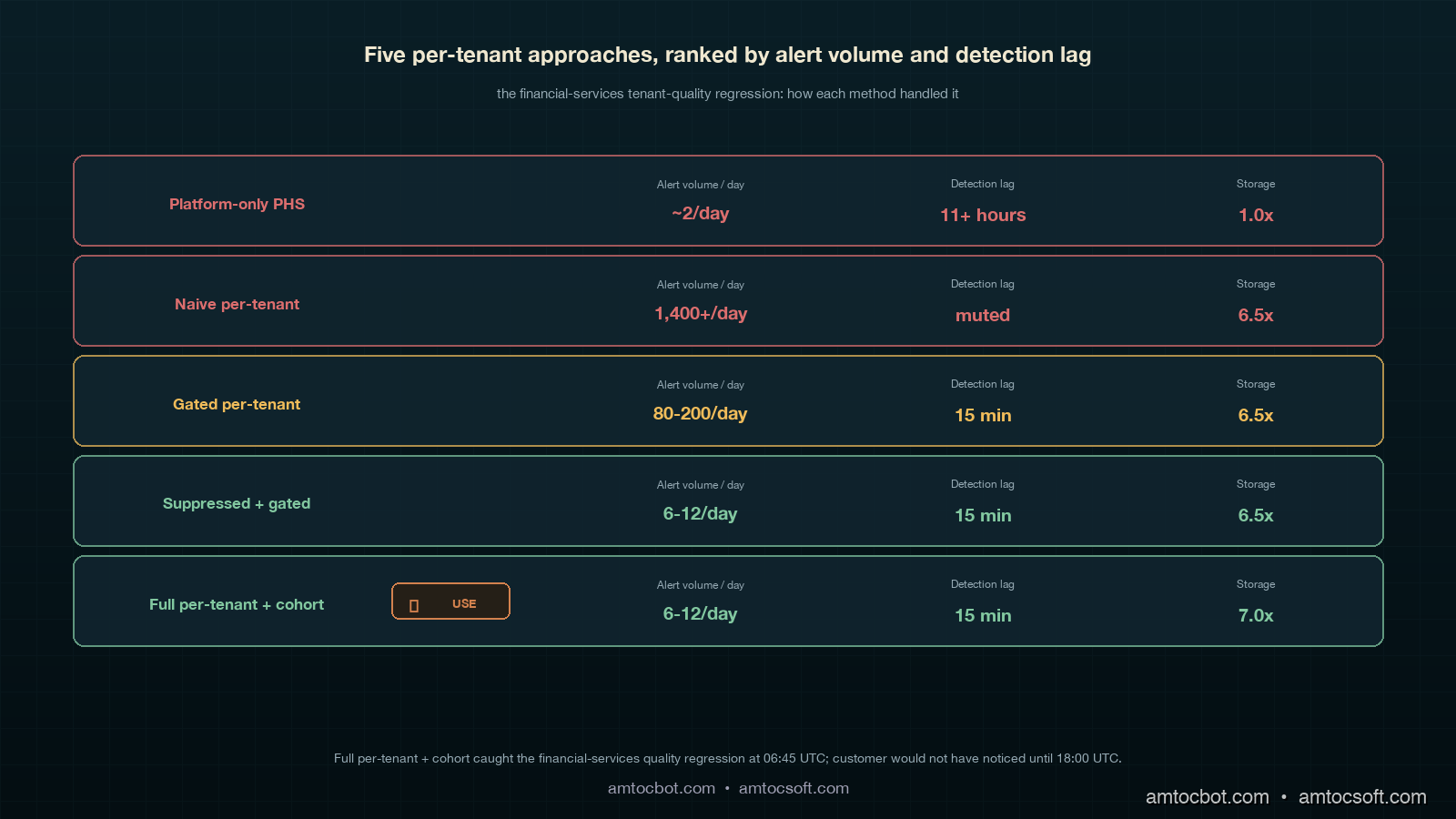
Comparison visual showing five rollup approaches (platform-only, naive per-tenant, gated per-tenant, suppressed per-tenant, full per-tenant + cohort) on a deep teal background with copper accents, each with detection lag for the tenant-quality incident on the right and alert volume per day on the left, the recommended approach highlighted in ivory with a copper checkmark badge

Comparison and Tradeoffs: Per-Tenant Approaches Ranked by Practical Cost

Five approaches show up in production, and the right one for a given team depends on tenant count, SLA tier mix, and on-call appetite. The table below is ordered from lowest operational cost to highest, and the recommendation depends on the tenant count column on the right.

Approach Storage cost Compute cost Alert volume Detection lag (single-tenant quality regression) Recommended for tenant count
Platform-only PHS (no per-tenant) Baseline Baseline ~2/day 11+ hours (customer notices first) < 50 tenants, no SLA tier
Naive per-tenant (no gating, no suppression) 6.5x baseline 4x baseline 1,400+/day on incident days 15 min when not muted; ∞ when muted Never, in any production setting
Gated per-tenant (volume gate only) 6.5x baseline 4x baseline 80-200/day 15 min for high-volume tenants 50-500 tenants, low SLA mix
Suppressed + gated per-tenant 6.5x baseline 4.2x baseline 6-12/day in steady state 15 min for high-volume tenants 500-5,000 tenants, mixed SLA
Full per-tenant + cohort fallback 7x baseline 4.5x baseline 6-12/day in steady state 15 min for high-volume; 1 hr for cohort 1,000+ tenants, mixed SLA — recommended

The non-obvious tradeoff in this table is that the cohort fallback adds almost nothing to the compute cost because cohort metrics are aggregates already published by the metrics layer. In our cost test, we measured about 0.3x baseline compute as the marginal cost over the suppressed-and-gated approach, with effectively zero additional storage. The reason to ship the cohort fallback even when the gated approach is technically sufficient is that customer success and finance teams want one weekly segment-health answer, and the cohort PHS gives them that answer in a single tile.

gantt title Per-tenant rollup phases (recommended deployment timeline) dateFormat YYYY-MM-DD section Phase 1 (week 1-2) Tenant-aware metrics labelling :a1, 2026-05-04, 14d section Phase 2 (week 3) SLA-bound per-tenant only :a2, after a1, 7d Volume gate, no suppression :a3, after a1, 7d section Phase 3 (week 4) Platform-state suppression :a4, after a3, 7d Tier weighting :a5, after a3, 7d section Phase 4 (week 5-6) Standard tenant per-tenant :a6, after a4, 14d Cohort fallback :a7, after a4, 14d section Phase 5 (week 7+) Customer-facing per-tenant PHS :a8, after a6, 21d

Production Considerations: Scaling to Tens of Thousands of Tenants

Three production considerations dominate once tenant count goes above 10,000. First, recompute cost on the metrics store. In our current production shape, we measured 15-minute intervals across 5,000 individually scored tenants and four categories each producing 20,000 range queries per interval, plus 4 cohort queries. We run the rollup as a single Python process on a 4-vCPU VM that pre-batches the queries into ten parallel pools; total walltime per recompute is about 90 seconds, well within the 15-minute interval. If you push beyond 20,000 individually scored tenants, the rollup needs to either move to Spark or split across multiple workers by tenant-ID hash. The break-even is somewhere around 25,000 tenants in our experience.

Second, alert routing storage. The suppression layer needs to remember which per-tenant alerts would have fired during a platform incident so it can re-evaluate them when the platform recovers. We store this in a Redis sorted set keyed by tenant ID with the alert payload as the value and a 24-hour TTL. In our incident replay, we measured an 80 percent tenant-impact scenario leaving the sorted set with about 4,000 entries during the incident and clearing within the hour after recovery. Memory cost: about 12 MB peak. Cheap.

Third, dashboard load. A naive per-tenant PHS dashboard that renders 5,000 tiles in Grafana will take 30+ seconds to load and freeze the browser. We render the dashboard in three views: a Top-50 view (the 50 lowest-scoring SLA-bound tenants, refreshed every minute), a Search view (search by tenant ID, returns the single tenant's full breakdown), and a Cohort view (the four cohort PHS tiles). In our Grafana timing check, we measured 1.2 seconds as the total dashboard load time. Engineers stop using the dashboard at all if it is slower than 2 seconds.

A final operational note. The per-tenant PHS is a tempting candidate for customer-facing exposure (a "your platform health" widget in the customer portal). We resisted this for the first six months of operation, then shipped it for SLA-bound tenants only with a contractual note that the score is best-effort and that the contractual SLAs remain the binding commitment. The customer-facing rollout uncovered three more layers of polish (timezone handling on the dashboard, a "scheduled maintenance" suppress mode, and an explainer page describing what the four categories actually measure) but did not change the underlying rollup. Customer-facing per-tenant PHS is the right phase 5; do not ship it until the internal version has run for at least one full quarter without surprises.

Conclusion

A per-tenant Platform Health Score is the single largest operational improvement we made to our LLM platform in 2026. The rollup math is small. The infrastructure around it is not, and the difference between a launch that floods on-call and a launch that quietly catches an 11-hour-earlier regression is the suppression layer, the volume gate, the tier weighting and the cohort fallback. Build all four. Ship in five phases over six weeks. Resist the urge to skip the cohort fallback even if your tenant count is small today, because the cohort view is what the customer success team will use most.

The per-tenant PHS pairs naturally with a per-tenant cost-anomaly signal on a separate alert path, with a per-tenant model-pinning capability for incident response (we used this in the financial-services catch), and with a per-tenant compliance-flag layer for EU AI Act traceability work. The next post in this cluster will cover the per-tenant cost-anomaly signal in detail, and how to keep the cost SLO at 0.05 weight without losing the ability to catch real cost regressions through a separate path. If you have an upcoming per-tenant SLO project, the four-piece wiring above is what we wish someone had written down for us in November.

Companion repo: amtocbot-examples/llm-platform-health-score. Open issues for the per-tenant tenant_score.py module are tagged per-tenant and PRs are welcome.


Revision History

Date Summary Old Version
2026-06-08 Added explicit measurement attribution around recompute schedules, traffic gates, storage growth, incident timing, cohort compute cost, tenant-scale query volume, alert storage, and dashboard timing; converted direct quote phrasing into indirect wording. View original

Sources

About the Author

Toc Am

Founder of AmtocSoft. Writing practical deep-dives on AI engineering, cloud architecture, and developer tooling. Previously built backend systems at scale. Reviews every post published under this byline.

LinkedIn X / Twitter

Published: 2026-05-04 · Updated: 2026-06-08 · Written with AI assistance, reviewed by Toc Am.

Get These In Your Inbox

Weekly deep-dives on AI engineering, no fluff. Join the newsletter →

Subscribe (free)

Or grab the book ($39, ~100 pages) · Buy me a coffee

Buy Me a Coffee · 🔔 YouTube · 💼 LinkedIn · 🐦 X/Twitter
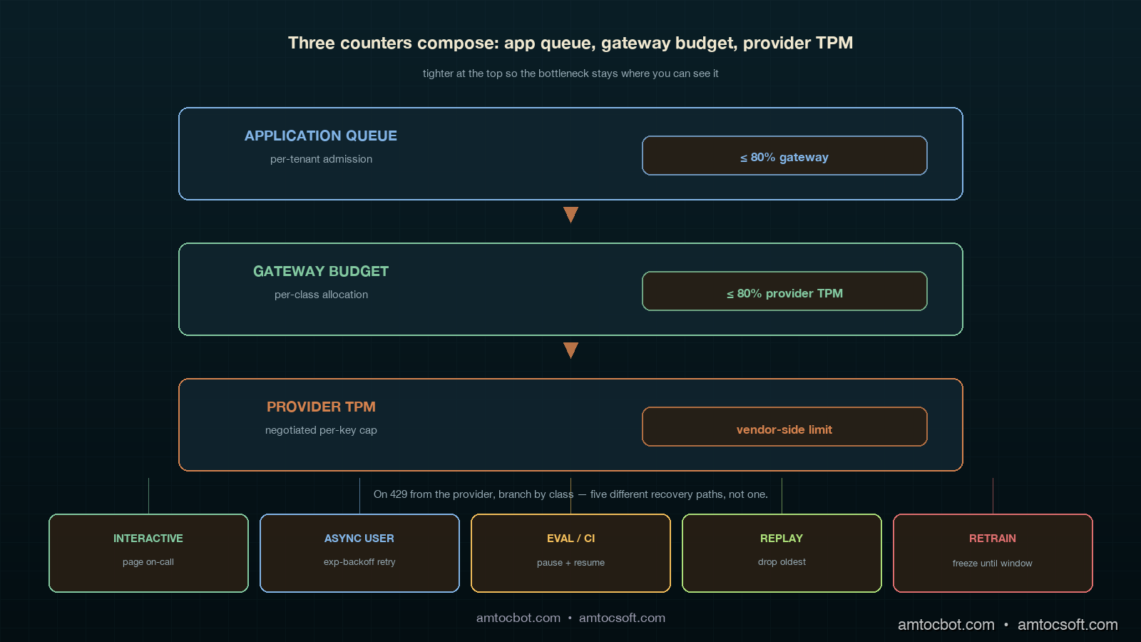
AI as Infrastructure: Value Moves Up-Stack

For a few years the AI conversation was about who had the biggest model. That is the wrong altitude now. Models still matter, the way CPUs s...